Akhil Holistic Health and Wellness Care – A Heartfelt Logo Design Journey
Introduction to Akhil Holistic Health and Wellness Care
Logos are not just visuals—they are identities, emotions, and silent storytellers of a brand. For Akhil Holistic Health and Wellness Care, founded by Dr. Surya Sai, the mission was clear: to create a visual identity that reflected the center’s commitment to holistic healing, encompassing mind, body, and soul.
When Dr. Surya Sai approached Harsh Designs, his request was simple yet challenging: “I need a logo that not only looks beautiful but one that patients can connect with emotionally and spiritually.”
This case study narrates how Harsh Designs developed a logo that became the soul of the brand, and why it remains a benchmark for healthcare logo design in Hyderabad.
The Challenge
The healthcare industry in Hyderabad is highly competitive, with hospitals, clinics, and wellness centers all trying to stand out. For Akhil Holistic, the challenge was twofold:
- Differentiation: Create a unique brand identity that separates it from conventional medical centers.
- Representation: Ensure the logo reflects holistic healing—a blend of physical health, emotional wellness, and spiritual balance.
Unlike a standard healthcare clinic, Akhil Holistic integrates modern medicine with holistic therapies. Thus, the logo needed to bridge science and spirituality, reassuring patients of both credibility and compassion.
Research & Competitor Analysis
Before designing, the Harsh Designs team conducted a research phase:
- Competitor Logos: Many healthcare logos in Hyderabad leaned on generic symbols like crosses, stethoscopes, or abstract waves. While functional, they lacked emotional depth.
- Color Psychology: Healthcare branding often defaults to blue or green (trust, calmness, growth). However, holistic care required warmer tones that connect with heart, family, and compassion.
- Audience Insight: Patients at Akhil Holistic seek comfort, personal connection, and community support—not just medical expertise.
This analysis made it clear: Akhil Holistic’s logo must feel human, not corporate.
The Concept Development
The design team began brainstorming multiple directions, sketching raw ideas and testing visual metaphors. After several iterations, they landed on a core concept:
- Three Hearts Symbolism:
- First Heart – Mind
- Second Heart – Body
- Third Heart – Soul
- Circle Motifs: Representing the human form, balance, and the holistic journey.
- Center Heart: Symbol of family, unity, and community care.
- Typography: The abbreviation AHW under the symbol, alongside the full brand name.
This visual combination captured holistic healing in its purest form.
The Execution
Execution was the most critical phase. The Harsh Designs team explored:
- Color Palettes: Warm reds (heart, compassion), greens (growth, wellness), and blues (trust).
- Fonts: Rounded sans-serif fonts to keep the brand approachable and friendly.
- Layouts: Horizontal (logo + name side-by-side) and vertical (stacked for brochures and signage).
After internal reviews and refinements, the final design emerged—a fusion of emotion and elegance.
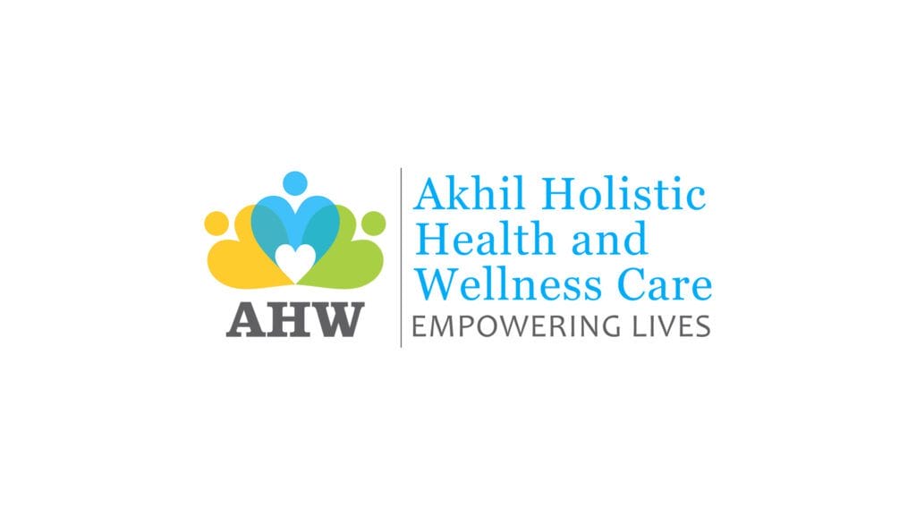
The Final Logo Design
The approved logo for Akhil Holistic Health and Wellness Care featured:
- Three hearts aligned uniquely (90-degree angle and centered heart).
- Circles forming human-like figures.
- A central small heart representing community bonding.
- The AHW text anchoring the symbol.
- Brand name on the right, ensuring readability.
This was not just a logo—it was a visual mantra of the brand’s philosophy.
The Client’s Reaction
When Harsh Designs presented the final version to Dr. Surya Sai, his response was heartfelt:
“This is not just a logo—it feels like the soul of my center. You have captured exactly what I envisioned: compassion, family, and wellness.”
The client’s satisfaction validated the design approach and became a testimony to Harsh Designs ability to translate emotions into visuals.
The Results
The impact of the new logo was immediate and powerful:
- Brand Recognition: Patients and community members quickly associated the logo with Akhil Holistic’s services.
- Professional Identity: The logo was rolled out across business cards, signage, letterheads, and brochures, creating a consistent brand presence.
- Digital Presence: The clinic’s Practo listing, social media pages, and website began using the logo, strengthening its online identity.
- Trust Building: The symbolic hearts reassured patients that they were entering a center of care, compassion, and holistic healing.
Beyond the Logo: Branding Extensions
The logo became the foundation of a broader branding strategy:
- Business Cards & Stationery: Clean designs with the heart motif.
- Clinic Interiors: Wall graphics using heart and circle patterns.
- Digital Marketing: Social posts that echoed the “mind, body, soul” theme.
- Brochures & Flyers: Incorporating the logo into storytelling for services.
Lessons Learned
- Emotion > Aesthetics: A logo must emotionally connect, not just look good.
- Research Matters: Competitor and audience insights shaped the differentiation.
- Holistic Storytelling: Using hearts and human forms gave the brand a soulful narrative.
- Client Collaboration: Continuous feedback loops ensured alignment with vision.
Conclusion
The Akhil Holistic Health and Wellness Care logo design case study is proof that a logo can be more than a mark—it can be a living identity.
For healthcare and wellness businesses, especially in Hyderabad, Harsh Designs continues to be a trusted partner, delivering best logo design services that are not only creative but also strategically impactful.
If your business needs a logo that speaks to your audience’s hearts, Harsh Designs is where your story begins.
