Codestar Logo Design Case Study – Branding an IT & AI Company from Plano, Texas
Introduction – Codestar and the Need for a Strong Brand Identity
The Codestar Logo Design Case Study highlights how Harsh Designs created a powerful brand identity for an IT and AI solutions provider based in Plano, TX 75074, USA. Founded by Nishanth, Codestar provides a range of services including Artificial Intelligence solutions for retail, IT staffing, executive search & selection, and digital transformation services.
In a highly competitive industry like technology and staffing, having a recognizable brand identity is crucial. Codestar needed a logo that represented innovation, intelligence, and integration—a visual identity that clients could trust globally.
About Codestar – Innovating in AI, IT Staffing & Digital Transformation
Codestar is a forward-thinking company focused on helping organizations adopt cutting-edge technologies and build world-class teams. Their expertise lies in:
- Artificial Intelligence in Retail – Offering AI-driven inventory management, predictive analytics, and customer experience solutions.
- IT Staffing – Helping businesses hire skilled IT professionals quickly through an extensive talent pool and smart vetting processes.
- Executive Search & Selection – Providing access to top C-suite executives and leaders to drive organizational growth.
- IT Solutions & Digital Transformation – Delivering personalized e-commerce experiences and tailored solutions for modern enterprises.
Codestar wanted its logo to reflect trust, innovation, and global connectivity.
The Client’s Requirement – Innovation in Identity
When Nishanth approached Harsh Designs, the requirement was clear: create a logo that resonates with technology-driven clients while also being minimal, scalable, and meaningful.
Key requirements included:
- A logo that represents AI, technology, and human connection.
- A modern look that works across digital platforms, websites, and presentations.
- A design that reflects global vision while maintaining professionalism.
The Design Process by Harsh Designs
Logo Type Selection
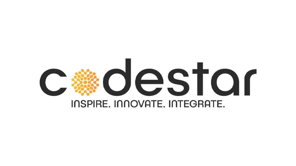
The chosen style was a wordmark logo with a pictorial element integrated into the typography. This ensured that the brand name Codestar remained the hero while still having a visual cue that adds depth and recognition.
Color Psychology
- Black: Professionalism, authority, and modern technology.
- Orange Gradient (Pictorial Mark): Innovation, creativity, and futuristic vision. Orange also adds warmth and energy, balancing the seriousness of black.
Typography
A clean, sans-serif font was chosen to highlight modernity, clarity, and trustworthiness. The lowercase letters make the brand approachable, while the bold structure gives it authority.
Pictorial Element – The “O” Starburst Symbol
The most striking element in the logo is the orange circular starburst replacing the letter “O.” This is not just decorative—it symbolizes:
- AI neural networks and digital connectivity.
- Innovation radiating outward to clients and industries.
- A futuristic starburst, representing Codestar as a shining force in IT and AI.
Final Logo Design Breakdown
The final Codestar logo designed by Harsh Designs successfully combines technology with human innovation. The “O” pictorial mark becomes a standalone symbol that can be used in apps, social media icons, and merchandise.
The tagline “Inspire. Innovate. Integrate.” further strengthens the identity, clearly communicating the brand’s mission.
Branding Applications – Where the Logo Came Alive
The Codestar logo was designed to be versatile across multiple branding applications:
- Digital Platforms: Website, LinkedIn, job portals, and corporate presentations.
- Recruitment & Staffing: Branded recruitment templates, offer letters, and HR material.
- Corporate Identity: Business cards, letterheads, and office branding.
- Global Presence: Adaptable for both US and Indian markets where Codestar operates.
Challenges Faced & Solutions
Challenge: The IT industry is full of logos with generic tech elements like circuits and gears.
Solution: Harsh Designs avoided clichés and created a unique, abstract pictorial mark that directly reflects Codestar’s innovative approach.
Challenge: Balancing professionalism with creativity.
Solution: A monochrome + gradient palette that is modern, bold, yet approachable.
Business Impact – Recognition & Trust
The Codestar logo design gave the company an instant edge in client interactions. Recruiters and corporate clients alike found the logo trustworthy, professional, and forward-looking.
The logo also helped Codestar build a stronger digital presence on LinkedIn, client presentations, and international collaborations.
Why the Codestar Logo Works – Design Expert Review
- Simplicity: Clean, easy to remember, and professional.
- Symbolism: The “O” starburst communicates innovation and intelligence.
- Scalability: Works on business cards, websites, and even billboards.
- Emotion + Tech Fusion: Balances human connection with futuristic vision.
Learnings from This Case Study for IT Businesses
The Codestar Logo Design Case Study offers valuable takeaways for IT and staffing businesses:
- A logo should reflect both services and values.
- Using abstract pictorial marks can differentiate tech brands.
- A strong tagline enhances the message.
- Consistency across branding builds global trust.
Harsh Designs – Building Global Tech Brands
At Harsh Designs, we specialize in creating logos that don’t just look good, but tell a story and build trust. From Cane Express in India to Codestar in the USA, our portfolio spans industries and geographies.
👉 If you’re launching a tech brand, let’s build your story together. Start your Logo Design Project with Harsh Designs today.
Internal Links to Harsh Designs Services
- Logo Design Services – Harsh Designs
- Packaging Design Services – Harsh Designs
- Digital Marketing Services – Harsh Designs
Conclusion – The Future of Codestar
The Codestar Logo Design Case Study proves how design can drive trust, recognition, and growth in the tech industry. With a strong identity, Codestar is now positioned as a global innovator in Artificial Intelligence, IT Staffing, and Digital Transformation.
The collaboration between Nishanth and Harsh Designs created not just a logo, but a long-term brand identity that inspires, innovates, and integrates.


