Cane Express Logo Design Case Study – A Branding Success Story by Harsh Designs
Introduction – Why This Cane Express Logo Design Case Study Matters
The Cane Express Logo Design Case Study is an inspiring journey of how Harsh Designs transformed a simple offline juice bar in Hyderabad into a brand identity that now stands strong with over 60+ stores across India. Cane Express started with a vision to provide fresh, healthy, and natural sugarcane juice in a modern setting. However, the challenge was clear—how to look different in a market filled with small juice stalls and local competitors. That is where the power of branding came into play.
This case study explores the design process, creative thinking, and branding strategy that went into crafting the Cane Express logo design, which helped the business grow from a single store to a recognizable franchise chain.
About Cane Express – From Hyderabad to 60+ Stores Across India
Cane Express began its journey as a small offline juice bar in Hyderabad. The founders wanted to revive the traditional love for sugarcane juice, but in a hygienic, modern, and customer-friendly way. Within a short span, their commitment to quality and fresh servings gained traction. Today, Cane Express has over 60 stores spread across cities and states in India, making it one of the fastest-growing juice bar franchises.
But rapid expansion needed more than just good taste. Customers needed to recognize the brand instantly, whether they saw it on a cup, a storefront, or an online ad. That’s where Harsh Designs stepped in—to create a logo design that truly expressed freshness, energy, and identity.
The Client’s Requirement – Fresh, Healthy, and Expressive Logo
When Cane Express approached Harsh Designs, their requirement was simple yet challenging: create a logo that reflects health, nature, and modernity while being scalable for offline and online branding.
They wanted a design that could connect with health-conscious customers, stand apart from street-side stalls, and also work well for franchise expansion. The logo had to be simple yet memorable, functional yet artistic. Most importantly, it needed to communicate freshness at a glance.
The Design Process by Harsh Designs
Logo Type Selection
Harsh Designs opted for a pictorial logo with a wordmark combination. This type of logo was chosen because Cane Express needed an identity that people could remember visually, not just by name. The blend of text and icon meant the brand would stand strong in both print and digital formats.
Color Psychology
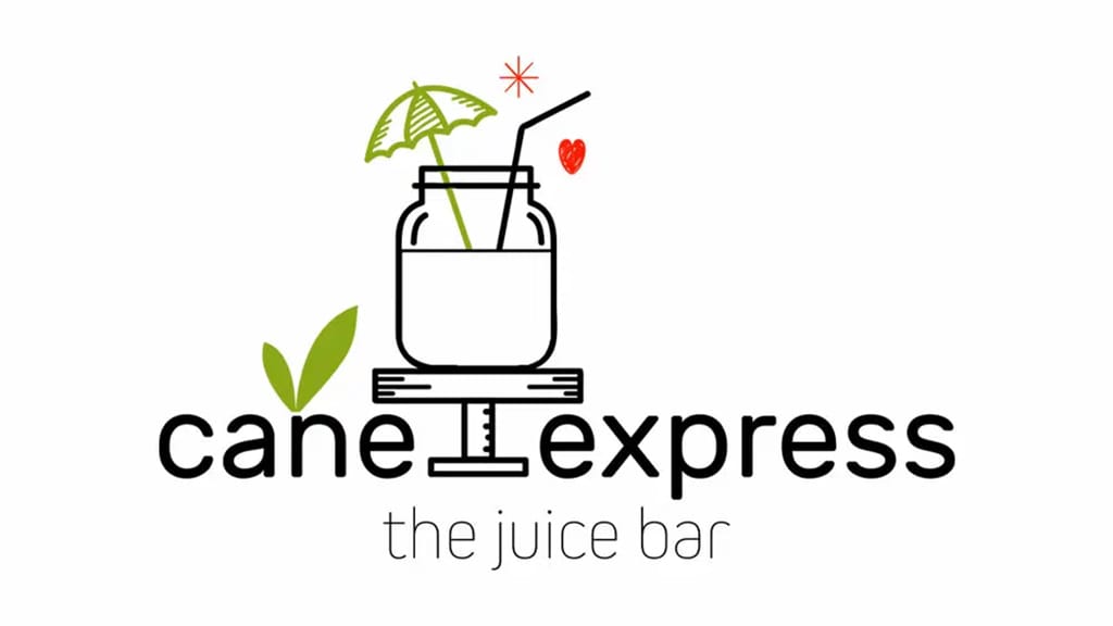
Colors are the silent language of branding. The Cane Express logo uses green to represent freshness, health, and nature. Black was chosen for confidence and professionalism, while a tiny red heart symbol adds warmth, passion, and emotional connection. Together, these colors created a balanced identity that resonates with both health-conscious and lifestyle-driven audiences.
Typography Choices
Typography is the backbone of logo communication. Harsh Designs selected a clean, sans-serif lowercase font that gives the brand a friendly, approachable feel. Lowercase text communicates accessibility and modern simplicity—important traits for a franchise targeting young customers and families alike.
Icon & Symbol Meaning
The Cane Express logo icon is instantly recognizable. The juice glass with a straw and umbrella conveys relaxation and freshness. The leaf element represents nature and organic values, while the heart symbol communicates love for health. These small yet powerful details make the logo meaningful, not just stylish.
Final Logo Design Breakdown – A Visual Analysis
The final logo delivered by Harsh Designs is not just a piece of art, but a carefully structured identity system. At its core, the logo represents freshness, love for health, and modern lifestyle.
The combination of text (“cane express”) with the illustrative juice glass creates a complete picture in the viewer’s mind—healthy juice, served fresh and quick. The subtle yet impactful use of green and red makes the design memorable, while the overall minimalist approach ensures scalability across multiple mediums.
Branding Applications – Where the Logo Came to Life
A logo is only as strong as its applications, and Cane Express ensured consistent use of its new brand identity across all customer touchpoints.
- Packaging Design: The logo appears on cups, bottles, and takeaway bags, giving customers an instant sense of hygiene and trust.
- Store Signage: The identity shines on large hoardings and storefronts across 60+ outlets, making the brand recognizable from a distance.
- Staff Uniforms: Employees wearing branded uniforms reinforce professionalism and consistency.
- Digital Presence: From social media banners to online promotions, the logo ensures Cane Express stands out in the digital landscape.
Challenges Faced & How Harsh Designs Solved Them
The biggest challenge was to differentiate Cane Express from the thousands of local juice stalls that customers see every day. Harsh Designs solved this by avoiding cliché imagery and focusing on a modern, minimalist style that appealed to a wider audience.
Another challenge was scalability—ensuring that the logo looked equally good on a tiny juice cup and on a giant billboard. The clean vector-based design ensured flawless scaling across all mediums.
Business Impact – Customer Recognition & Market Growth
The new Cane Express logo had a direct impact on business growth. Within months of its launch, the brand saw increased customer recall, better franchise recognition, and stronger market positioning.
Customers didn’t just remember the taste of the juice—they remembered the Cane Express brand identity. This recall power played a key role in the brand’s expansion to over 60 outlets across India.
Why Cane Express Logo Design Works – An Expert Review
Design experts at Harsh Designs believe the Cane Express logo works because it follows the golden rules of branding:
- Simplicity – Easy to recognize and remember.
- Scalability – Works across different sizes and mediums.
- Relevance – Represents juice, health, and freshness clearly.
- Emotion – The heart symbol adds warmth and love.
This balance of functionality and creativity makes the Cane Express logo timeless.
Learnings from This Case Study for New Businesses
The Cane Express Logo Design Case Study provides valuable lessons for startups and entrepreneurs:
- Tell a story through your logo. Don’t just decorate—communicate.
- Use color psychology. Pick colors that resonate with your brand’s message.
- Keep it scalable. A good logo should look great on a visiting card and on a billboard.
- Think long-term. A logo is not for today—it should represent your brand for years.
Harsh Designs – Your Partner in Brand Building
At Harsh Designs, we believe that a logo is not just a design, but the face of your business. The Cane Express Logo Design Case Study is just one example of how we have helped brands establish strong, memorable identities.
Whether you need logo design, packaging design, web development, or digital marketing, Harsh Designs is the go-to agency for businesses looking to grow in India and internationally.
👉 Ready to create your own brand story? Start your Logo Design Project with Harsh Designs today.
External References for Branding Inspiration
Internal Links to Harsh Designs Services
- Logo Design Services – Harsh Designs
- Packaging Design Services – Harsh Designs
- Digital Marketing Services – Harsh Designs
Conclusion – The Future of Cane Express
From its humble beginnings in Hyderabad to becoming a recognizable juice brand with 60+ stores, Cane Express has proved the power of strong branding. The Cane Express Logo Design Case Study highlights how a simple yet meaningful design can transform the way customers see a business.
With Harsh Designs as a partner, Cane Express built more than just a logo—they built an identity. And that identity continues to grow stronger as the brand expands across India.
