Digital Stalk Logo Design Case Study – Building a Modern IT Brand Identity
Introduction to the Digital Stalk Logo Design Case Study
The Digital Stalk Logo Design Case Study is an in-depth look at how Harsh Designs created a unique, scalable, and professional brand identity for Digital Stalk, an IT company founded by Pavan Kumar Atmakur in Hyderabad. The company focuses on web design and app development services, assisting businesses in creating a strong online presence and offering solutions that combine technology with branding. Harsh Designs was approached with the responsibility of crafting a logo that reflected growth, technology, and trustworthiness while standing apart in a highly competitive market.
About Digital Stalk – Assisting Businesses in the Digital Age
Digital Stalk is positioned as more than just another IT company. It is a partner for businesses that want to grow digitally. The tagline “Assisting | Business | Branding” highlights the company’s mission to support organizations not only with technology but also with branding strategies. In today’s competitive environment, where websites and apps act as the first impression for any business, Digital Stalk helps clients by providing modern, user-friendly, and high-performing solutions. A logo that mirrors this commitment was a vital need for the company.
The Client’s Vision and Requirement for the Logo
When Pavan Kumar Atmakur approached Harsh Designs, his requirements were clear. He wanted the logo to be professional, simple, and symbolic of growth. Since Digital Stalk caters to both small businesses and large enterprises, the identity had to strike a balance between being approachable and authoritative. It also had to be versatile enough to look impactful on digital platforms, corporate stationery, and office branding. The design could not be overly complicated, as simplicity ensures better recall and adaptability across multiple mediums.
Research and Inspiration Behind the Logo Design
The Harsh Designs team conducted market research by analyzing other IT service providers in Hyderabad and globally. They found that most IT companies leaned on generic design elements like circuit boards, globes, or abstract tech icons. While these worked in a basic sense, they failed to stand out. The team wanted to avoid clichés and create something unique that communicated Digital Stalk’s identity directly through its typography. They also explored the psychology of colors and shapes, knowing these elements influence how potential clients perceive a brand.
The Design Process – From Concept to Final Identity
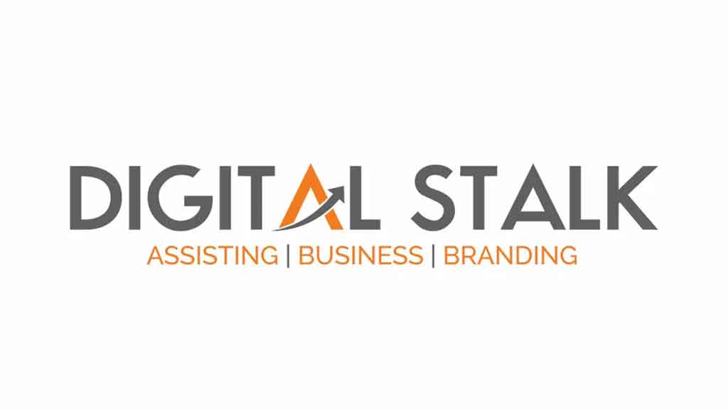
The process of creating the Digital Stalk logo involved multiple steps. First, the decision was made to focus on a wordmark logo, ensuring the company name remained the most important element. This approach allowed Harsh Designs to embed creativity within the typography itself rather than relying on external graphics. Grey was chosen as the primary color to represent professionalism and balance, while orange was added to symbolize energy, creativity, and growth. Together, the two colors created a modern and appealing contrast.
The typography selected was a clean, bold, sans-serif typeface. This choice gave the logo a modern edge while ensuring readability and authority. The most unique element came in the form of the stylized letter A in “Digital.” Instead of leaving it as a plain character, the designers incorporated an upward arrow within it. This arrow was symbolic of progress, growth, and forward-thinking technology, directly aligning with the services Digital Stalk provides. By integrating this arrow into the text itself, the logo maintained simplicity while carrying deeper meaning.
The Final Logo Design and Its Symbolism
The completed logo for Digital Stalk was more than just a design—it was a statement of intent. The bold typography ensured that the name was clear and authoritative. The grey tones anchored the design in professionalism, while the orange injected vibrancy and innovation. The arrow in the A stood out immediately, subtly but effectively communicating the company’s promise of growth and progress. The tagline below the logo added clarity by outlining the services and mission in three impactful words: Assisting, Business, and Branding.
Applications of the Digital Stalk Logo
One of the strengths of the logo was its versatility across applications. On the Digital Stalk website, it appeared sharp and professional, instantly making the brand look more trustworthy to potential clients. On business cards, letterheads, and corporate stationery, the logo gave consistency to the company’s identity. On social media platforms, the orange-grey combination created a distinct look that stood out from competitors. The design was also scalable, looking equally effective on small digital icons and large corporate signboards.
Challenges in Designing the Logo and Solutions Applied
The main challenge in designing the Digital Stalk logo was to ensure uniqueness in a crowded IT services market. Many logos in this sector look alike, often relying on overused tech symbols. Harsh Designs solved this problem by embedding the symbolic arrow directly into the typography, keeping the design minimal while adding distinctiveness. Another challenge was scalability. A logo might look good in one size but lose clarity when resized. The team tested the design across different resolutions and formats, refining it until it maintained legibility and impact everywhere.
The Impact of the New Logo on Digital Stalk
The new logo brought an immediate shift in the perception of Digital Stalk. Clients who visited the website noticed the professional upgrade, which built instant credibility. The logo gave the company a polished and consistent brand image that improved first impressions. In meetings and client presentations, the professional identity reflected positively on the brand, creating more trust among prospects. The internal team also felt a stronger sense of pride and belonging, as the logo became a symbol of the company’s vision and growth.
Why the Digital Stalk Logo Design Works
The Digital Stalk logo works because it adheres to the timeless principles of logo design. It is simple, making it easy to recall. It is meaningful, with the arrow symbol representing growth and progress. It is versatile, functioning across digital and print mediums without losing impact. It is timeless, avoiding fleeting trends in favor of a clean, scalable look. This balance ensures that the logo will remain relevant for years as Digital Stalk continues to grow in Hyderabad and beyond.
Lessons from the Digital Stalk Case Study for IT Companies
The Digital Stalk Logo Design Case Study teaches important lessons for IT companies and startups. A logo must be more than an aesthetic element—it must communicate values, vision, and mission. Avoiding generic elements can set a brand apart in a crowded market. Color psychology plays an important role in building perception, as does typography. Most importantly, logos should be tested across different applications to ensure versatility. For IT companies looking to build trust, a professional logo is often the first and most impactful step.
The Future of Digital Stalk with Its New Identity
As Digital Stalk continues to provide web design and app development services, its new identity ensures that it is recognized as a serious and professional IT partner. The logo stands as a foundation for the company’s future branding strategies, supporting digital campaigns, business development efforts, and international collaborations. It symbolizes not only where the company is today but also where it is heading tomorrow.
Internal Links to Harsh Designs Services
- Logo Design Services – Harsh Designs
- Packaging Design Services – Harsh Designs
- Digital Marketing Services – Harsh Designs
Conclusion to the Digital Stalk Logo Design Case Study
The Digital Stalk Logo Design Case Study is a story of how design can shape perception and influence business outcomes. With the creative expertise of Harsh Designs, Digital Stalk received more than a logo—it received a brand identity that reflects its vision of assisting businesses in the digital age. This case study is a reminder that in the world of IT services, where competition is fierce, a strong brand identity is not optional but essential.
