Panj Tara Logo Design Case Study – Crafting a Cultural Identity for an Indian Kitchen & Bar
Introduction to the Panj Tara Logo Design Case Study
The Panj Tara Logo Design Case Study explores how Harsh Designs created a unique brand identity for Panj Tara, an Indian Kitchen & Bar founded by Harmit Kaur. Located in Texas, Panj Tara is a celebration of Indian hospitality, flavors, and culture. The restaurant needed a visual identity that reflected its roots while appealing to a modern audience. The result was a vibrant and elegant wordmark logo design that blended tradition with contemporary style.
Harsh Designs’ goal was not only to create a logo but to tell the story of Panj Tara through design. The name itself, which translates to “Five Stars,” demanded a design that conveyed premium quality and authenticity while staying approachable and welcoming. This case study details the creative journey, from understanding the client’s vision to developing a logo that has become central to the Panj Tara identity.
About Panj Tara – The Vision of Harmit Kaur
Panj Tara is more than just an Indian restaurant. It represents a cultural experience rooted in hospitality, tradition, and culinary excellence. Under the leadership of Harmit Kaur, the restaurant brings together authentic Indian recipes with a modern dining experience.
The brand’s philosophy emphasizes:
- Honoring rich Indian culinary traditions.
- Offering an extensive menu that appeals to diverse tastes.
- Creating a warm and welcoming atmosphere for both regulars and new guests.
- Maintaining a commitment to innovation while preserving authenticity.
From soups and salads to traditional Indian snacks, beverages, and signature dishes, Panj Tara’s menu reflects its focus on quality and creativity. The logo design needed to capture this philosophy visually.
The Client’s Requirement for the Logo Design
When Harmit Kaur approached Harsh Designs, the requirement was clear. The Panj Tara brand identity had to represent Indian culture, hospitality, and premium quality while also appealing to a broad audience in Texas. The logo needed to work across signage, menus, digital platforms, packaging, and merchandise.
The client emphasized three key values:
- Tradition and authenticity.
- Warmth and hospitality.
- A premium yet approachable identity.
This meant the logo had to be more than a decorative mark. It had to embody the essence of the restaurant’s vision.
Research and Inspiration Behind the Design
The Harsh Designs team began the project with extensive research. They studied Indian cultural motifs, traditional restaurant logos, and modern wordmark identities used by global hospitality brands. The goal was to create a design that stood out but still felt rooted in Indian aesthetics.
Inspiration came from traditional Indian dance, hospitality symbols, and cultural storytelling. The designers wanted to capture the celebratory essence of Indian dining—where food is not just a meal but an experience of joy, family, and community.
The Design Process – Crafting the Panj Tara Logo
The design journey involved several stages:
Logo Type
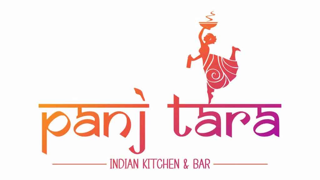
Harsh Designs opted for a wordmark logo combined with an illustrative element. This ensured that the name “Panj Tara” remained central while also including a symbolic representation of Indian culture.
Typography
The custom typography was inspired by Indian calligraphy styles but refined for readability. The flowing curves and strokes brought an artistic touch, while the modern finish kept it contemporary.
Color Palette
The color palette of orange and magenta was chosen to symbolize vibrancy, warmth, and festivity. Orange is associated with energy and hospitality, while magenta adds elegance and modern flair. Together, they created a gradient effect that communicated richness and creativity.
Symbolism – The Dancer Icon
One of the most distinctive elements of the Panj Tara logo is the dancing woman carrying a tray. This symbol represents joy, celebration, and Indian hospitality. It captures the essence of serving with love and warmth, a core value of Panj Tara. The dancer also adds a sense of movement and energy, making the logo lively and dynamic.
The Final Logo Design and Its Message
The final Panj Tara logo combines typography and symbolism seamlessly. The wordmark is elegant and readable, with cultural undertones in its design. The dancer figure adds storytelling, showing that Panj Tara is not just about food but about a joyful experience. The orange-magenta gradient ties everything together into a premium yet approachable design.
Branding Applications of the Panj Tara Logo
The Panj Tara logo has been applied across a variety of platforms and mediums. Each application strengthens the brand’s identity and makes it recognizable to customers.
Restaurant Signage
On storefront signage, the vibrant logo attracts attention and sets the tone for the dining experience.
Menu Design
The logo appears prominently on menus, reinforcing brand identity every time customers browse dishes.
Digital Platforms
From the official website to social media pages, the logo gives Panj Tara a professional and consistent online presence.
Merchandise and Packaging
The logo works equally well on take-out packaging, uniforms, and promotional items, making the brand more visible in the community.
Challenges Faced During the Design Process
Creating the Panj Tara logo came with challenges that required creative solutions. One challenge was ensuring the design reflected Indian culture without relying on clichés. Harsh Designs achieved this by using a dancer figure that represents celebration, rather than predictable motifs. Another challenge was balancing tradition with modernity. The typography and gradient color palette solved this, creating a design that feels cultural yet contemporary.
Business Impact of the Logo Design
The new Panj Tara logo has had a significant impact on the restaurant’s brand perception. Customers associate the vibrant design with the warmth and authenticity of the dining experience. The professional branding has also helped Panj Tara stand out among competitors in the Texas food and beverage market.
Internally, the logo has become a source of pride for the team. It reflects their values and mission, uniting staff under a shared visual identity. The combination of cultural symbolism and modern execution positions Panj Tara as both authentic and premium.
Why the Panj Tara Logo Works
The Panj Tara logo works because it captures both identity and experience. Its success lies in several factors:
- Simplicity and elegance for easy recognition.
- Cultural storytelling through the dancer icon.
- Vibrant and warm color palette.
- Scalability across different branding applications.
- A balance of tradition and modernity.
This ensures that the logo will remain effective and timeless as the brand grows.
Lessons for Hospitality Businesses from This Case Study
The Panj Tara Logo Design Case Study provides valuable insights for restaurants and hospitality brands. A logo should not just decorate but narrate a story. Colors, typography, and symbols should align with the brand’s mission and values. The design should work across various applications, from signage to packaging. Most importantly, cultural authenticity combined with modern execution can set a brand apart in a crowded market.
Internal Links to Harsh Designs Services
- Logo Design Services – Harsh Designs
- Packaging Design Services – Harsh Designs
- Digital Marketing Services – Harsh Designs
Conclusion to the Panj Tara Case Study
The Panj Tara Logo Design Case Study is a testament to the power of branding in hospitality. By combining cultural symbolism with modern design, Harsh Designs created a logo that embodies the spirit of Panj Tara. Under Harmit Kaur’s leadership, the restaurant continues to delight guests while the logo stands as a beacon of identity, welcoming customers with warmth and authenticity.
