TruRadix Wordmark Logo Design Case Study – Modernizing Ancient Methodologies
Introduction to the TruRadix Logo Design Case Study
The TruRadix Logo Design Case Study showcases how Harsh Designs collaborated with founders Venkata Reddy Nallagangula and Siva Kota Reddy Konda to build a holistic brand identity for their wellness company. TruRadix Nutrition was born out of a mission to modernize ancient methodologies and bring preventive healthcare into everyday lifestyles.
This case study explores the creation of the TruRadix wordmark logo design—a simple yet powerful visual identity that conveys trust, modernity, and wellness. Over time, Harsh Designs extended its partnership with TruRadix to deliver packaging design, 3D modeling, website development, digital marketing, and social media branding, creating a complete ecosystem for the brand.
About TruRadix – The Birth of a Preventive Healthcare Brand
TruRadix was founded with a vision to bring ancient medicinal wisdom into modern preventive healthcare solutions. In today’s world, sedentary lifestyles and processed foods have made our bodies more vulnerable to illness. TruRadix believes in building wellness rather than treating diseases, focusing on preventive measures backed by nutrition and natural sciences.
With a team of clinical nutritionists, dieticians, research scientists, and naturopathists who bring more than 20 years of combined experience, TruRadix has created supplements that balance ancient methodologies with advanced sciences.
The TruRadix philosophy rests on:
- Preventive care through natural ingredients.
- Transparent and ethical processes.
- Strict compliance with quality standards.
- Sustainability and eco-conscious practices.
- Building wellness communities through awareness.
The Client’s Requirement for a Logo
The TruRadix founders wanted a wordmark logo design that was modern, professional, and easy to recall. Unlike abstract logos or emblem marks, the wordmark was chosen to highlight the brand’s name strongly and make it recognizable across packaging, online stores, and healthcare networks.
The client emphasized these needs:
- A clean, minimal design that reflects trust and wellness.
- A timeless identity that would remain relevant as the brand expands globally.
- A flexible design suitable for packaging, websites, and digital platforms.
- Alignment with the brand’s mission of blending ancient methodologies with modern science.
Research and Inspiration for the Logo Design
Harsh Designs conducted research on global nutraceutical and healthcare supplement brands. Most leading companies leaned toward clean typography and minimalistic approaches for their logos. Since TruRadix wanted to stand out with authenticity and professionalism, a custom wordmark with subtle design touches became the ideal solution.
The design inspiration combined elements of modern typography, natural wellness, and scientific precision. The team wanted the wordmark to look authoritative yet approachable—something that could represent both healthcare professionals and everyday consumers.
The Design Process for TruRadix Logo
Typography
A modern sans-serif font was chosen as the base for the TruRadix wordmark. It communicates clarity, trust, and modernity. The sharp yet smooth letterforms highlight both precision (science) and flow (nature).
Subtle Customization
The designers added refined details to make the wordmark unique. The typography was adjusted to strike a balance between boldness (strength and reliability) and softness (health and wellness).
Color Palette
The primary colors explored included green, blue, and earthy tones to symbolize nature, health, and trust. These colors resonate with the wellness industry while maintaining a professional look.
Final Wordmark Concept
The TruRadix logo emerged as a modern, minimal, and professional identity. It works equally well in monochrome and full-color versions, ensuring adaptability across different mediums.
Extending Beyond the Logo – Complete Brand Identity
After completing the logo, Harsh Designs continued to build the TruRadix brand with a complete set of services:
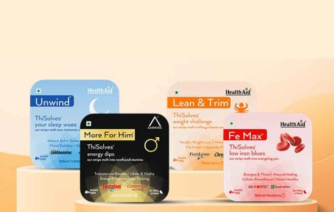
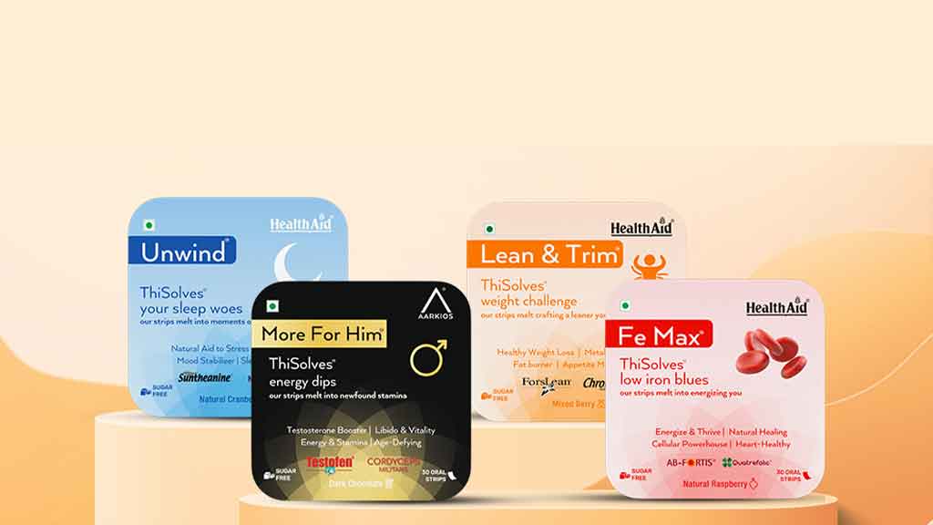
Packaging Design
Custom packaging was created for TruRadix health supplements. The designs balanced scientific precision with natural themes, ensuring that the products stood out on retail shelves while reflecting authenticity.
3D Modeling of Packaging
3D product mockups were developed for presentations, online stores, and marketing campaigns. These models allowed TruRadix to showcase their packaging designs digitally before mass production.
Website Development
A responsive and user-friendly website was built to showcase the brand’s vision, products, and research-backed methodology. The design emphasized trust, transparency, and customer education.
Digital Marketing
Comprehensive digital marketing campaigns were executed, including SEO, Google Ads, and content marketing, to boost TruRadix’s online presence.
Social Media Marketing
Engaging visuals, educational posts, and wellness tips were shared on social media to connect with audiences and build brand loyalty.
Business Impact of the TruRadix Brand Identity
The TruRadix logo and extended branding created a professional and trustworthy identity in the healthcare sector. The wordmark became instantly recognizable, while the consistent branding across packaging, digital platforms, and social media reinforced credibility.
Key impacts include:
- Increased customer trust through a modern, minimal logo.
- Strong retail presence with premium packaging design.
- Enhanced digital visibility through web development and SEO.
- Active engagement with wellness communities via social media campaigns.
Why the TruRadix Logo Works
- Simplicity: A clean, modern wordmark ensures memorability.
- Versatility: Works seamlessly across print, digital, and packaging.
- Professionalism: Reflects authority in healthcare and wellness.
- Emotional connection: Subtle design choices communicate both science and nature.
- Scalability: Equally effective on a supplement bottle or a billboard.
Internal Links to Harsh Designs Services
- Logo Design Services – Harsh Designs
- Packaging Design Services – Harsh Designs
- Web Development Services – Harsh Designs
- Digital Marketing Services – Harsh Designs
Conclusion to the TruRadix Logo Design Case Study
The TruRadix Wordmark Logo Design Case Study demonstrates how a minimal yet powerful identity can shape the perception of a wellness brand. With Harsh Designs’ expertise, TruRadix moved from just an idea to a comprehensive brand ecosystem—from logo design to packaging, 3D modeling, web development, and digital marketing.
TruRadix continues to grow as a preventive healthcare brand, backed by a strong identity that reflects modernized ancient methodologies. The wordmark logo stands as a symbol of trust, authenticity, and wellness for generations to come.
