ForeFathers Logo Design Case Study — Building a Nature-Rooted Food & Wellness Brand Identity
ForeFathers is a natural food and wellness brand associated with TruRadix Nutraceuticals, created around products such as honey, premium teas and other nature-led offerings.
Harsh Designs worked with ForeFathers across multiple creative touchpoints, beginning with the logo design and extending the identity into product packaging design, labels, pouches, 3D product modelling and visualization, and social media marketing.
The central challenge was to create a visual language capable of expressing the brand’s connection with nature and roots while remaining flexible enough to work across very different products—from honey jars and tea tins to stand-up pouches and digital marketing creatives.
The result was a recognisable tree-and-root identity that became the visual anchor for the broader ForeFathers product range.
About ForeFathers
ForeFathers operates within the natural food, wellness and lifestyle product space and is a sister brand of TruRadix Nutraceuticals.
The product range represented in our project work included categories such as:
- Natural honey
- Wild honey
- Kashmir white honey
- Premium tea
- Kashmir Kahwa tea
- Purple cranberry tea
- Detox tea
Because these products differ significantly in format, ingredients, colour and customer presentation, the brand needed an identity capable of connecting the entire range without forcing every product to look identical.
That requirement influenced how the ForeFathers logo and subsequent packaging system developed.
The Brand Challenge
Natural food and wellness categories are highly competitive visually.
Brands frequently use familiar imagery such as:
- Leaves
- Mountains
- Honeycombs
- Flowers
- Herbs
- Tea leaves
- Trees
- Organic textures
- Earth-inspired colours
The challenge was therefore not simply to make ForeFathers appear “natural.”
The identity needed enough character to become recognisable as ForeFathers, while also providing a foundation that could support multiple product categories.
The design also needed to work across very different packaging environments.
A logo placed on a dark premium honey label has different visual requirements from the same logo appearing on a white tea canister, a kraft pouch or a colourful social media creative.
The project therefore required us to think beyond a standalone logo and consider how the identity could continue working as the product portfolio expanded.
Project Objectives
Our key objectives for the ForeFathers project were to:
- Develop a distinctive logo connected visually with nature and roots.
- Establish a recognisable graphic element that could travel across multiple products.
- Create packaging systems suited to honey, tea and wellness products.
- Maintain brand recognition while allowing individual products to have their own colour and visual character.
- Develop product labels and pouches appropriate to different packaging structures.
- Present the completed products through realistic 3D visualization.
- Extend the brand consistently into social media communication.
Building the ForeFathers Logo
The ForeFathers logo is centred around one dominant visual element:
A Tree With Visible Roots
The tree extends upward through a wide network of branches carrying green leaves, while an equally prominent root structure extends downward beneath the ForeFathers name.
The result creates a vertically balanced identity in which both the visible growth above ground and the roots beneath it become part of the same mark.
This structure gives the logo an immediate connection with:
- Nature
- Growth
- Roots
- Plant-based visual language
- Natural product categories
Rather than using a separate icon beside the business name, the typography sits directly between the tree and its root system.
This allows the word FOREFATHERS to become part of the illustration itself.
The Tree as the Primary Visual Device
The tree is the most recognisable component of the identity.
Its canopy is broad and irregular rather than geometrically symmetrical. Branches extend naturally in different directions and are punctuated with bright green leaves.
The trunk then travels toward the wordmark before continuing visually into the exposed roots.
This creates a single connected composition.
From a brand-recognition perspective, the tree provides ForeFathers with an element that can remain consistent even when the surrounding packaging changes dramatically.
That became particularly important as the identity moved from the original logo into multiple product categories.
The Root System
The roots occupy a substantial part of the logo rather than appearing as a small decorative detail.
Visually, this strengthens the relationship between the name ForeFathers and the idea of origins or roots.
It also gives the logo an unusual vertical profile.
Most nature-oriented marks focus heavily on the tree canopy or leaves. In the ForeFathers identity, the area below the ground line receives almost equal visual importance.
The result is a mark with two clear visual halves:
Growth Above
and
Roots Below
with the brand name positioned between them.
Integrating the ForeFathers Name
The word FOREFATHERS sits across the centre of the logo in bold uppercase typography.
Rather than floating independently from the illustration, the name intersects visually with the tree-and-root structure.
This helps create one complete mark instead of:
Icon + Separate Wordmark
The strong uppercase lettering also provides an important contrast against the organic shapes of the branches and roots.
The result combines structured typography with a more natural, irregular illustration.
Colour Strategy
The primary ForeFathers logo uses a relatively restrained colour system:
- Charcoal / dark grey
- Bright natural green
- White / neutral background
The dark structure defines the tree, roots and typography, while green is concentrated mainly in the leaves.
This gives the green greater visual importance without requiring the entire logo to be heavily coloured.
Green as an Accent
Instead of colouring the full tree green, the logo uses green selectively.
The leaves become points of colour distributed throughout the branches.
This approach allows the identity to communicate a connection with natural products while keeping the overall mark controlled and adaptable.
The green can also provide a useful bridge into packaging designs that use botanical, herbal or wellness-oriented visual language.
Dark Neutral Structure
The trunk, branches, roots and wordmark use a dark neutral treatment.
This gives the logo sufficient visual weight and helps it remain legible against light packaging.
It also allows the logo to coexist with stronger product-specific colours without introducing too many competing hues.
That flexibility became important when designing ForeFathers packaging.
From Logo Design to Product Packaging
Once the core logo was established, the next stage was translating the identity into physical product presentation.
ForeFathers included products that required substantially different packaging formats, including:
- Glass jars
- Product labels
- Metal tea containers
- Stand-up pouches
Instead of forcing one rigid packaging template onto every product, we maintained consistent brand elements while allowing individual ranges to develop their own visual hierarchy.
Honey Packaging Design
The ForeFathers honey range provided an opportunity to create a warmer, more premium product presentation.
The supplied product designs include different visual treatments for products such as:
- Wild Honey
- Kashmir White Honey
The packaging uses the ForeFathers tree identity prominently while introducing colours and supporting graphics connected to the individual product.
Wild Honey — Dark Packaging Direction
The Wild Honey label uses a predominantly dark visual system with warm gold accents.
The combination of:
- Dark background
- Gold tree treatment
- Honeycomb graphics
- Warm honey tones
- Structured product typography
creates a strong contrast against the amber colour of the honey inside the transparent jar.
The dark label also gives the product imagery a more concentrated visual presence when shown against light ecommerce backgrounds.


Gold Logo Application
For the dark honey packaging, the ForeFathers identity transitions from the original green-and-charcoal treatment into a gold-toned application.
This demonstrates an important characteristic of the logo system.
The structure of the mark remains recognisable even when its colour application changes.
The distinctive:
Tree + ForeFathers Name + Roots
combination continues to identify the brand.
This allows product packaging to create its own mood without losing the master identity.
Honeycomb Graphic Language
Honeycomb-inspired geometric elements appear throughout the honey label.
These supporting graphics help establish the product category without replacing the main brand identity.
This creates an information hierarchy in which:
ForeFathers identifies the brand
while
Honeycomb and product imagery communicate the product category.
Keeping those roles separate prevents the packaging from depending entirely on decorative imagery for recognition.
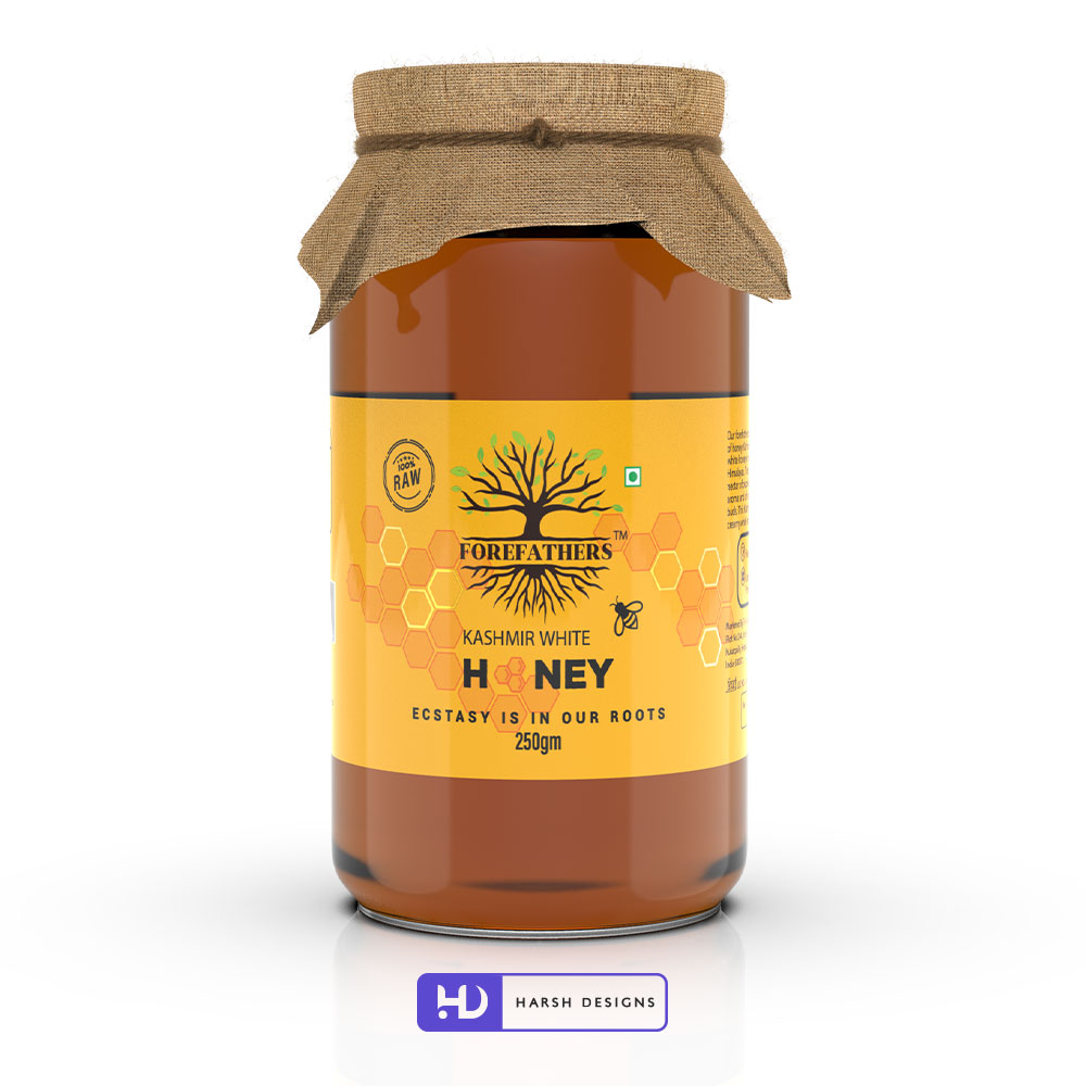
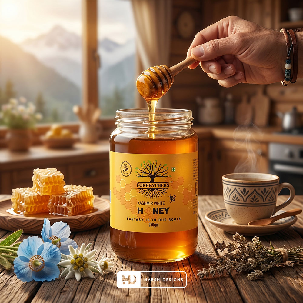
Kashmir White Honey Packaging
The Kashmir White Honey direction introduces a brighter visual treatment.
A warm yellow-to-orange label creates a very different shelf appearance from the dark Wild Honey packaging.
The ForeFathers tree identity continues to provide the connection between the two products.
This demonstrates how a master brand can create product differentiation without requiring an entirely new visual identity for every SKU.
Creating Differentiation Across Honey Products
One of the challenges in multi-product packaging is balancing two competing requirements:
Product Recognition
Customers need to distinguish one product from another quickly.
Brand Recognition
Customers must still understand that the products come from the same brand.
For ForeFathers, this balance was created through:
- Consistent logo placement
- Repeated tree imagery
- Related typography
- Product-specific colours
- Supporting honey graphics
- Consistent label proportions
The system creates variation without disconnecting individual products from the parent identity.
Premium Tea Packaging
The ForeFathers identity was also developed across tea products.
Tea packaging required a different visual language from honey because the physical container, product information and category expectations were different.
The project includes packaging for products such as:
- Purple Cranberry Tea
- Kashmir Kahwa Tea
- Detox Tea
Each product has its own personality while retaining ForeFathers as the primary brand.
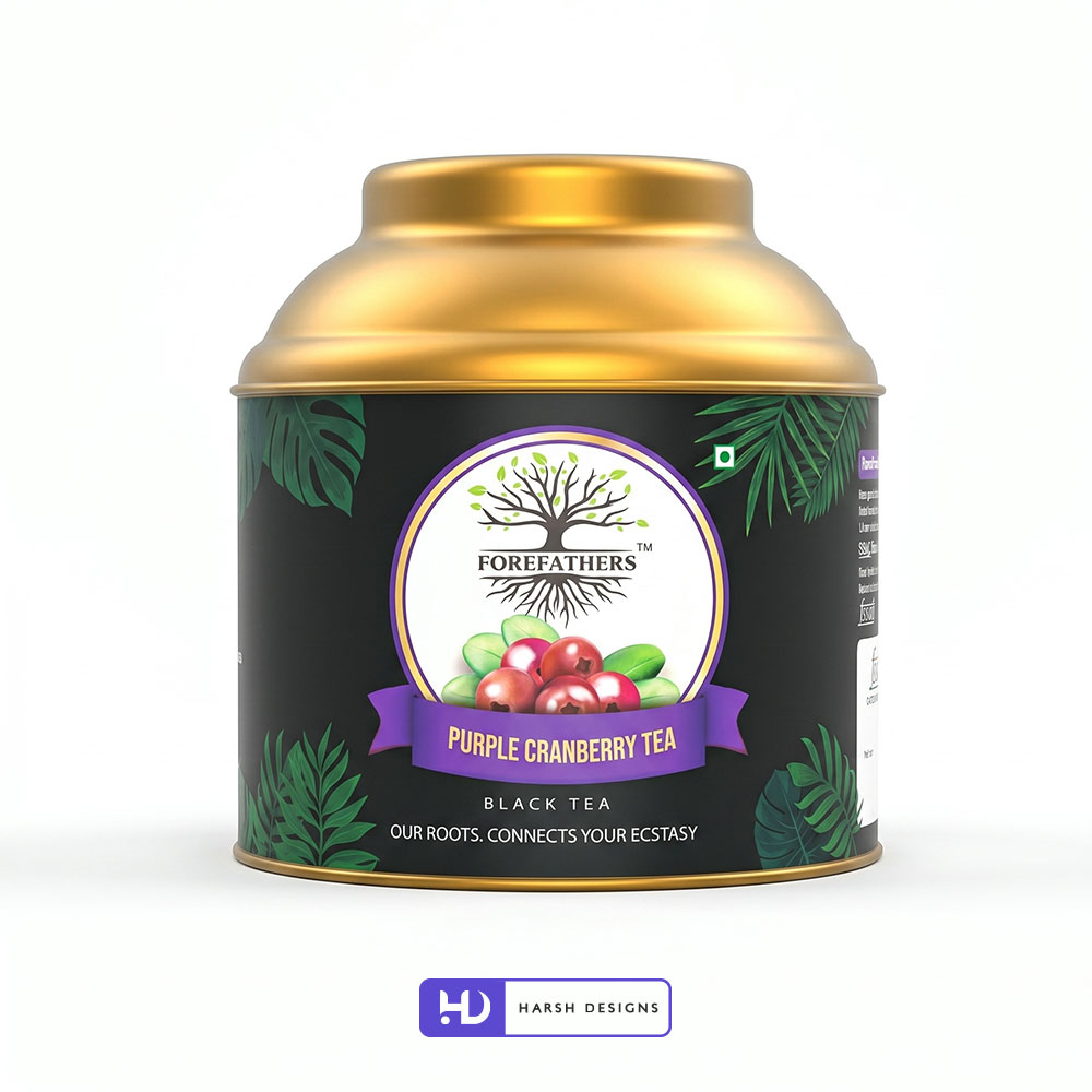
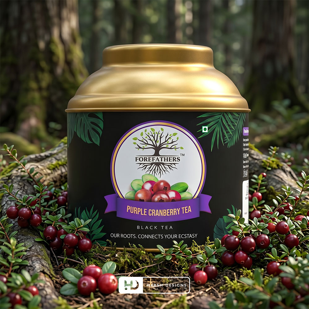
Purple Cranberry Tea Packaging
The Purple Cranberry Tea packaging uses a cylindrical tea container with a metallic gold lid.
The primary label uses:
- Deep green / near-black background
- Botanical leaf elements
- ForeFathers tree identity
- Purple product-name banner
- Cranberry-inspired imagery and colour
- Gold detailing
Purple becomes the primary differentiation colour for the product name, immediately separating this SKU from other products.
The darker background allows both the gold lid and purple banner to stand out strongly.
Creating a Botanical Product Environment
Leaf graphics around the outer sections of the Purple Cranberry Tea label provide botanical context.
Rather than overwhelming the product with photography, the design uses controlled illustrative details around a centrally aligned brand and product hierarchy.
This keeps the ForeFathers identity visible while still allowing the specific tea variety to develop its own visual character.
Kashmir Kahwa Tea Packaging
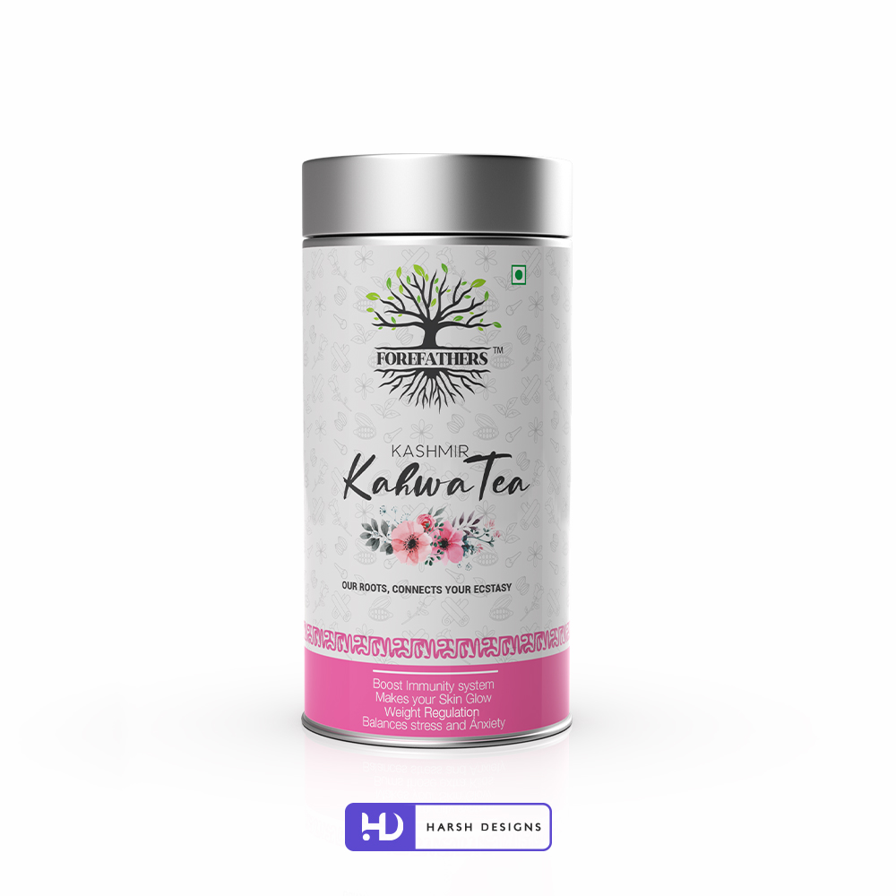
The Kashmir Kahwa Tea packaging moves in another direction.
Instead of a dark background, the design uses a primarily light surface with subtle ingredient-inspired line illustrations.
The main visual hierarchy includes:
- ForeFathers logo
- Kashmir identifier
- Kahwa Tea product name
- Floral illustration
- Supporting product communication
- Pink lower colour band
The contrast between black typography, pale background and pink floral imagery creates a lighter product personality than the honey and cranberry tea ranges.
Typography Hierarchy for Kashmir Kahwa Tea
The product name uses contrasting typographic treatments.
KASHMIR appears in a cleaner uppercase style.
Kahwa Tea becomes the dominant product text through a larger handwritten/script treatment.
This separation allows customers to process the origin/reference and actual product name at different visual levels.
The ForeFathers logo remains positioned above this information as the master-brand identifier.
Floral and Ingredient-Inspired Visual Language
The Kashmir Kahwa Tea packaging incorporates decorative floral artwork and a subtle line-art ingredient pattern across the container.
These elements help differentiate the product while maintaining the predominantly light packaging surface.
Importantly, the decorative system remains secondary to:
- The ForeFathers identity
- The product name
- Supporting information
This maintains a clear hierarchy rather than turning the label into an illustration-heavy composition.
Detox Tea Pouch Design
ForeFathers Detox Tea uses a stand-up kraft pouch format.
This required another adaptation of the identity.
The design uses:
- Kraft packaging
- White central label
- ForeFathers logo
- Green wellness accents
- Minimal icon-based communication
- Central blue tea-cup visual
- Structured product information
The natural kraft material provides an earthy base while the white label creates enough separation for product information to remain organised.

Designing Across Different Packaging Structures
By this stage of the project, the ForeFathers identity had been applied across:
Glass Jars
↓
Adhesive Labels
↓
Metal Tea Containers
↓
Stand-Up Pouches
This is where the value of a recognisable master logo becomes especially visible.
The packaging structure changes.
The product colour changes.
The typography changes according to hierarchy.
Supporting imagery changes.
But the ForeFathers tree and root identity continues to connect the range.
Developing a Scalable Product Identity
A successful product identity should not require every SKU to look identical.
Instead, customers should be able to recognise the family relationship between products while still distinguishing individual variants.
For ForeFathers, consistency came from recurring elements such as:
- Tree-and-root logo
- Centralised brand placement
- Nature-oriented graphic language
- Controlled use of botanical elements
- Clear product hierarchy
- Product-specific accent colours
This gave the range room to expand without abandoning the primary identity.
3D Product Modelling & Visualization
Packaging artwork becomes much more useful when stakeholders can see how it will appear on the actual product form.
Harsh Designs therefore extended the ForeFathers project into 3D product modelling and visualization.
The product packaging was presented across realistic jar, container and pouch formats.
This helped translate flat artwork into a more practical representation of the final product.
Why 3D Visualization Was Important
A flat label file cannot fully communicate:
- How a label wraps around a jar
- How much visual space the logo occupies
- How typography behaves on a curved container
- Whether individual design elements feel balanced
- How the product may appear in ecommerce imagery
- How packaging colours interact with the container itself
3D visualization makes these relationships easier to evaluate.
For ForeFathers, the process allowed the packaging system to be viewed as finished products rather than isolated artwork files.
Creating Ecommerce-Ready Product Presentation
The product visualizations also provide a clean way to present packaged products digitally.
ForeFathers products were shown using controlled compositions such as:
- Isolated product views
- Clean white-background presentation
- Styled environmental scenes
- Ingredient-led compositions
- Honey and botanical surroundings
- Product-focused promotional layouts
This allows the same packaging work to become useful for broader digital presentation.
Lifestyle Product Visualization
In addition to isolated product renders, selected ForeFathers products were presented within contextual environments.
For example, honey jars were visualised alongside:
- Honeycomb
- Flowers
- Natural wooden surfaces
- Botanical environments
- Serving elements
These compositions help customers understand the product visually while keeping the package itself as the primary subject.
The intention is not to replace accurate product presentation but to give digital communication a richer visual context.
Connecting Packaging and Digital Presentation
One advantage of combining packaging design with 3D visualization is consistency.
The same agency designing the label understands:
- Logo placement
- Intended colour relationships
- Typography hierarchy
- Packaging proportions
- Product differentiation
That knowledge can carry directly into the product visualization.
For ForeFathers, this created continuity between the packaging artwork and its digital presentation.
Extending ForeFathers Into Social Media Marketing
After establishing the visual identity and product presentation, Harsh Designs also worked on social media marketing for ForeFathers.
At this stage, the challenge changes again.
A packaging design may be viewed physically for several seconds, but social media communication often needs to establish the brand and product almost immediately.
The existing identity provided a consistent base for digital content.
Maintaining Brand Recognition on Social Media
The ForeFathers logo and product presentation could be used as recurring recognition elements across social communication.
The established system provided:
- A recognisable tree identity
- Existing product colour palettes
- 3D product visuals
- Product-focused imagery
- Botanical and natural visual cues
This reduced the need to reinvent the brand style for every communication.
Instead, individual social media content could build upon the visual system already established through the logo and packaging.








A Connected Design Journey
The ForeFathers project demonstrates how one core identity can develop through several stages.
Logo Design
A tree-and-root visual identity established the primary brand recognition system.
↓
Product Packaging Design
The identity was adapted into labels, honey jars, tea containers and stand-up pouches.
↓
Product Range Differentiation
Individual products developed distinct colour systems and supporting visual languages while retaining the master identity.
↓
3D Product Modelling
Packaging designs were translated into realistic three-dimensional product presentations.
↓
Digital Product Visualization
Products were placed into clean and lifestyle-oriented compositions suitable for digital presentation.
↓
Social Media Marketing
The established visual assets provided the foundation for ongoing online brand communication.
This created a more connected process than treating every deliverable as a separate creative exercise.
Services Delivered by Harsh Designs
For ForeFathers, Harsh Designs worked across:
Logo Design
Development of the ForeFathers tree-and-root identity.
Product Packaging Design
Creative packaging development across multiple product categories.
Label Design
Product labels for jar and container-based products.
Pouch Design
Stand-up pouch packaging for selected wellness and tea products.
Product Range Design
Development of product-specific visual treatments within the ForeFathers master identity.
3D Product Modelling
Three-dimensional representation of packaged products.
3D Packaging Visualization
Realistic product presentation based on the completed packaging artwork.
Digital Product Presentation
Clean and lifestyle-based product compositions for digital usage.
Social Media Marketing
Extension of the established identity into ongoing social media communication.
The Final Visual System
The completed ForeFathers project is connected by one recurring visual idea:
Roots and Growth
The logo provides the anchor.
Product-specific packaging then introduces different colours, ingredients, typography and supporting visuals.
This allows ForeFathers to present very different products without losing the visual connection between them.
From a dark Wild Honey label to a bright Kashmir White Honey package, a purple-accented tea tin, a light Kashmir Kahwa container or a natural kraft Detox Tea pouch, the master identity remains present.
The Outcome
The ForeFathers project resulted in a connected visual system rather than a standalone logo.
The logo was successfully carried into multiple real product categories and packaging formats, demonstrating its ability to function beyond the original identity artwork.
The project produced:
- A recognisable ForeFathers logo
- Honey packaging
- Tea packaging
- Label designs
- Pouch designs
- Multiple product visual directions
- 3D product presentations
- Lifestyle product visuals
- Social media-ready brand assets
- A consistent foundation for digital communication
We have intentionally not included unsupported claims relating to sales growth, revenue, conversion rates or campaign performance.
The outcome documented here is the creative and visual system delivered through the project.
Harsh Designs Role
Harsh Designs worked across several stages of the ForeFathers brand presentation.
Our involvement began with the logo and continued through product packaging, visualization and digital communication.
This allowed us to consider not only how the logo looked in isolation, but how it would function when placed on actual products.
Our work followed a connected journey:
Logo Design → Packaging Design → Labels & Pouches → 3D Modelling → Product Visualization → Social Media Marketing
That continuity helped maintain a recognisable ForeFathers identity across physical and digital touchpoints.
What Makes the ForeFathers Logo Distinctive?
The strongest feature of the ForeFathers identity is the integration of the tree, brand name and visible root system into one graphic.
The logo does not depend only on a leaf symbol to communicate its natural character.
Instead, the full structure becomes the identity:
Branches
Leaves
Tree
ForeFathers
Roots
This gives the logo a distinctive silhouette and creates a visual concept that can remain recognisable across different product ranges.
Why Consistency Matters for Multi-Product Brands
Businesses selling several product categories often face a common branding problem.
If every product looks completely different, customers may not recognise that they belong to the same brand.
If every product looks exactly the same, customers may struggle to differentiate between categories or variants.
A scalable packaging system needs to find the balance between the two.
The ForeFathers project demonstrates this through a consistent master logo combined with flexible product-level design.
The identity stays the same.
The product expression changes.
Logo and Packaging Design for Food & Wellness Brands
Food, natural-product, tea, honey and wellness businesses require branding that works in real commercial environments.
The identity may need to appear on:
- Small labels
- Large packages
- Curved containers
- Pouches
- Ecommerce listings
- Social media
- Product advertisements
- Printed communication
For that reason, the logo should not be considered separately from how customers will eventually encounter the product.
ForeFathers is an example of how Harsh Designs approaches this process by connecting the initial identity with its practical packaging and digital applications.
Looking for Logo & Packaging Design for Your Product Brand?
Harsh Designs works with food, wellness, nutraceutical, FMCG and product-based businesses looking to build stronger visual identities and packaging systems.
Depending on the project, our creative services can include:
- Logo Design
- Brand Identity
- Product Packaging Design
- Label Design
- Pouch Design
- 3D Packaging Visualization
- Product Presentation
- Social Media Marketing
Whether you are launching your first product or developing a larger product range, the goal is to create an identity that can remain consistent as the business grows.