Mademoiselle Product Packaging Design Case Study — Creating a Refined Innerwear Packaging System
Designing a Consistent, Elegant Packaging Language for a Women’s Intimate Apparel Brand in Paris, France
Mademoiselle is a women’s intimate apparel and innerwear brand associated with Paris, France, offering products across underwear, bodywear, bras, bandeau styles and thigh accessories.
For a product category where comfort, fit, femininity and visual presentation all influence customer perception, the packaging needed to do more than simply contain the garment.
It needed to present the product clearly, maintain a refined visual character and create consistency across multiple product categories.
Harsh Designs worked with Mademoiselle specifically on Product Packaging Design, developing a coordinated box-packaging system that brings together product photography, restrained colour, clear product naming and the distinctive Mademoiselle script wordmark.
The project demonstrates how a relatively minimal packaging system can create strong recognition when typography, imagery and hierarchy are used consistently.
About Mademoiselle
Mademoiselle operates within the women’s intimate apparel and innerwear category.
The supplied project range includes products such as:
- Slip Brillante
- Mademoiselle Microfibra
- Body Dolcevita M/L
- TC-107 Brasiliana Cotone
- Brassiere
- Fascia Corta
- Fortuna Satin Thigh Band
These products vary substantially in form and use.
Some are underwear essentials.
Some are upper-body garments.
Others are bodywear or accessories.
The packaging therefore needed to establish a common Mademoiselle identity while still making each individual product immediately understandable.
The Packaging Challenge
Fashion and intimate apparel packaging creates a different design challenge from many FMCG products.
The product itself may be:
- Soft
- Folded
- Available in multiple sizes
- Available in different materials
- Difficult to explain through text alone
- Highly dependent on fit and silhouette
The front of the package therefore needs to communicate visually.
For Mademoiselle, the challenge was to develop a packaging language capable of answering several questions quickly:
What is the product?
The customer should immediately understand whether the package contains a brief, bodysuit, bra, bandeau or thigh band.
Which variant is it?
Product naming must remain visible without competing with the visual.
Which brand does it belong to?
The Mademoiselle identity needs to remain recognisable across every SKU.
Does the range feel connected?
Different products should not appear as though they were designed by unrelated brands.
This became the foundation of the packaging approach.
Project Objectives
The Mademoiselle packaging project was developed around several practical objectives.
1. Create a Consistent Packaging System
Develop a visual language that could work across different intimate apparel categories.
2. Make the Product Immediately Understandable
Use strong product-led imagery so customers can recognise the garment quickly.
3. Maintain Mademoiselle Brand Recognition
Ensure the distinctive Mademoiselle name remains a recurring visual element across the range.
4. Balance Femininity With Restraint
Avoid making the packaging visually overcrowded while maintaining an elegant, intimate character.
5. Establish Clear Product Hierarchy
Separate the brand name, product name, material or collection information and imagery.
6. Support Multiple Product Variants
Create enough flexibility for different garments without losing the relationship between packages.
7. Build Packaging Suitable for Modern Retail Presentation
Design front panels that remain clear whether viewed physically or through digital product imagery.
Our Packaging Design Direction
The final Mademoiselle packaging takes a photography-led, minimal and neutral approach.
Rather than surrounding the product with heavy decorative graphics, the design gives visual priority to the garment itself.
Across the range, several recurring elements create consistency:
- Large fashion imagery
- Soft grey and neutral backgrounds
- White typography
- Mademoiselle script wordmark
- Minimal supporting copy
- Clear product naming
- Rectangular box structures
- Controlled spacing
This creates a packaging system that feels connected without requiring every product box to be identical.
Letting the Product Become the Hero
One of the most noticeable characteristics of the Mademoiselle system is that the product is not represented through an abstract icon or illustration.
The garment itself becomes the main communication device.
For intimate apparel, this has a practical advantage.
Customers can understand:
- Product silhouette
- Coverage
- General styling
- Intended placement
- Product category
much faster through a strong visual than through descriptive copy alone.
This allows the packaging to communicate with fewer competing elements.
A Restrained Neutral Colour System
The packaging uses predominantly:
- White
- Soft grey
- Warm skin tones
- Neutral beige
- Subtle blush tones
Rather than introducing a different bright colour for every product, the system maintains a relatively quiet background.
This gives the product photography more visual importance.
It also creates stronger consistency across very different product categories.
The result is a range that feels coordinated without being overly uniform.
Why Neutral Packaging Works for the Category
Innerwear packaging needs to balance several qualities.
It needs to feel:
Clean
without becoming clinical.
Feminine
without becoming overly decorative.
Premium
without appearing inaccessible.
Product-focused
without feeling like a basic catalogue image.
The Mademoiselle packaging uses neutral visual space to allow the garment, body silhouette and typography to establish this balance.
The Mademoiselle Wordmark as a Consistent Brand Anchor
Across the supplied packaging range, the Mademoiselle name appears in an expressive handwritten/script style.
This provides an important contrast against the cleaner sans-serif typography used for product information.
The script wordmark creates the more emotional and feminine component of the composition.
The supporting typography remains simpler and more functional.
Together, these two typographic styles create a clear relationship:
Mademoiselle
The brand.
Product Name
The specific garment.
Material / Collection
Supporting product information.
This hierarchy repeats across the range.
Typography as Part of the Packaging System
Typography performs a particularly important role because the visual design itself is intentionally restrained.
Large product photography attracts attention first.
The text then explains what the customer is looking at.
The packaging avoids filling the front panel with excessive information.
Instead, the hierarchy is usually built around a small number of elements:
Product Name
↓
Mademoiselle
↓
Material / Collection Information
This gives each element space to breathe.
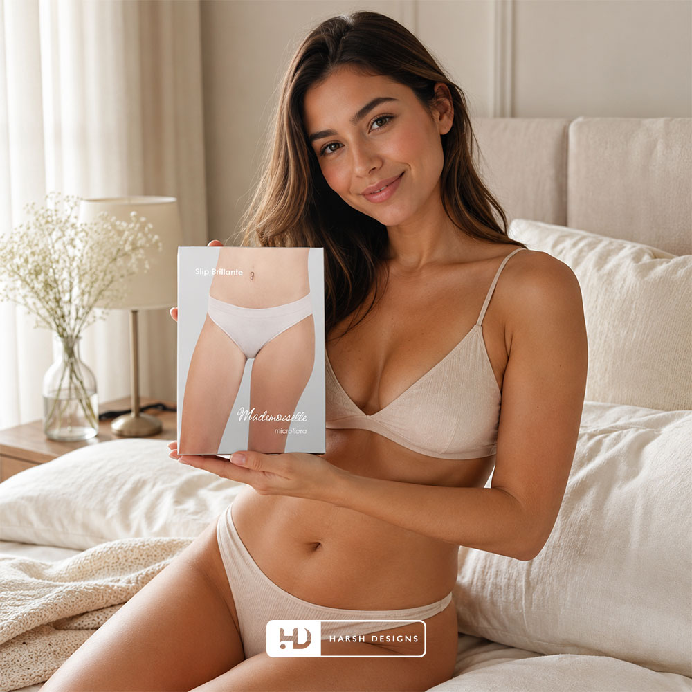
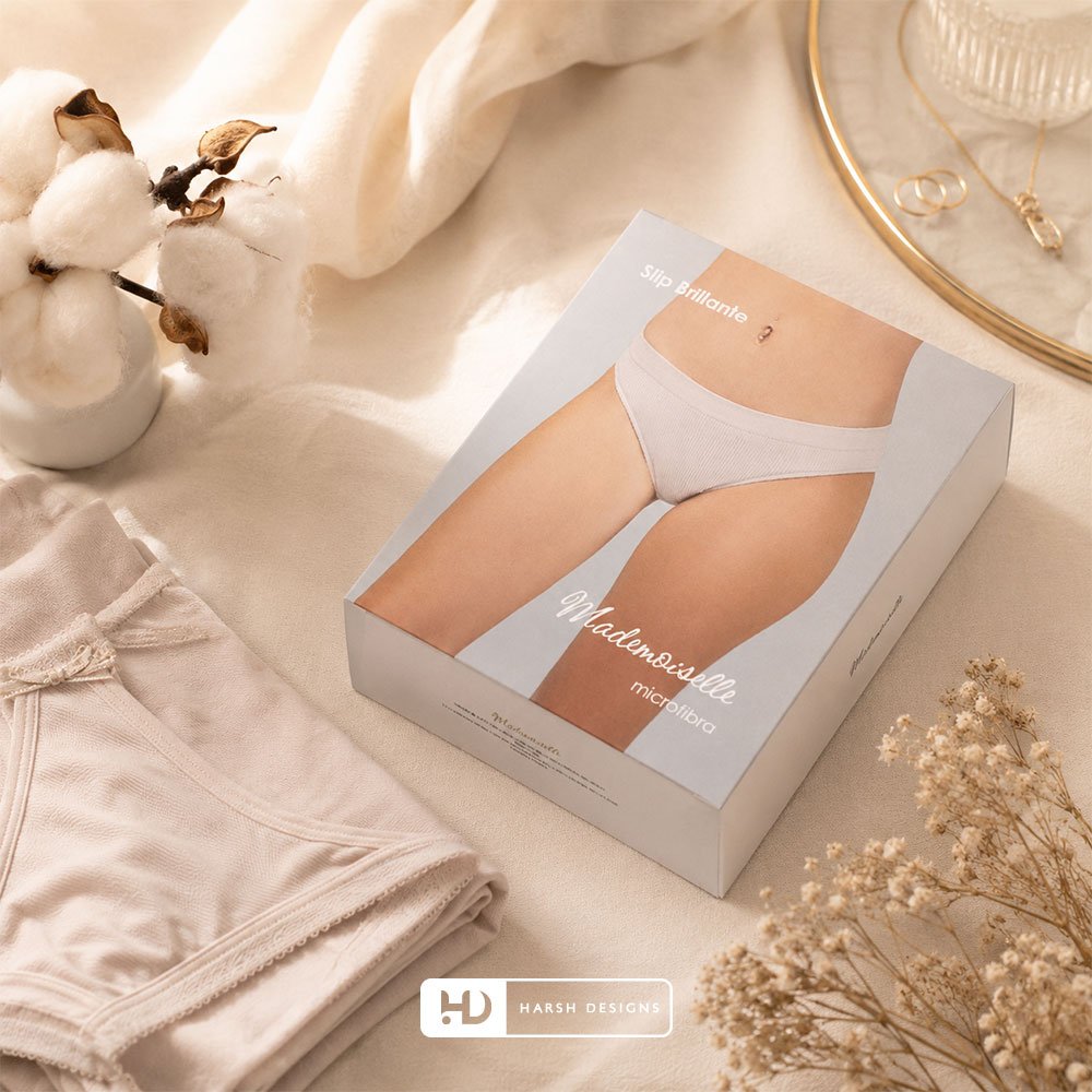
Slip Brillante — Microfibra Packaging
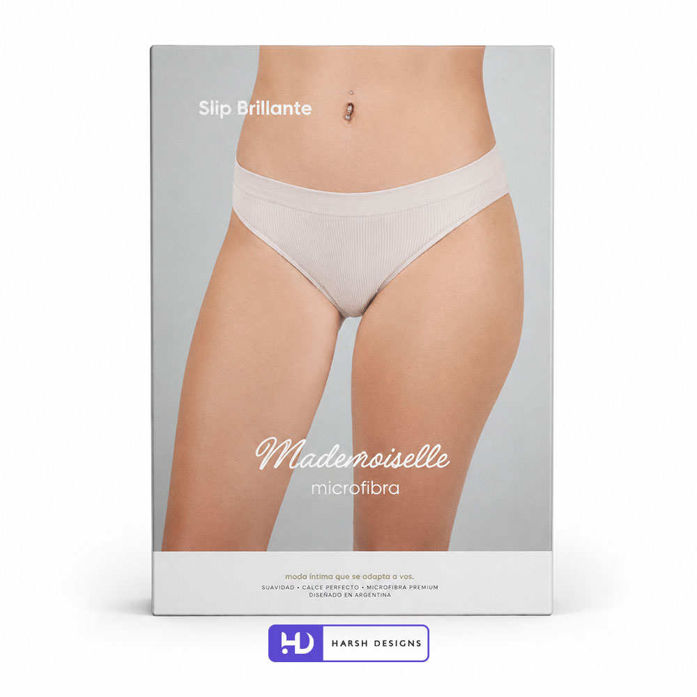
The Slip Brillante packaging uses a direct front-facing product presentation.
The garment is shown clearly against a light neutral background, immediately communicating the brief-style silhouette.
The supporting typography remains minimal.
The product name:
Slip Brillante
appears independently from the Mademoiselle branding.
The lower portion then carries:
Mademoiselle
microfibra
This separation allows customers to process the product and brand information quickly.
The overall composition remains quiet and product-focused.
Creating Clarity Through Large-Scale Imagery
The Slip Brillante packaging demonstrates an important principle within the wider system:
The product image occupies most of the available visual space.
This reduces the need for additional diagrams or decorative elements.
Customers can understand the garment’s general form before reading the supporting information.
For innerwear packaging, that direct visual communication is highly valuable.
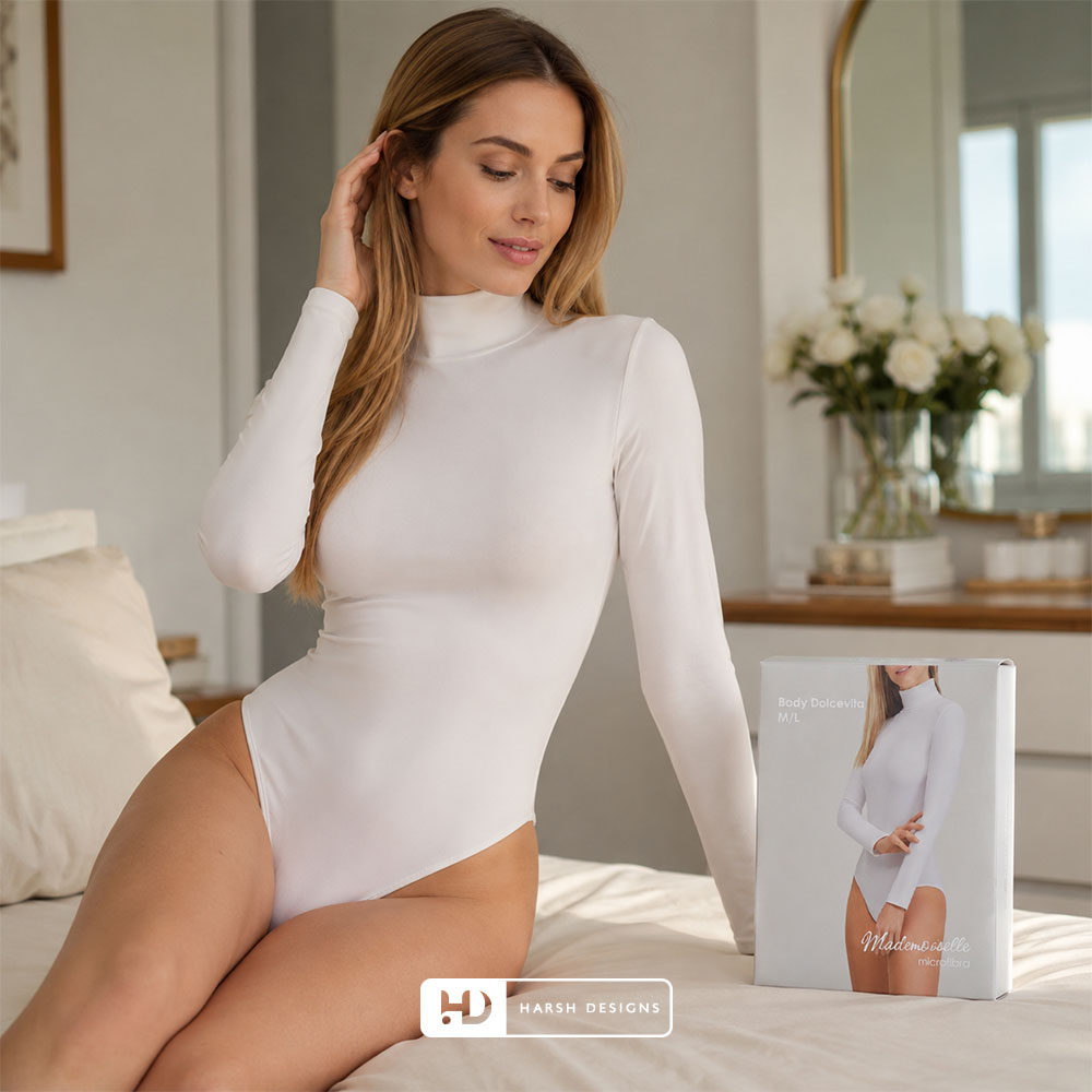
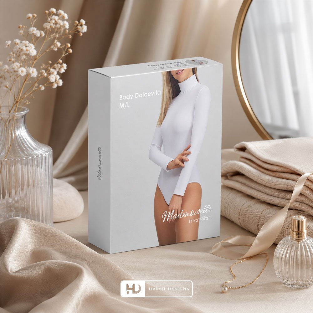
Body Dolcevita M/L — Microfibra
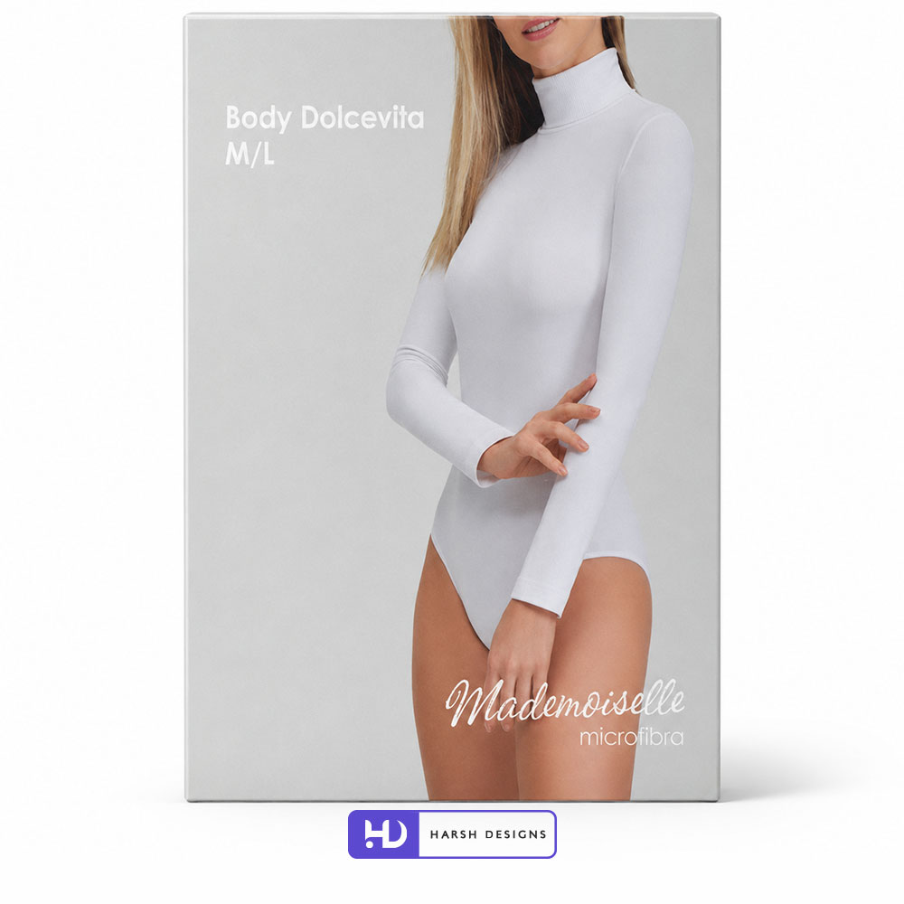
The Body Dolcevita M/L packaging extends the same visual system into a substantially different garment category.
Instead of a lower-body product, the box presents a long-sleeve bodysuit.
The visual composition remains familiar:
- Neutral background
- Large garment-focused photography
- White product typography
- Mademoiselle script branding
- Microfibra identification
This is an important example of system scalability.
The product shape changes dramatically.
The packaging identity does not.
Maintaining Recognition Across Different Garment Types
The Body Dolcevita box shows why packaging systems should be designed around principles rather than a single rigid template.
A bodysuit requires a taller visual composition than a brief.
A bra requires different framing again.
A thigh band requires a completely different crop.
Trying to force each product into exactly the same photographic composition would reduce clarity.
Instead, consistency is maintained through:
- Typography
- Brand placement
- Colour environment
- Image treatment
- Spacing
- Overall tone
This provides flexibility without sacrificing recognition.
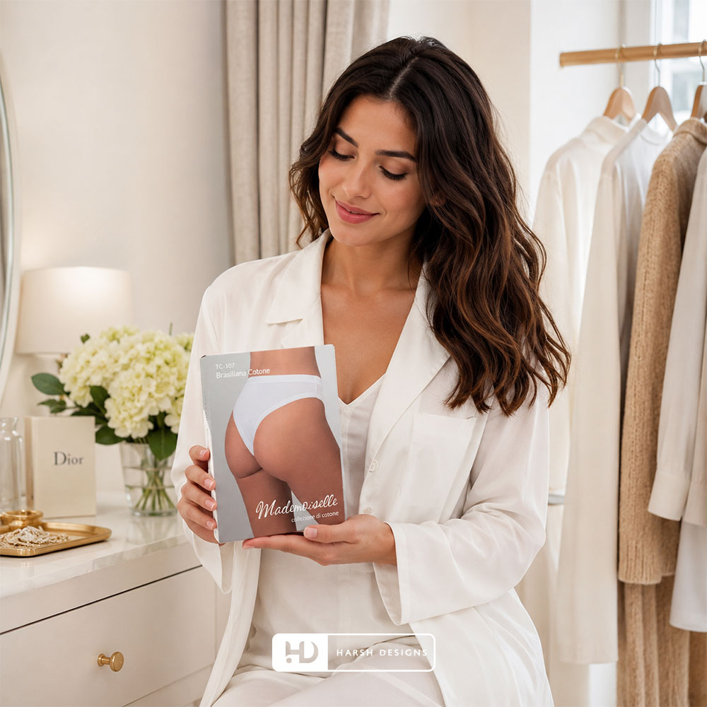
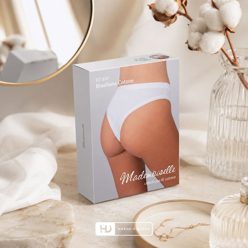
TC-107 Brasiliana Cotone Packaging
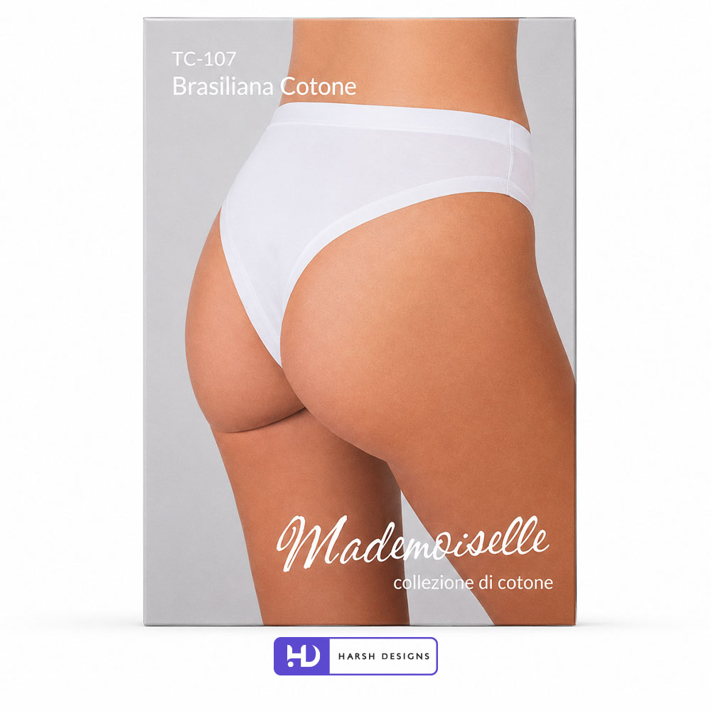
The TC-107 Brasiliana Cotone packaging uses a rear-view garment presentation.
The product image clearly communicates the cut and coverage of the underwear.
Supporting information appears at the top:
TC-107
Brasiliana Cotone
while the Mademoiselle branding remains prominently positioned toward the lower section.
The supporting phrase:
collezione di cotone
helps identify the product as part of a cotton-oriented collection.
The overall presentation remains visually consistent with the wider range.
Using Product Codes Without Overpowering the Design
Fashion and apparel products frequently require codes for internal or retail identification.
In this example:
TC-107
is visible but does not dominate the package.
The hierarchy ensures the customer still encounters:
- The garment
- Product description
- Mademoiselle branding
before secondary identification details become visually dominant.
This helps maintain both retail usefulness and visual refinement.
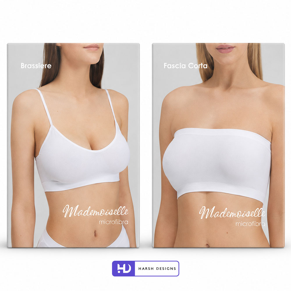
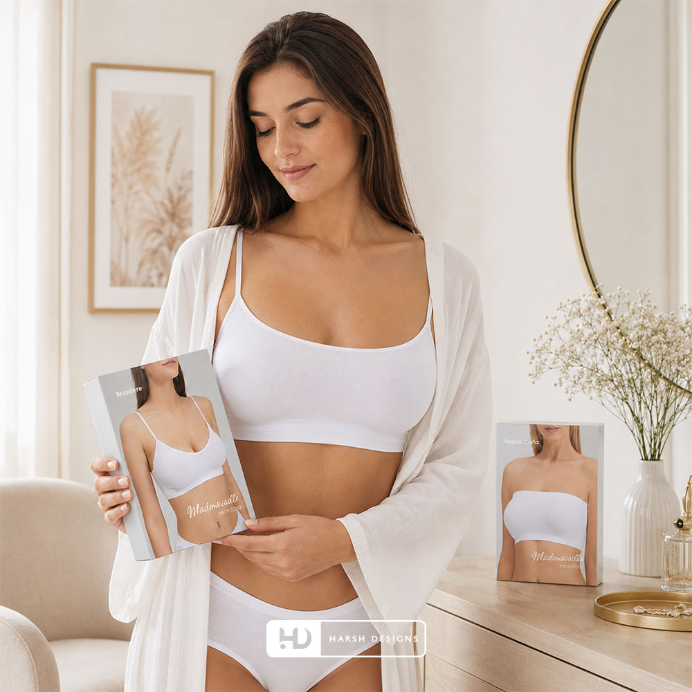
Brassiere Packaging
The Brassiere packaging moves into upper-body innerwear.
The garment photograph occupies almost the entire front panel.
The product title is positioned toward the top while the Mademoiselle identity remains integrated into the lower portion.
This approach allows the packaging to communicate the category immediately.
There is little ambiguity about what is inside.
The customer sees the garment first.
The typography confirms it second.
Fascia Corta Packaging
The Fascia Corta product uses the same overall design philosophy for a bandeau-style garment.
Again, the image itself provides the primary explanation.
Even when the Brassiere and Fascia Corta packages are displayed together, they feel visually related because they share:
- Similar background tones
- Similar typography
- Related image treatment
- Consistent Mademoiselle wordmark
- Similar overall proportions
Yet each product remains easy to differentiate.
Designing a Multi-SKU Packaging Family
This is where the strength of the Mademoiselle system becomes most visible.
Products do not need radically different colours to be distinguished.
The differences come naturally from:
- Garment silhouette
- Image crop
- Product name
- Product category
- Supporting material information
The neutral framework then unifies the entire collection.
This creates a packaging family rather than a series of disconnected boxes.
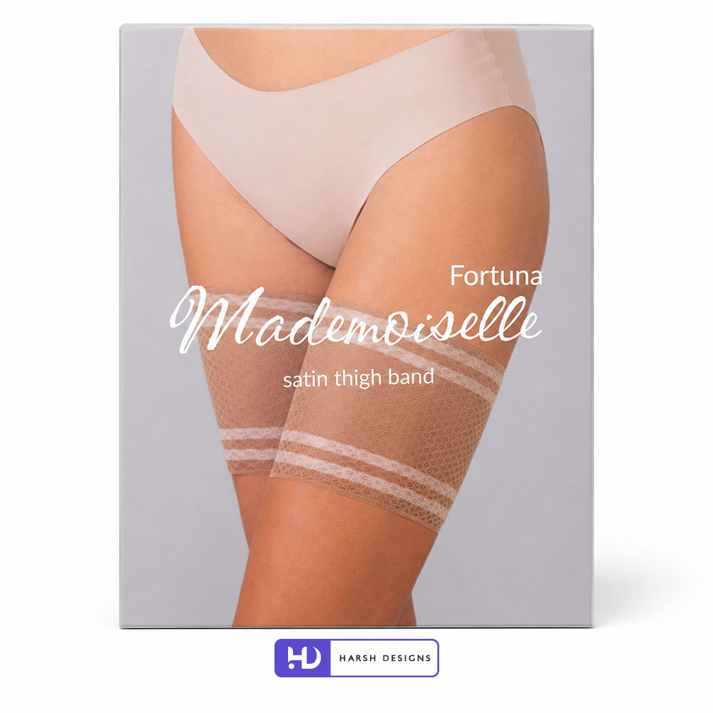
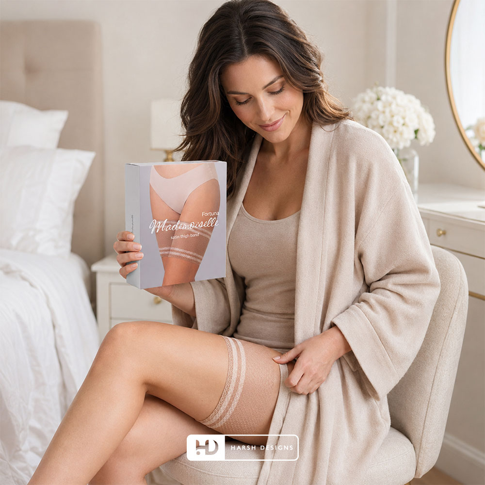
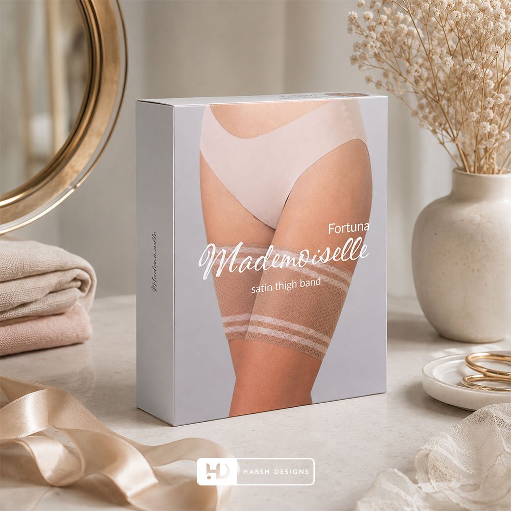
Fortuna Satin Thigh Band Packaging
The Fortuna Satin Thigh Band packaging introduces a different type of intimate apparel accessory.
The product is shown being worn around the thighs, making its function immediately understandable.
The hierarchy includes:
Fortuna
as the product or range identifier,
followed by:
Mademoiselle
and:
satin thigh band
This composition demonstrates how the same packaging system can adapt to accessories as well as traditional innerwear.
Balancing Brand and Product Information
An important design consideration across the Mademoiselle range is preventing the brand name and product name from competing.
The product needs to be identifiable.
The brand also needs recognition.
By creating differences in:
- Size
- Position
- Typeface
- Spacing
the information can coexist clearly.
The Mademoiselle script provides visual personality, while the product terminology remains more straightforward.
Photography-Led Fashion Packaging
Fashion packaging has a major advantage when product imagery is handled effectively.
The customer does not need to imagine how an abstract icon relates to the garment.
The package can communicate the actual product category immediately.
For Mademoiselle, this is particularly relevant because the range covers different garment silhouettes.
The photography makes those differences obvious.
Keeping the Front Panel Uncluttered
One of the strongest visual characteristics of the project is the amount of negative space.
The packaging does not attempt to fill every available area.
Instead, the design allows:
- Product imagery
- Brand name
- Product title
- Supporting information
to operate independently.
This helps give the packaging a calmer and more refined appearance.
Creating a Premium Visual Tone Without Excess Decoration
Premium presentation does not always require:
- Gold foil
- Heavy ornament
- Complex patterns
- Dark colours
- Multiple decorative effects
In the Mademoiselle project, refinement comes primarily through restraint.
The visual system depends on:
Composition
Photography
Typography
Spacing
Neutral Colour
This creates a fashion-oriented presentation without relying on excessive embellishment.
Packaging for an International Fashion Context
Mademoiselle’s Paris, France context also makes clarity important.
Fashion products may be distributed, displayed or communicated across audiences with different linguistic backgrounds.
A photography-led system provides an advantage because the garment itself communicates much of the essential product information visually.
Terms such as:
- Microfibra
- Cotone
- Brassiere
- Fascia Corta
- Satin Thigh Band
can then supplement the image rather than carrying the entire communication burden.
Designing for Physical Retail
In physical retail, intimate apparel packaging must compete with multiple:
- Brands
- Sizes
- Product categories
- Colour variants
- Material variants
A clear front panel can reduce visual confusion.
The Mademoiselle system uses large product imagery to make identification easier while maintaining strong brand repetition across the range.
When several boxes are displayed together, the repeated script logo and neutral visual environment help create a recognisable Mademoiselle block.
Designing for Digital Presentation
Packaging today is also frequently encountered online.
Customers may initially see the product through:
- Ecommerce listings
- Retail websites
- Product catalogues
- Marketplace thumbnails
- Digital advertising
At smaller image sizes, complicated packaging can quickly become difficult to understand.
The Mademoiselle system benefits from having relatively few high-priority elements.
The viewer can still recognise:
- Product silhouette
- Light packaging
- Mademoiselle name
- General product category
without needing to read a large amount of small copy.
Consistency Without Repetition
A successful packaging family should feel consistent without feeling monotonous.
For Mademoiselle, this was achieved by keeping several elements stable while allowing the product imagery to change.
Consistent Elements
- Neutral background palette
- Mademoiselle script typography
- White supporting typography
- Photography-led composition
- Minimal design language
- Rectangular box presentation
Variable Elements
- Garment category
- Model pose
- Product crop
- Product name
- Material information
- Product code
This provides both recognition and flexibility.
Packaging That Lets the Product Speak
The packaging does not attempt to create an elaborate fictional world around the garment.
Instead, the product remains central.
This is particularly appropriate for intimate apparel because customers often want to understand:
- Shape
- Fit category
- Coverage
- Style
- Fabric category
- Product purpose
The design supports this information rather than competing with it.
Services Delivered by Harsh Designs
For Mademoiselle, Harsh Designs provided:
Product Packaging Design
Development of the visual packaging system for multiple intimate apparel products.
Our packaging work covered the creative presentation of products including:
- Brief / slip packaging
- Cotton underwear packaging
- Microfibre innerwear packaging
- Bodysuit packaging
- Brassiere packaging
- Bandeau packaging
- Thigh-band packaging
The project focused specifically on Product Packaging Design.
No additional services such as logo design, website development, social media marketing or digital advertising are being claimed as part of this case study.
The Complete Packaging System
The Mademoiselle packaging range can be summarised through five connected principles.
01. Product-First Imagery
The garment itself provides the strongest communication.
↓
02. Minimal Visual Environment
Neutral colours and controlled spacing reduce unnecessary distraction.
↓
03. Distinctive Brand Typography
The Mademoiselle script acts as a recurring recognition element.
↓
04. Clear Product Hierarchy
Product names, codes and material descriptions remain easy to distinguish.
↓
05. Multi-Product Consistency
Different garment categories retain a common visual identity.
Together, these elements create a system capable of expanding across a wider innerwear portfolio.
The Final Solution
The final Mademoiselle packaging system brings together:
Fashion Photography
Minimal Packaging Design
Neutral Colour Palette
Distinctive Script Branding
Clear Product Naming
Multi-SKU Consistency
Flexible Product Presentation
The result is a restrained packaging language that allows individual products to remain clearly identifiable while still belonging to the same Mademoiselle family.
The Outcome
Harsh Designs delivered a coordinated packaging system capable of presenting multiple intimate apparel categories within one recognisable visual framework.
The project created consistency across products such as:
- Slip Brillante
- Body Dolcevita M/L
- Brasiliana Cotone
- Brassiere
- Fascia Corta
- Fortuna Satin Thigh Band
while allowing the individual garment photography and product information to change appropriately.
The outcome documented in this case study is the actual packaging-design system and visual presentation developed for the product range.
We have intentionally not included unsupported numerical claims relating to:
- Sales growth
- Retail performance
- Conversion rates
- Customer acquisition
- Ecommerce performance
- Market share
Such claims should only be added where verified client data is available.
Harsh Designs’ Role
Harsh Designs worked as the Product Packaging Design partner for Mademoiselle.
Our role focused on translating the product range into a consistent packaging presentation capable of supporting multiple garment categories.
The project demonstrates our approach to packaging systems where the objective is not simply to make one attractive box.
The greater challenge is creating a visual framework that can continue working as the product catalogue expands.
For Mademoiselle, that framework is built around:
Product → Photography → Typography → Brand → Consistency
Why the Mademoiselle Packaging Works
The strength of the packaging comes from its simplicity.
The design does not ask customers to decode the product.
They can see it.
The packaging does not depend on excessive decorative styling.
The product provides the visual interest.
The brand does not need to dominate every inch of the package.
The repeated Mademoiselle script provides recognition naturally.
This creates a system where the packaging performs its most important function:
Helping customers understand the product while remembering the brand.
Fashion Packaging Design Requires a Different Approach
Packaging for fashion, lingerie and intimate apparel cannot always follow the same rules as food, cosmetics or FMCG packaging.
The garment itself has a visual language.
Its:
- Shape
- Fabric
- Fit
- Silhouette
- Coverage
- Style
are important parts of the purchasing decision.
Packaging therefore needs to present these characteristics rather than hiding them behind unnecessary graphic elements.
The Mademoiselle project is an example of how Harsh Designs approaches fashion packaging by allowing the product and brand identity to work together.
Packaging Design for International Brands
The Mademoiselle project also represents Harsh Designs’ ability to work on product packaging beyond the Indian market.
Based in Hyderabad, India, Harsh Designs works with businesses requiring packaging design for local, national and international audiences.
For international product brands, packaging needs to consider:
- Product clarity
- Brand consistency
- Visual hierarchy
- Category expectations
- Multi-product scalability
- Retail presentation
- Digital presentation
The principles remain consistent regardless of geography: the package should communicate clearly and strengthen recognition.
Looking for Fashion or Innerwear Packaging Design?
Harsh Designs works with product-based businesses looking for packaging systems that combine clear product communication with distinctive visual presentation.
Our packaging capabilities include:
- Product Packaging Design
- Box Packaging Design
- Fashion Packaging Design
- Innerwear Packaging Design
- Apparel Packaging Design
- Multi-SKU Packaging Systems
- Label & Product Information Layout
- Print-Ready Packaging Artwork
Whether you are launching a new apparel product or developing packaging across an existing product range, we can help create a system that remains consistent as the business grows.