Biscuitwala Packaging, 3D Visualization & Social Media Marketing Case Study
Modernising a Heritage Hyderabad Food Brand Across Packaging, Ecommerce & Social Media
Biscuitwala by Shalimar is an established Hyderabad food brand offering traditional and contemporary biscuit varieties such as Osmania Biscuits, Cashew Biscuits, Fruit Biscuits, Pista Badam Biscuits and Choco Chip Biscuits.
As customer discovery expanded beyond traditional retail into ecommerce marketplaces and social media, Biscuitwala needed its product presentation to work across both physical and digital environments.
Harsh Designs worked with Biscuitwala across three connected areas:
- Product Packaging Design
- 3D Product Modeling & Visualization
- Social Media Marketing
The objective was not to remove the familiarity of an established food brand. It was to give the products a stronger contemporary presentation while retaining Biscuitwala’s existing recognition and Hyderabad character.
The project evolved from physical packaging into ecommerce-ready product visualization and finally into ongoing digital communication.
About Biscuitwala by Shalimar
Biscuitwala is associated with the Shalimar food business in Hyderabad and represents a range of biscuits connected with the city’s bakery and tea-time culture.
The range includes both traditional products and flavour-based varieties, creating a packaging challenge that goes beyond designing a single box.
Products represented through our work included:
- Osmania Biscuits
- Cashew Biscuits
- Fruit Biscuits
- Pista Badam Biscuits
- Choco Chip Biscuits
The packaging also carries the line:
“A Product of Hyderabad”
giving the products a visible connection with their regional origin.
For Harsh Designs, this meant the project needed to balance two ideas:
Heritage and familiarity
with
Modern retail and digital presentation
The Business Challenge
Established food brands face a different design problem from newly launched businesses.
A startup can begin with a completely new visual system.
A traditional business already has:
- Existing customer recognition
- Familiar products
- Established branding
- Legacy visual elements
- Loyal buyers
- Existing retail presence
The challenge is therefore not simply to make the packaging “new.”
The new presentation has to improve clarity and competitiveness without creating unnecessary distance from what customers already recognise.
At the same time, Biscuitwala’s products were increasingly being presented through modern channels such as:
- Ecommerce portals
- Online grocery platforms
- Marketplace listings
- Amazon
- Flipkart
- JioMart
- Social media
The same product box now needed to work on a retail shelf and as a small digital product image on a mobile screen.
That changed the role of packaging considerably.
The Three-Part Project Strategy
Harsh Designs approached the Biscuitwala project as a connected journey.
01. Product Packaging Design
Modernise and differentiate the physical biscuit range.
↓
02. 3D Product Modeling & Visualization
Convert the completed packaging into realistic reusable digital assets.
↓
03. Social Media Marketing
Extend the products and visual identity into ongoing digital communication.
Each stage built upon the previous one.
Rather than creating unrelated designs for retail, ecommerce and social media, the same visual foundation could continue across different customer touchpoints.
Project Objectives
The project was developed around several practical objectives:
- Modernise Biscuitwala’s product presentation.
- Preserve existing brand recognition.
- Create clear differentiation between multiple biscuit variants.
- Improve product visibility through stronger front-panel hierarchy.
- Make the packaging suitable for physical retail and ecommerce.
- Develop reusable 3D product assets for digital marketplaces.
- Create a consistent visual foundation for social media marketing.
- Connect the physical package with the wider digital customer experience.
SERVICE 01 — PRODUCT PACKAGING DESIGN
Modernising the Biscuitwala Packaging Range
Packaging was the foundation of the project.
For a biscuit brand with several variants, the packaging needed to answer three questions immediately:
Who is the brand?
Biscuitwala
What is the product?
Cashew, Fruit, Osmania, Pista Badam, Choco Chip, etc.
How is this product different from the others?
Through colour, product imagery, ingredients and typography.
The packaging system therefore needed enough consistency to create a family relationship while allowing every SKU to develop its own personality.
Creating a Clear Packaging Hierarchy
Food packaging has limited space and only a short time to communicate.
The Biscuitwala front-panel hierarchy was built around:
- Biscuitwala Logo
- Product Name
- Product Photography / Visual
- Ingredient or Flavour Cues
- Net Weight and Supporting Information
- Hyderabad Association
This made the product easier to understand across both retail shelves and ecommerce thumbnails.
Maintaining the Existing Biscuitwala Identity
One of the most important decisions was to retain the Biscuitwala logo as the master recognition element.
Individual packaging designs could then change substantially in:
- Background colour
- Graphic style
- Product photography
- Typography
- Ingredient imagery
- Decorative framing
without making the products appear unrelated.
This gave the range greater flexibility.
The packaging could evolve while the brand remained recognisable.
Multi-SKU Packaging Strategy
Biscuitwala’s products differ significantly in ingredients, flavour and traditional associations.
Instead of applying one generic visual template to every product, Harsh Designs developed distinct visual territories for different biscuit variants.
This helped create faster product recognition.
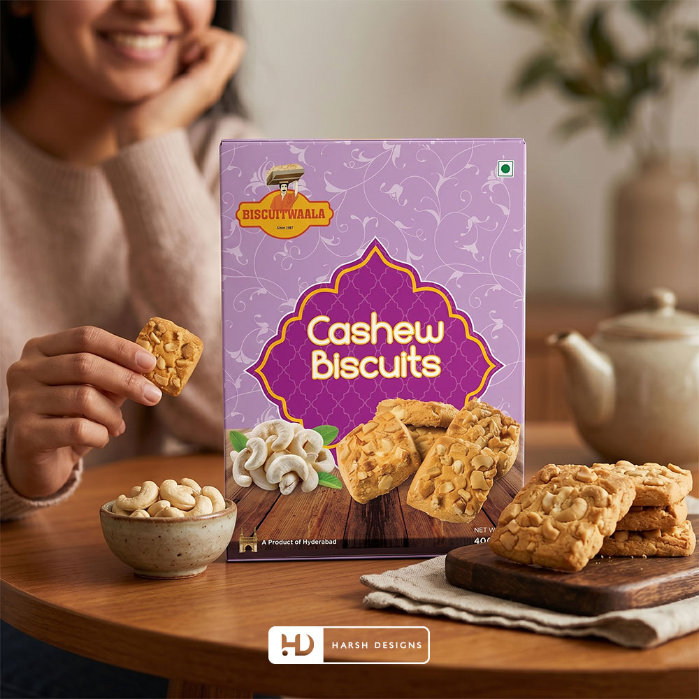
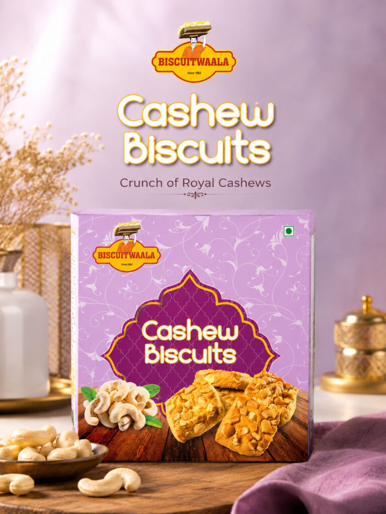
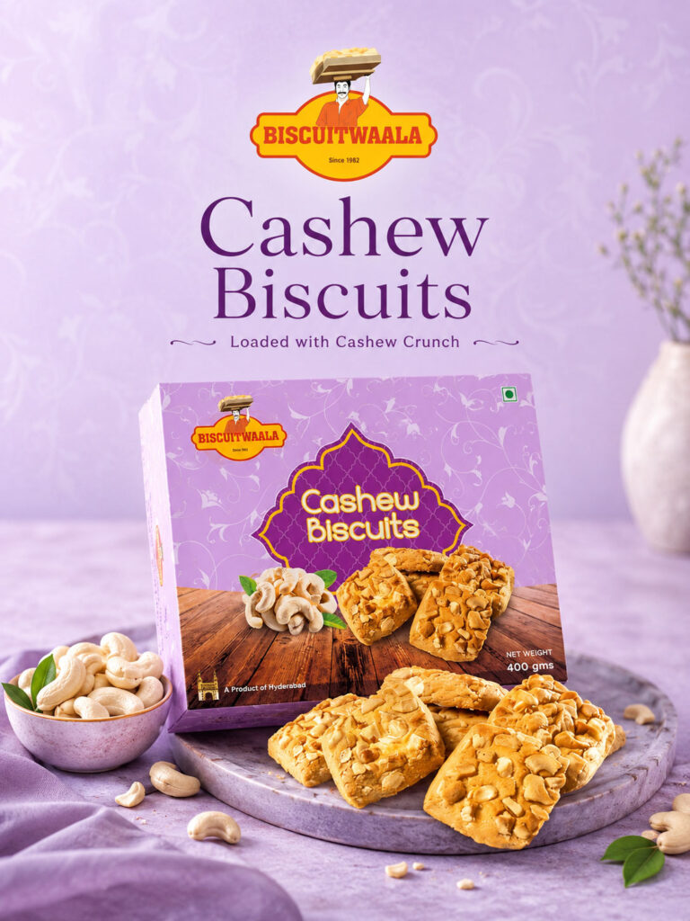
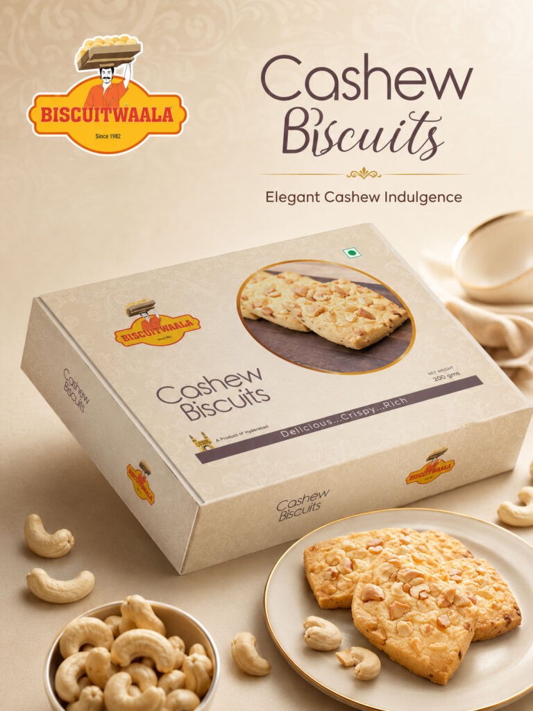
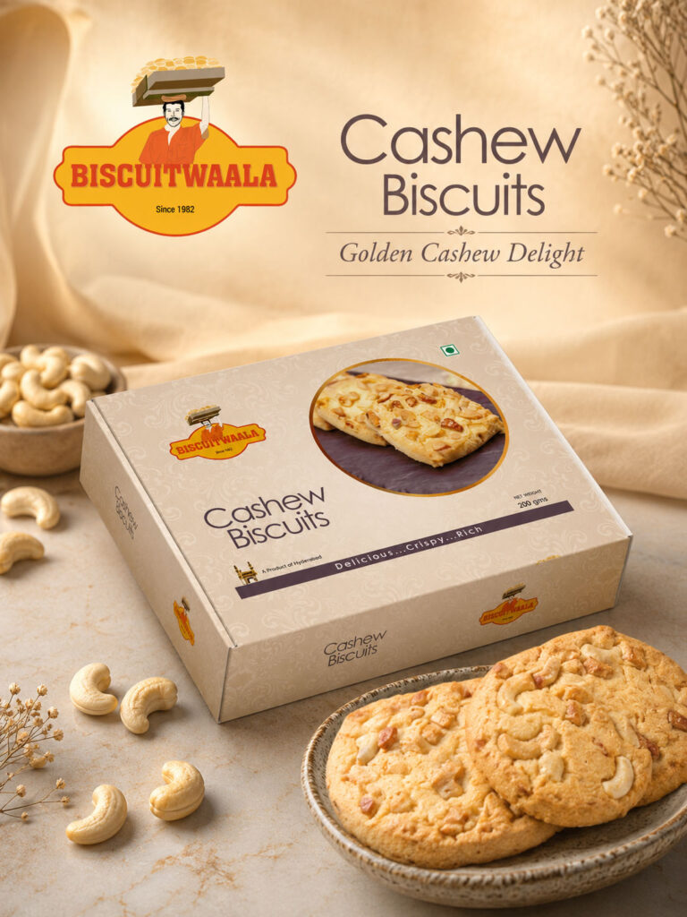
Cashew Biscuits Packaging
Cashew Biscuits were presented using strong nut and biscuit imagery.
The packaging directions use the cashew itself as an immediate flavour cue, supported by large product visuals.
One of the prominent treatments uses a purple colour system with a decorative central product-name frame.
The combination of:
Purple Packaging
Cashew Imagery
Large Biscuit Visuals
creates a clear identity for the variant.
The Biscuitwala logo remains positioned prominently, connecting the pack with the master brand.
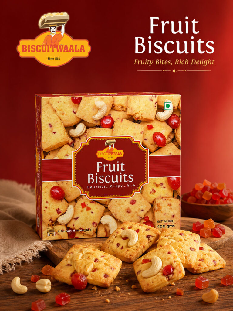
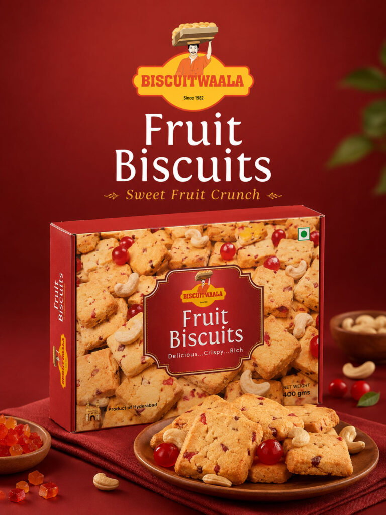
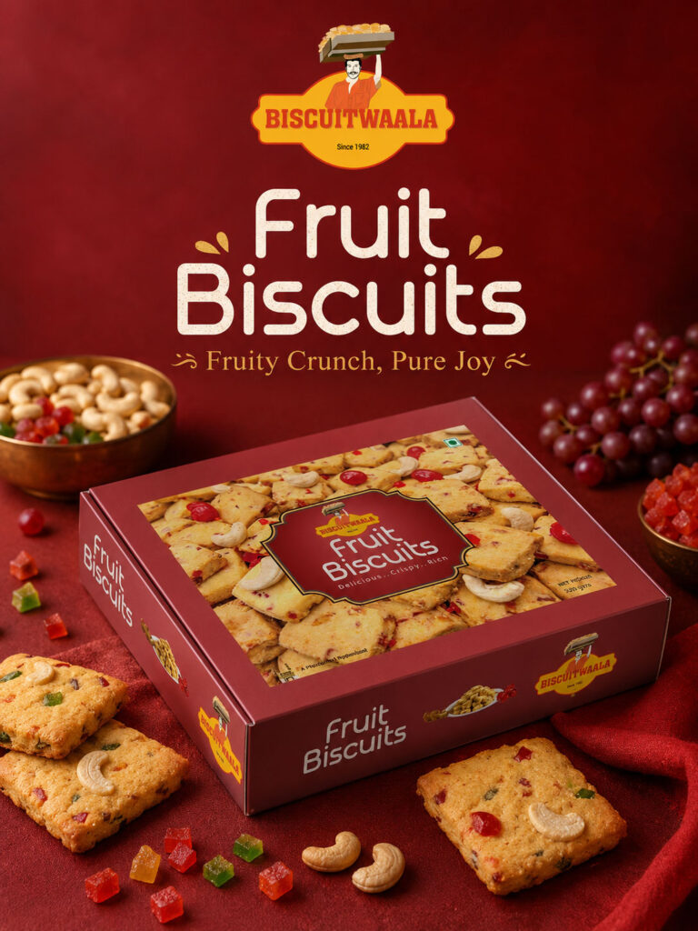
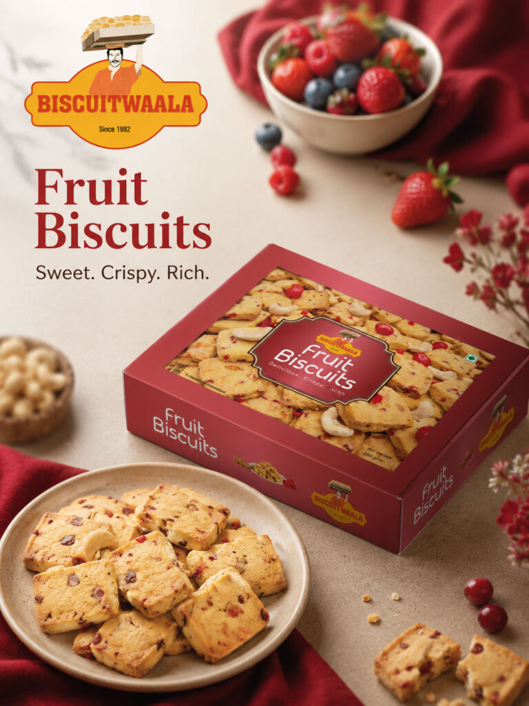
Fruit Biscuits Packaging
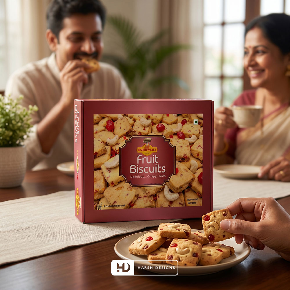
Fruit Biscuits required a different visual personality.
The packaging uses deeper red and maroon tones together with large imagery of the biscuit itself.
The visible fruit pieces and cashews help communicate the nature of the product without requiring customers to depend entirely on the product name.
The strong red colour territory also creates immediate separation from Cashew, Osmania and Pista Badam variants.
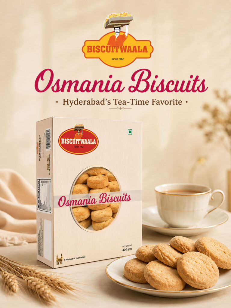
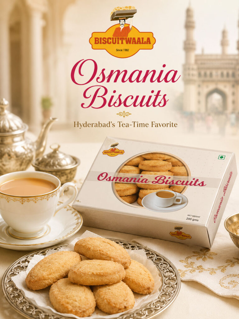
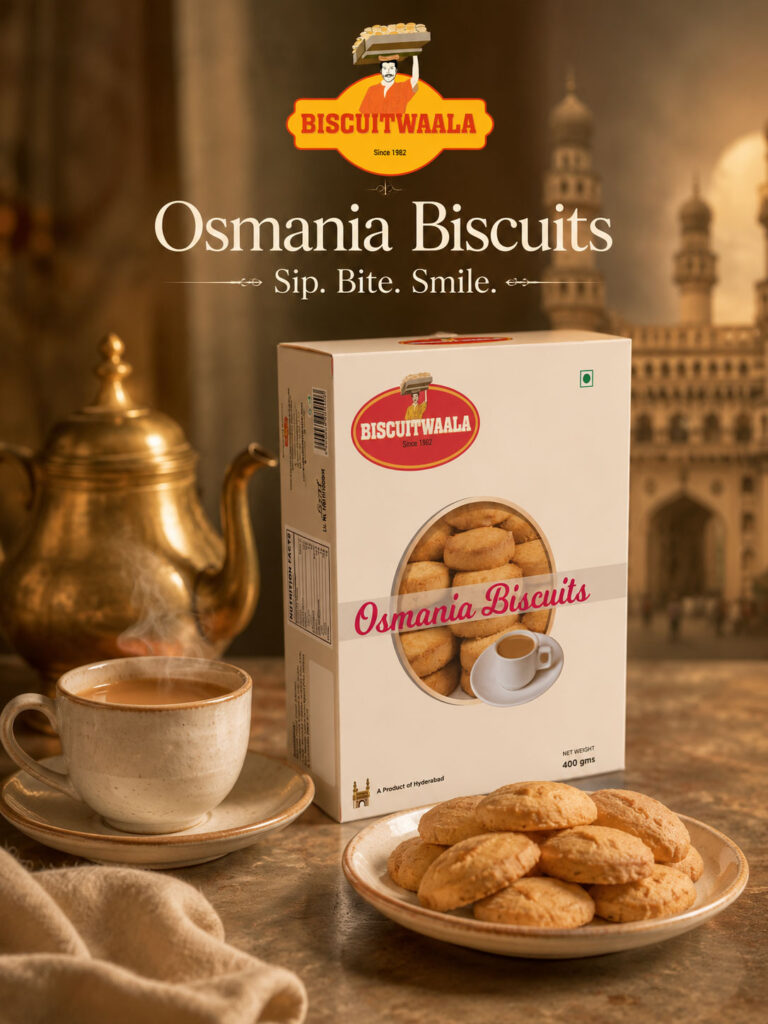
Osmania Biscuits Packaging
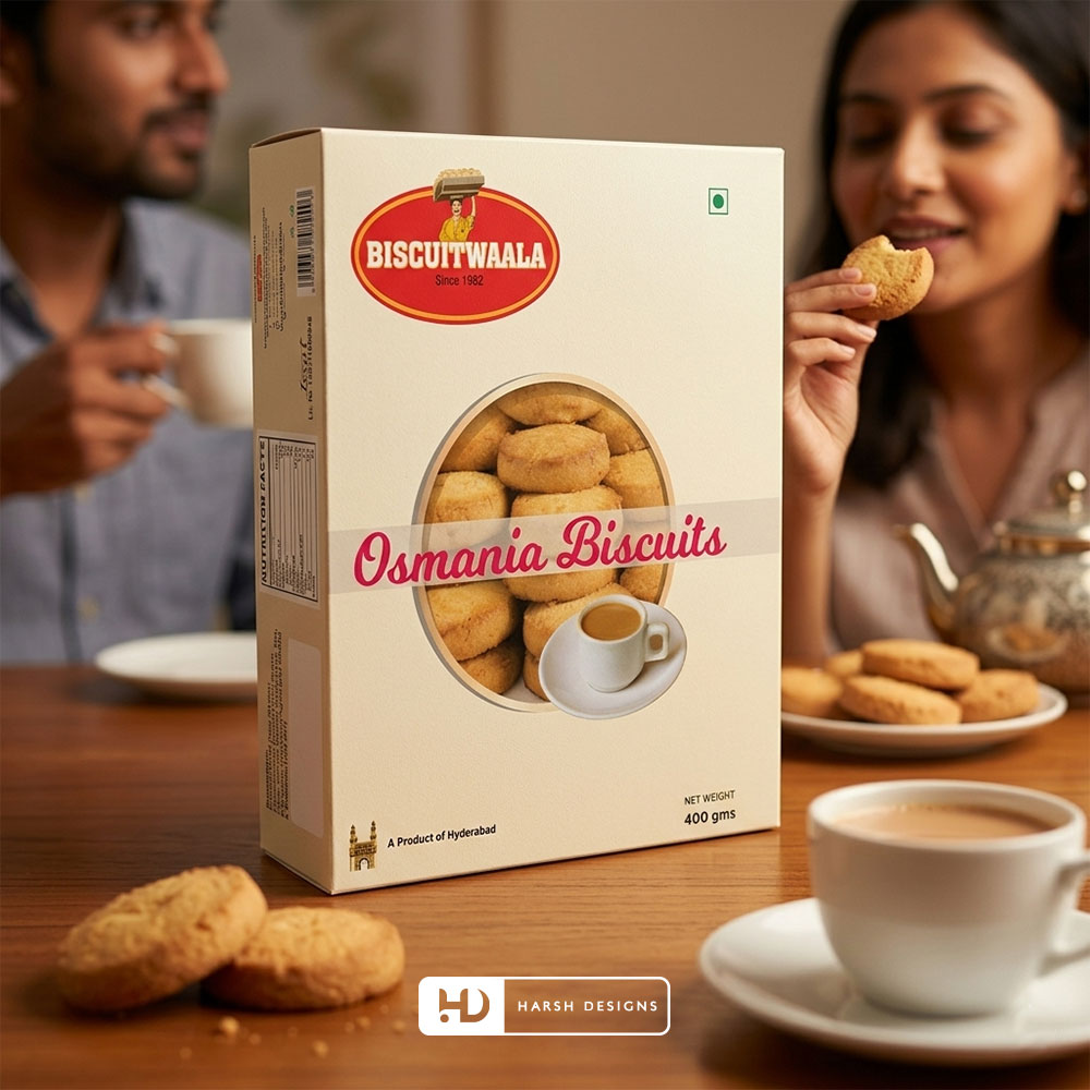
Osmania Biscuits have a particularly strong relationship with Hyderabad’s tea-time culture.
The packaging therefore moves toward a lighter and more traditional presentation.
A cream-coloured visual system is combined with:
- Prominent biscuit imagery
- Tea-cup visual cues
- Large product naming
- Biscuitwala branding
- “A Product of Hyderabad”
This gives the product a distinctive character within the broader range.
The visual connection with tea also helps communicate the familiar consumption context of Osmania Biscuits.
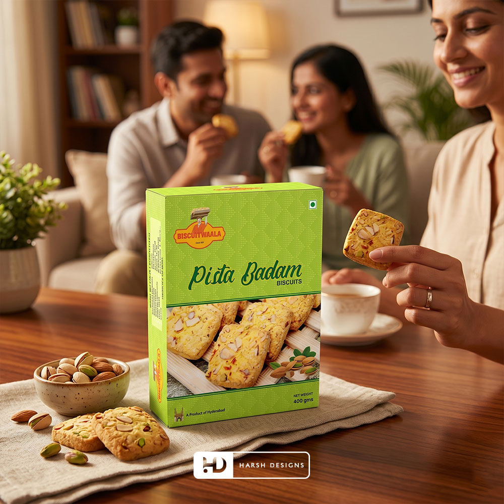
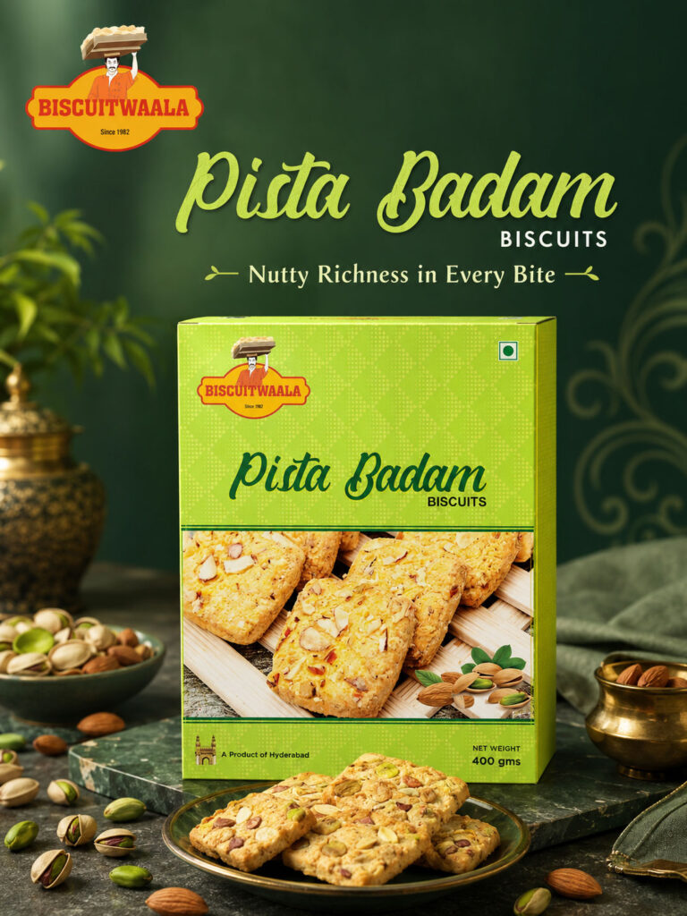
Pista Badam Biscuits Packaging
Pista Badam Biscuits use a bright green colour territory.
The green immediately differentiates the product while creating a visual association with pistachio.
The pack combines:
- Pistachio cues
- Almond cues
- Biscuit imagery
- Green background treatment
- Biscuitwala branding
The result gives the variant a recognisable visual identity even when viewed quickly.
Choco Chip Biscuits Packaging
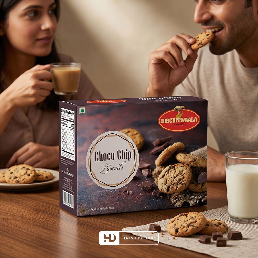
For Choco Chip Biscuits, the visual system moves into a darker chocolate-led environment.
The packaging uses:
- Dark brown tones
- Choco chip biscuit imagery
- Chocolate pieces
- Rich food photography
- Contrasting product typography
This allows the chocolate category to feel clearly different from the fruit, nut and traditional biscuit varieties.
Colour as a Product Navigation Tool
Across a multi-product range, colour can help customers navigate variants quickly.
The Biscuitwala system creates noticeable colour differences between products.
For example:
Purple
Cashew Biscuits
Red / Maroon
Fruit Biscuits
Cream
Osmania Biscuits
Green
Pista Badam Biscuits
Dark Brown
Choco Chip Biscuits
The result is a range where individual SKUs can stand apart without abandoning the master brand.
Product Imagery as the Main Selling Cue
Food packaging needs to communicate appetite as well as information.
A customer should be able to understand the product visually.
For that reason, the Biscuitwala packages place strong emphasis on:
- Biscuit texture
- Ingredients
- Nuts
- Fruit pieces
- Chocolate
- Serving cues
This product-led approach helps the packaging communicate even when viewed at smaller sizes online.
Designing for Retail Shelves
Physical retail creates a crowded visual environment.
A biscuit box may compete with:
- National brands
- Regional brands
- Multiple flavours
- Promotional packs
- Different sizes
- Shelf labels
The packaging therefore needed strong visual recognition.
Biscuitwala uses:
- Distinctive colours
- Prominent product names
- Consistent brand placement
- Large product imagery
- Clear variant differentiation
to improve visual communication.
Designing for Ecommerce at the Same Time
The same packaging also needed to work online.
On ecommerce platforms, products may initially appear as small thumbnails.
At that size, fine details become less important.
The strongest information needs to remain visible first:
Brand
Product
Variant
Primary Colour
Pack Appearance
This was an important consideration in creating packaging that could move successfully between physical and digital environments.
SERVICE 02 — 3D PRODUCT MODELING & VISUALIZATION
Taking the Packaging Beyond the Printed Box
Once the packaging system had been developed, Harsh Designs extended the project into 3D product modeling and visualization.
This stage transformed flat packaging artwork into realistic digital product assets.
Instead of showing only front and side artwork files, Biscuitwala products could now be presented as complete three-dimensional boxes.
Why 3D Product Modeling Was Important
Packaging design exists in three dimensions.
Flat artwork cannot fully demonstrate:
- Package depth
- Perspective
- Side-panel relationships
- Artwork wrapping
- Logo proportions
- Lighting
- Surface appearance
- Realistic product presentation
3D modeling allowed these elements to be visualised more accurately.
It also created reusable product assets for digital applications.
From Packaging Files to Ecommerce Assets
The value of a 3D product model extends beyond design approval.
Once the Biscuitwala products existed as digital 3D assets, they could be adapted for:
- Ecommerce listings
- Marketplace product pages
- Amazon A+ content
- Flipkart A+ content
- JioMart
- Digital catalogues
- Social media
- Promotional campaigns
This allowed the packaging work to continue functioning after the physical product was produced.
Marketplace-Ready Product Presentation
According to the project scope, Biscuitwala’s product visuals were prepared and used for online channels including:
- Amazon A+
- Flipkart A+
- JioMart
- Other ecommerce portals
These environments require a different visual approach from traditional print.
Customers need to understand products quickly without physically handling the box.
Clear, controlled product visuals therefore become extremely important.
Clean Product Visualization
3D assets can be presented as clean standalone product views.
These are useful for:
- Main ecommerce product images
- Product catalogues
- Listings
- Comparison sections
- Product range displays
The packaging remains the primary subject with minimal distraction.
Lifestyle Product Visualization
The same product models can also be placed into more contextual environments.
For Biscuitwala, product scenes could incorporate:
- Tea
- Coffee
- Milk
- Biscuit plates
- Cashews
- Pistachios
- Chocolate
- Fruit ingredients
- Family tea-time environments
This allows the product to move from a simple packshot into a more relatable consumption context.
Creating Appetite Appeal Digitally
Food products require more than technical product accuracy.
They also need appetite appeal.
A strong digital composition can help customers imagine the product as part of an everyday moment.
For Biscuitwala, this could include:
Morning Tea
Evening Chai
Coffee Breaks
Family Snacking
Guest Serving
Everyday Treats
The packaging remains the commercial focus, while the environment helps create context.
Supporting Amazon A+ and Flipkart A+
Marketplace-enhanced content often requires multiple types of creative assets.
A product may need to appear within:
- Hero banners
- Ingredient sections
- Product-feature modules
- Product-range comparisons
- Brand-story sections
- Lifestyle compositions
Having reusable 3D assets gives the brand more flexibility across these applications.
The same packaging can be presented from different angles and within different compositions while maintaining visual consistency.
Supporting JioMart and Online Grocery
Online grocery platforms create another important use case.
Customers may compare several biscuit products on a mobile screen within seconds.
The clarity of the product image therefore matters significantly.
A strong digital pack presentation helps customers identify:
- Brand
- Variant
- Pack size
- Product type
quickly.
The Biscuitwala 3D assets helped extend the updated packaging system into these digital shopping environments.
SERVICE 03 — SOCIAL MEDIA MARKETING
Extending Biscuitwala Into Social Media
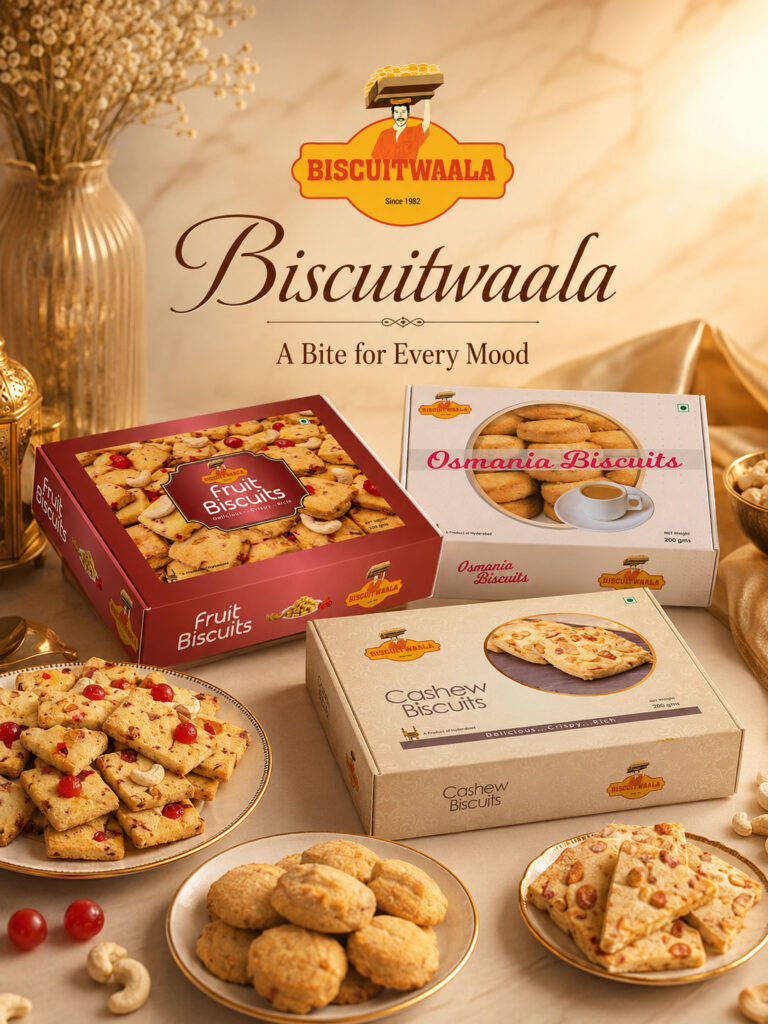
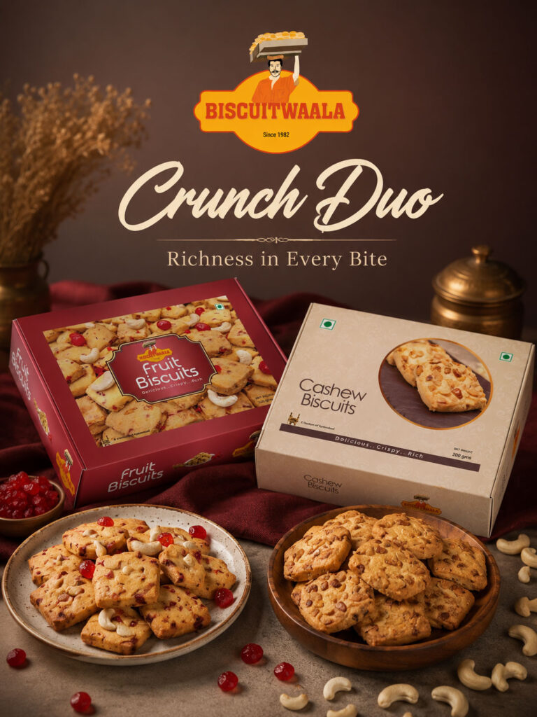
The third stage of the project was Social Media Marketing.
Once the packaging and digital product assets had been established, Harsh Designs could extend the same visual system into ongoing customer communication.
This created a natural progression:
Packaging
↓
3D Product Assets
↓
Social Media Content
Rather than reinventing the brand for social media, the existing product identity became the foundation.


Building a Consistent Social Media Presence
For a multi-product food brand, social media needs variety.
Posting the same composition repeatedly can quickly become repetitive.
At the same time, excessive variation can make the brand appear inconsistent.
Biscuitwala already had several visual assets capable of supporting an ongoing content system:
- Product-specific colours
- Packaging designs
- 3D renders
- Product imagery
- Ingredients
- Biscuit textures
- Hyderabad association
These became useful building blocks for digital communication.
Product-Led Social Media Content
Different Biscuitwala products could become individual content themes.
For example:
Osmania Biscuits
Tea-time and Hyderabad-oriented communication.
Cashew Biscuits
Nut-rich product-focused visuals.
Fruit Biscuits
Colourful ingredient and snacking communication.
Pista Badam Biscuits
Premium nut-led compositions.
Choco Chip Biscuits
Chocolate and indulgence-oriented visual communication.
This gives the social media presence variety while keeping each communication connected with an actual product.
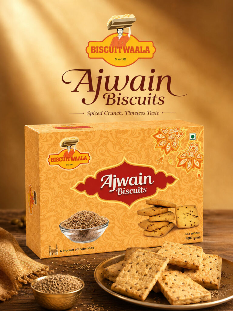
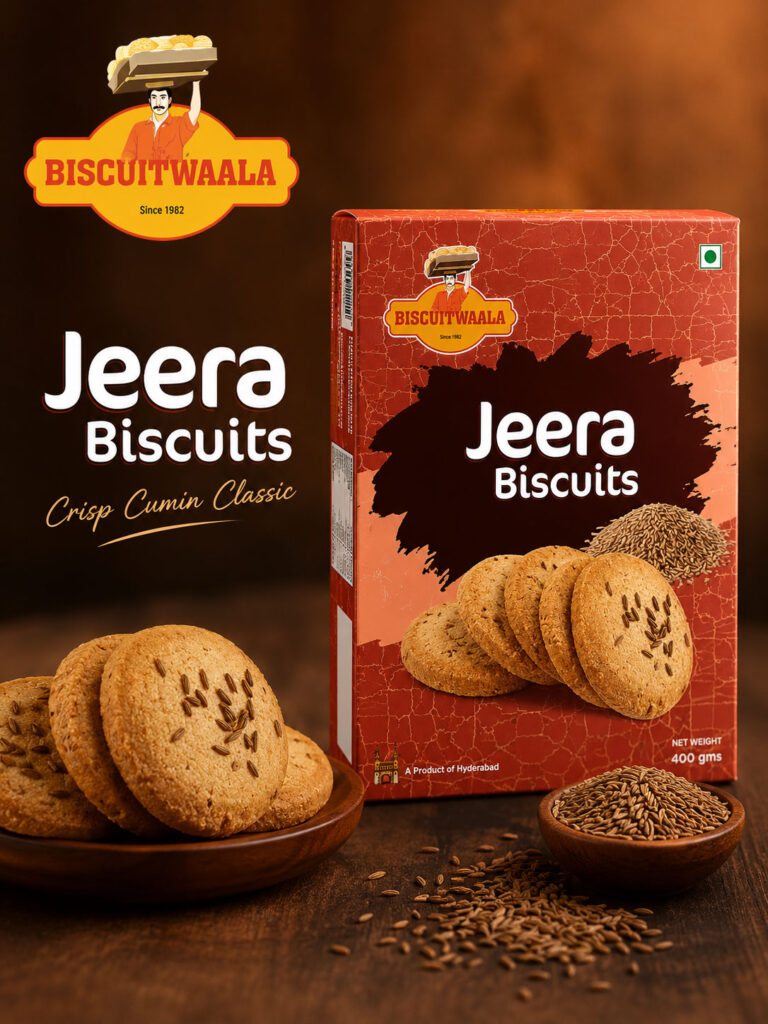
Using 3D Product Assets in Social Media
The 3D models created earlier became particularly useful during social media content development.
The same product could be:
- Rotated
- Repositioned
- Enlarged
- Combined with ingredients
- Placed into lifestyle environments
- Used within promotional graphics
without requiring the packaging itself to be recreated for every communication.
This helped connect the 3D visualization stage directly with the social media stage.
Connecting Products With Everyday Moments
Biscuit products naturally belong to familiar everyday routines.
Social media communication can therefore move beyond simply displaying the box.
Products can be associated visually with:
- Tea-time
- Coffee breaks
- Family conversations
- Office snacks
- Guest serving
- Festive sharing
- Casual snacking
This creates more relatable communication while keeping Biscuitwala at the centre.
Maintaining Visual Continuity
One of the key benefits of working across all three services was continuity.
The same visual decisions made during packaging could continue through 3D and social media.
For example:
Purple Cashew Packaging
could remain identifiable in:
- Ecommerce imagery
- Marketplace modules
- Social media posts
The same principle applies across the wider range.
This creates a stronger connection between what customers see online and what they eventually receive physically.
The Complete Biscuitwala Brand Journey
The Biscuitwala project can be understood through three major stages.
01 — Product Packaging Design
We developed updated visual presentations for multiple biscuit variants, creating better differentiation while preserving master-brand recognition.
↓
02 — 3D Product Modeling & Visualization
The packaging artwork was transformed into reusable digital product assets suitable for ecommerce and marketplace environments.
↓
03 — Social Media Marketing
Those established brand and product assets were extended into ongoing digital communication.
Together, the three services created a connected journey from:
Retail Shelf → Ecommerce Screen → Social Media Feed
Why These Three Services Work Better Together
Product Packaging Design, 3D Visualization and Social Media Marketing can be delivered separately.
But their value increases when they are connected.
Packaging creates the product identity.
3D visualization makes that identity reusable digitally.
Social media gives the product an ongoing communication channel.
The relationship can be simplified as:
PACKAGING
What the customer recognises.
↓
3D VISUALIZATION
How the product is presented digitally.
↓
SOCIAL MEDIA
How the product continues communicating with the customer.
For Biscuitwala, these services became parts of the same system rather than isolated deliverables.
Services Delivered by Harsh Designs
Product Packaging Design
Harsh Designs created updated biscuit-box packaging across multiple products.
The packaging work included:
- Biscuit box design
- Multi-SKU packaging
- Product hierarchy
- Variant differentiation
- Colour systems
- Product-focused visuals
- Ecommerce-conscious packaging presentation
3D Product Modeling & Visualization
We converted the packaging designs into digital three-dimensional product assets.
The work supported:
- Ecommerce product imagery
- Amazon A+ content
- Flipkart A+ content
- JioMart
- Digital catalogues
- Promotional graphics
- Marketplace presentations
- Social media creatives
Social Media Marketing
Harsh Designs extended Biscuitwala’s updated product presentation into social media communication.
The established packaging, product colours and 3D visuals created a consistent foundation for communicating different biscuit variants online.
Product Variants Included in the Project
The supplied Biscuitwala work includes products such as:
- Cashew Biscuits
- Fruit Biscuits
- Osmania Biscuits
- Pista Badam Biscuits
- Choco Chip Biscuits
These products demonstrate how the packaging system could support visually different variants while maintaining master-brand recognition.
The Final Solution
The finished Biscuitwala project connects three major areas:
Physical Product Presentation
through Product Packaging Design
Digital Product Presentation
through 3D Product Modeling & Visualization
Ongoing Digital Communication
through Social Media Marketing
The combined system supports the brand across:
- Retail shelves
- Ecommerce
- Online grocery
- Marketplace listings
- Enhanced marketplace content
- Social media
- Digital promotional environments
The Outcome
The Biscuitwala project resulted in a more connected product presentation spanning physical packaging and digital communication.
Harsh Designs delivered:
- Updated packaging for multiple biscuit products
- Stronger SKU differentiation
- Ecommerce-conscious product presentation
- Reusable 3D product assets
- Marketplace-ready visual content
- Social media communication based on the same product identity
The project demonstrates how packaging can continue working long after the print-ready artwork is completed.
The product box becomes an ecommerce asset.
The ecommerce asset becomes a social media asset.
And all three reinforce the same brand.
We have intentionally not included unsupported numerical claims regarding:
- Sales growth
- Revenue
- Marketplace conversion rates
- Social media reach
- Engagement growth
- Follower growth
- Advertising performance
Such results should only be added where verified analytics are available.
Harsh Designs’ Role
Harsh Designs worked across the complete visual journey of the Biscuitwala products.
Our role connected:
Packaging Design
How the product appears physically.
3D Product Visualization
How the packaging is represented digitally.
Social Media Marketing
How the product is communicated continually online.
This gave the project continuity from one customer environment to another.
A customer could encounter Biscuitwala on a social media post, recognise the same package on an ecommerce portal and later see the same product in a physical store.
That consistency was one of the most important advantages of connecting all three services.
Modernising a Heritage Food Brand Without Losing Familiarity
Established regional food brands do not always need complete reinvention.
Their existing recognition is often one of their strongest assets.
The better design challenge is frequently to determine:
- What should remain familiar?
- What needs to feel more contemporary?
- How should products become easier to differentiate?
- How should packaging perform online?
- How should the product appear in digital campaigns?
- How can all of those touchpoints remain consistent?
The Biscuitwala project reflects this approach.
The existing brand remains visible.
The product presentation becomes stronger.
And the same visual system can now work across physical retail, ecommerce and social media.
Packaging Design Beyond the Retail Shelf
Modern packaging has two lives.
Physical
It appears on:
- Shelves
- Store displays
- Counters
- Customer tables
- Physical product deliveries
Digital
It appears on:
- Amazon
- Flipkart
- JioMart
- Ecommerce sites
- Social media
- Marketplace ads
- Digital catalogues
Product brands therefore need packaging that performs in both environments.
Biscuitwala demonstrates how Harsh Designs combines packaging design with digital visualization to create assets capable of working across this broader customer journey.
From Hyderabad Heritage to Digital Commerce
Biscuitwala’s connection with Hyderabad gives the brand an existing cultural and geographic identity.
The objective was not to remove that character in pursuit of a generic modern appearance.
Instead, the project helped present the products in a way that could remain relevant across newer channels.
From traditional Osmania Biscuits to Cashew, Fruit, Pista Badam and Choco Chip varieties, each product could maintain its individual identity while remaining part of Biscuitwala.
The same packaging could then travel from:
Hyderabad Retail
to
National Ecommerce
to
Digital & Social Media Communication
without requiring a completely different visual identity at each stage.
Looking for Packaging, 3D Visualization & Social Media Marketing?
Harsh Designs works with food, FMCG and product-based businesses that need more than a standalone packaging file.
Our connected product-brand services include:
- Product Packaging Design
- Biscuit & Food Box Design
- Multi-SKU Packaging Systems
- Label Design
- Pouch Design
- 3D Product Modeling
- 3D Packaging Visualization
- Ecommerce Product Visualization
- Social Media Marketing
Whether you are launching a new food product or modernising an established product range, we can help build a visual system designed to work from the retail shelf to the ecommerce marketplace and social media feed.