Evocati Gym Logo Design Case Study — Building a Powerful Fitness Emblem
Evocati Gym required a logo that could visually represent strength, discipline and the intensity associated with a serious fitness environment.
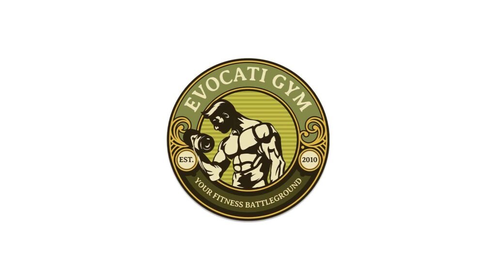
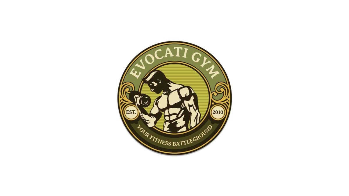
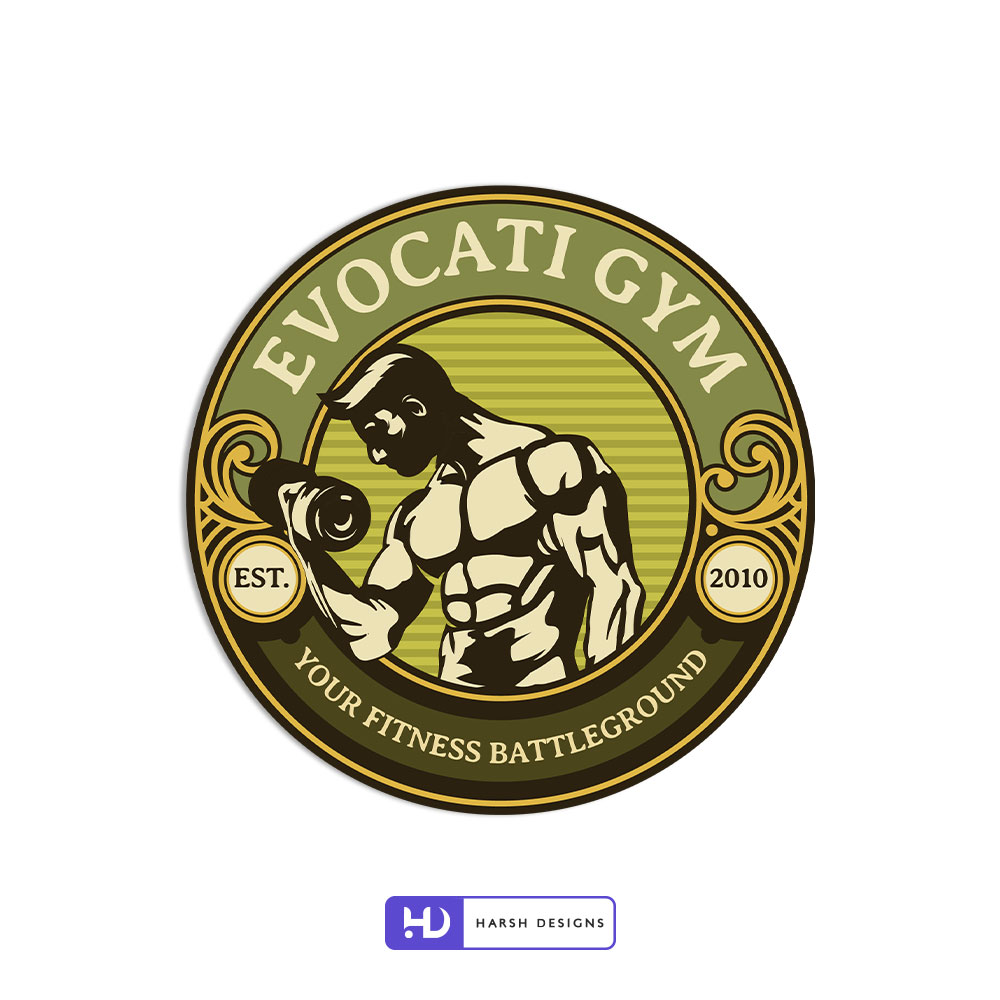
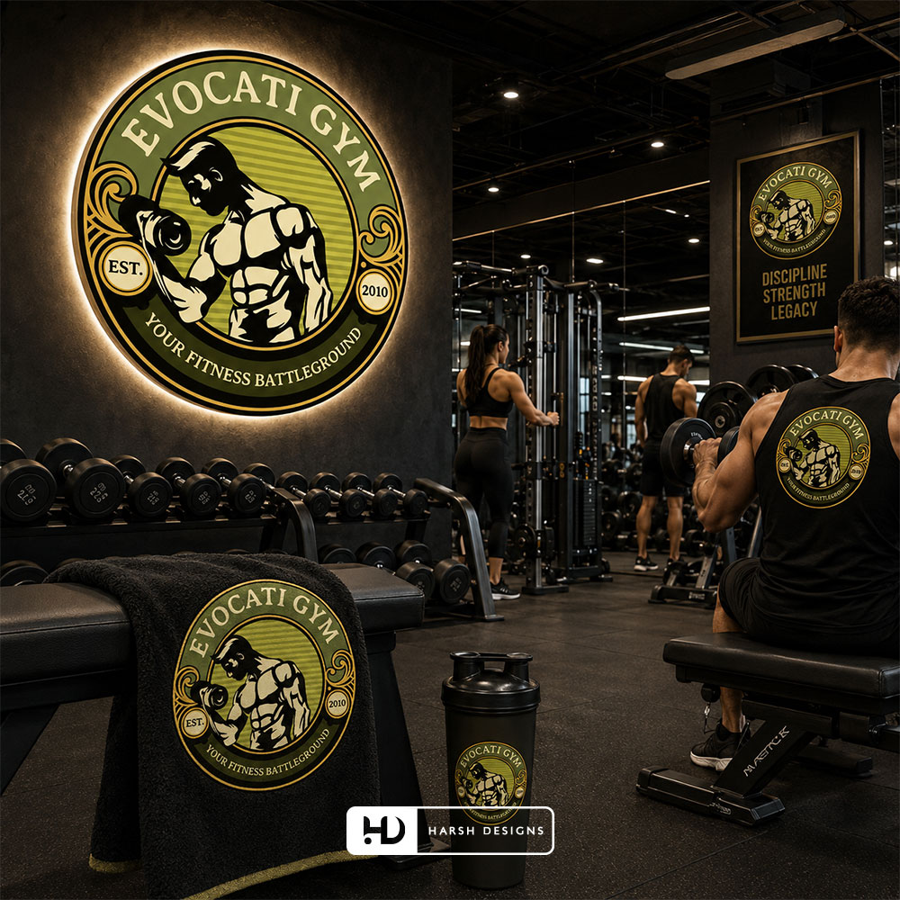
Harsh Designs developed an emblem-style gym logo built around a powerful illustrated figure, structured circular composition and the distinctive statement “Your Fitness Battleground.”
Rather than creating a minimal symbol disconnected from the character of the gym, the final logo uses a detailed badge format to give Evocati Gym a strong, recognisable visual presence.
About Evocati Gym
Evocati Gym operates within the fitness and training industry, where visual identity plays an important role in communicating energy, strength, motivation and commitment.
For a gym, the logo often becomes one of the most frequently seen brand elements.
It can appear across signage, social profiles, fitness merchandise, promotional communication and other customer-facing environments.
The Evocati Gym logo therefore needed to communicate the nature of the business immediately while remaining distinctive enough to be associated with the gym itself.
The final identity also carries the establishment reference:
EST. 2010
and the statement:
as visible components of the emblem.
The Logo Design Challenge
Fitness branding is a visually crowded category.
Many gym logos use similar elements:
- Dumbbells
- Barbells
- Flexed arms
- Bodybuilding silhouettes
- Shields
- Flames
- Lightning
- Aggressive typography
The challenge with a fitness logo is therefore not simply to make it look strong.
It needs to create its own character within a category where strength-related symbolism is already common.
For Evocati Gym, the final direction moved toward a more elaborate emblem logo, allowing multiple visual elements to work together inside one structured identity.
The result combines:
Name + Central Illustration + Establishment Year + Tagline + Decorative Elements + Circular Structure
into a single recognisable mark.
Project Objectives
For the Evocati Gym logo project, the design needed to achieve several practical goals:
- Clearly communicate a fitness and strength-training environment.
- Give the gym a strong and recognisable visual identity.
- Create an emblem capable of carrying both imagery and typography.
- Make the name Evocati Gym prominent within the logo.
- Incorporate the visible EST. 2010 heritage reference.
- Integrate the “Your Fitness Battleground” statement naturally into the composition.
- Create a logo suitable for use as a badge-style gym identity.
Developing an Emblem Logo Direction
The final Evocati Gym logo uses a circular badge structure.
This type of logo construction allows several elements to coexist while still reading as one complete symbol.
The outer circular form creates a strong boundary around the identity, while the internal rings separate the brand name, central illustration, establishment details and tagline.
The badge structure gives the logo a self-contained appearance rather than leaving the typography and illustration as unrelated elements.
It also gives Evocati Gym a visual identity that feels closer to an insignia or club emblem.
The Central Fitness Illustration
At the centre of the logo is an illustrated muscular male figure.
The figure immediately establishes the fitness context.
Instead of relying only on a barbell or dumbbell icon, the design uses the human physique itself as the dominant visual element.
The illustration highlights:
- Muscular development
- Physical strength
- Training intensity
- Bodybuilding-oriented visual language
The character occupies a large portion of the centre of the emblem, making it the primary visual focal point after the Evocati Gym name.
Strength-Focused Visual Character
The central figure creates a direct connection between the logo and physical transformation.
A viewer does not need additional explanation to understand that the identity belongs to a fitness-oriented business.
This directness is particularly useful for gym branding.
Rather than using an abstract symbol that requires interpretation, the visual language communicates the category immediately.
The detailed illustrated style also gives the identity a different character from contemporary minimalist fitness logos.
The Warrior-Inspired Character
The central figure is presented with imagery that carries a warrior-like character.
This visual direction works naturally alongside the statement:
“Your Fitness Battleground”
Together, these elements create a consistent visual theme around physical challenge and training intensity.
The logo therefore does not present fitness simply as recreation.
Its visual language positions the gym environment as a place associated with effort, discipline and personal challenge.
The important point is that this message is communicated visually rather than depending only on promotional copy.
“Your Fitness Battleground”
The tagline is integrated directly into the lower section of the circular emblem:
YOUR FITNESS BATTLEGROUND
Its placement allows the statement to become part of the logo construction rather than functioning as separate text underneath the identity.
The wording complements the strength-focused central illustration and helps give Evocati Gym a distinctive verbal component.
The circular placement also maintains the symmetry of the badge while keeping the main gym name dominant.
Highlighting the Evocati Gym Name
The words:
EVOCATI GYM
occupy the upper section of the emblem.
Large uppercase lettering follows the curvature of the outer circle, allowing the business name to frame the central visual.
This placement establishes a clear hierarchy:
Evocati Gym
↓
Central Fitness Illustration
↓
Your Fitness Battleground
The name remains one of the largest textual elements in the identity, which helps establish brand recognition rather than allowing the illustration to function independently.
EST. 2010
The identity contains two small circular sections positioned on opposite sides of the central composition.
One contains:
EST.
and the other:
2010
Together they form the establishment reference:
EST. 2010
Including the year inside the badge visually integrates the gym’s history into the logo.
Rather than adding the establishment year as a separate line of supporting text, the information becomes part of the emblem itself.
The symmetrical positioning also helps balance the composition.
Circular Logo Construction
Circular logos are particularly effective when several pieces of information need to appear within one identity.
For Evocati Gym, the construction can be understood through several visual layers.
Outer Border
A strong circular outline defines the overall shape and creates separation from surrounding backgrounds.
Brand Name Ring
The upper section contains the Evocati Gym name.
Central Illustration
The muscular character forms the primary graphic element.
Side Information
EST. and 2010 provide visual balance on opposite sides.
Lower Tagline Area
“Your Fitness Battleground” follows the bottom curve.
Together, these elements create a complete emblem rather than a loose combination of illustration and text.
Decorative Details
The logo includes ornamental flourishes around the left and right sections.
These elements add visual complexity to the emblem and help connect the central illustration with the surrounding badge structure.
They also reinforce the insignia-like character of the design.
The decorative treatment is intentionally more elaborate than the geometry used in minimalist corporate logos, which suits the strong and expressive direction of the Evocati Gym identity.
Colour Direction
The logo uses a distinctive combination of:
- Olive / yellow-green
- Cream
- Dark brown / near-black
- Gold-toned detailing
Rather than using the highly common red, blue or black-only palette frequently associated with fitness brands, the Evocati logo uses a more unusual combination.
This gives the emblem additional visual character.
Olive and Yellow-Green
The central and upper background uses an olive-to-yellow-green family of tones.
This provides the main colour field against which the dark illustration and cream typography can be displayed.
The colour is distinctive without competing heavily with the detailed artwork.
Dark Brown and Black Tones
Dark tones define:
- Illustration outlines
- Borders
- Lower sections
- Structural details
- Typography contrast
These darker elements give the emblem weight and help separate the different layers of the composition.
Cream
Cream is used prominently for the brand name and parts of the illustration.
Against the darker and olive backgrounds, this produces clear contrast.
The slightly warmer tone also fits naturally with the gold and olive colour family.
Gold-Toned Details
Gold-toned borders and ornamental elements help distinguish different sections of the emblem.
They provide additional separation between rings and contribute to the badge-style appearance.
Typography
The typography uses bold uppercase letterforms for the most important brand information.
The EVOCATI GYM name is intentionally prominent, following the outer curve of the circular construction.
The tagline is smaller and positioned around the lower section.
This difference creates an appropriate hierarchy:
Primary
EVOCATI GYM
Supporting
YOUR FITNESS BATTLEGROUND
Additional Information
EST. 2010
The typography is therefore part of the structural composition of the emblem rather than simply text placed beside a graphic.
Visual Hierarchy
Despite containing several elements, the final logo has a clear visual sequence.
The viewer is first drawn toward the central illustrated figure.
The eye then moves toward:
EVOCATI GYM
followed by:
EST. 2010
and:
YOUR FITNESS BATTLEGROUND
This hierarchy helps the logo communicate both visually and verbally.
The central character establishes the fitness category, while the typography establishes the specific brand.
Why an Emblem Logo Works for Evocati Gym
An emblem format provides Evocati Gym with an identity that feels more like a badge than a generic fitness icon.
That is particularly appropriate for a brand whose final logo combines:
- Strength imagery
- Establishment year
- Gym name
- Tagline
- Decorative details
Trying to separate all of these components into an icon-and-wordmark structure could have weakened the unified character of the design.
The circular emblem allows everything to remain visually connected.
A Logo Designed Around the Gym’s Character
The finished design does not attempt to hide its fitness-industry character.
It embraces it.
The muscular illustration is direct.
The tagline is strong.
The composition is bold.
And the badge structure gives the identity a substantial visual presence.
This creates a logo aimed at communicating the attitude of the gym rather than following a generic corporate visual direction.
Logo Scalability and Practical Use
Detailed emblem logos require careful consideration when used across different sizes.
At larger sizes, the Evocati Gym identity allows viewers to see:
- Illustration details
- Decorative elements
- Establishment year
- Tagline
- Outer borders
For smaller applications, the most important recognition elements remain the overall circular silhouette, central figure and Evocati Gym name.
The strong outer shape helps the identity retain a recognisable profile even when individual decorative details become less prominent.
Potential Brand Applications
Although Harsh Designs project scope for Evocati Gym was limited to Logo Design, the finished emblem format is naturally suitable for a variety of gym-related applications.
These can include:
- Exterior signage
- Interior gym graphics
- Social media profiles
- Membership materials
- Fitness apparel
- T-shirts
- Gym merchandise
- Promotional posters
- Digital advertising
- Training accessories
These applications are examples of where a badge-style logo can function effectively; they are not additional services claimed as part of the Harsh Designs project scope.
Services Delivered by Harsh Designs
For Evocati Gym, Harsh Designs provided:
Logo Design
The project focused specifically on developing the final Evocati Gym emblem logo.
No website development, digital marketing, social media management or broader branding services are being presented as part of this case study.
Keeping that distinction clear allows the project to accurately document the work completed by Harsh Designs.
The Final Logo
The completed Evocati Gym logo brings several visual components together into one identity:
EVOCATI GYM
Muscular Fitness Illustration
Circular Emblem
EST. 2010
YOUR FITNESS BATTLEGROUND
Olive, Cream, Dark and Gold Colour System
The result is a detailed fitness emblem with an immediately identifiable gym-focused character.
The Outcome
The Evocati Gym project resulted in a distinctive emblem-style logo capable of visually communicating the fitness category while giving the gym its own recognisable badge.
The final design establishes:
- A strong central fitness visual
- Clear Evocati Gym branding
- A structured emblem composition
- An establishment-year reference
- A distinctive tagline
- A memorable circular silhouette
- A colour palette different from many conventional gym identities
No numerical claims regarding membership growth, sales, enquiries or other business performance have been included because those outcomes are not part of the available project evidence.
The case study focuses instead on the design solution Harsh Designs actually delivered.
Harsh Designs Role
Harsh Designs was responsible for the logo design for Evocati Gym.
Our role was focused on developing the visual mark rather than creating a broader multi-service campaign.
The final emblem demonstrates how logo design can combine typography, illustration, business information and brand messaging within one coherent symbol.
For fitness businesses, this is especially important because the logo often becomes the primary identifier across both physical and digital environments.
What Makes the Evocati Gym Logo Distinctive?
The strongest characteristic of the Evocati Gym identity is its willingness to use an expressive visual language.
Rather than reducing the gym to a generic initial or geometric symbol, the logo presents a detailed representation of physical strength inside an emblem structure.
At the same time, the design incorporates the business name, establishment year and tagline without separating them into unrelated components.
This creates a complete identity with a clear gym-specific personality.
Logo Design for Gyms and Fitness Businesses
A gym logo needs to do more than indicate that a business provides fitness services.
It should help establish the type of environment the business represents.
Some fitness businesses may require a minimal, performance-oriented identity.
Others may need something energetic, aggressive, premium, community-focused or strength-driven.
The Evocati Gym project demonstrates one possible direction: a detailed emblem built around strength, challenge and a strong visual presence.
The right approach depends on the individual business rather than applying the same fitness symbol to every client.
Looking for a Professional Gym Logo Design?
Harsh Designs creates custom logo designs for businesses across different industries, including gyms, fitness centres, health and wellness businesses.
Our logo design approach considers:
- Business category
- Brand positioning
- Target audience
- Visual personality
- Logo type
- Typography
- Colour direction
- Scalability
- Practical brand usage
If you are launching a new gym or updating an existing fitness business, we can help create a logo designed specifically around your business rather than relying on a generic fitness template.