
Savithrammas Logo Design Case Study — Building a Heritage Food Brand Identity
Savithrammas is a traditional food brand built around authentic Telugu flavours, regional recipes and a strong sense of family heritage. When the brand needed an identity that could represent this story across packaging, ecommerce and digital platforms, Harsh Designs developed a distinctive emblem-style logo centred on the person behind the brand.
The Savithrammas identity was not created as an isolated logo. It became the visual foundation for product packaging, ecommerce presentation, product photography, SEO content, social media and digital marketing—helping create a consistent brand experience from the product pouch to the online store.
About Savithrammas
Savithrammas offers traditional food products inspired by the flavours and culinary culture of Telangana and the wider Telugu region.
The brand identity revolves around a deeply personal element: Savithramma herself.
Rather than relying on a generic food icon, spice illustration or abstract symbol, the brand places her portrait at the centre of its identity. This gave the visual system an immediate human connection and created a recognisable device that could travel consistently across different products and platforms.
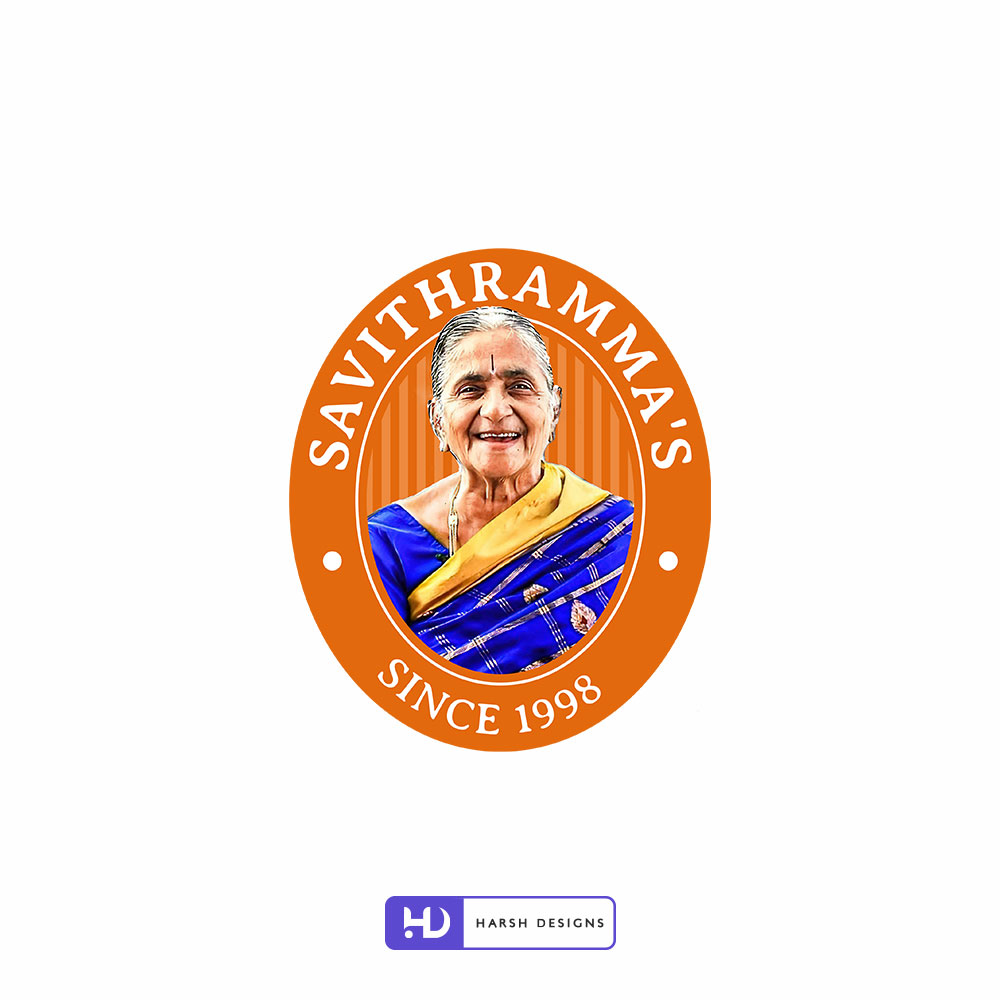
The final logo carries the name Savithramma’s together with the heritage marker “Since 1998”, establishing the brand’s history directly within the identity.
The Branding Challenge
Traditional food brands often need to communicate two ideas at the same time.
They must feel rooted in authenticity and heritage, while also looking organised, trustworthy and professional enough for modern retail, ecommerce and digital marketing.
For Savithrammas, the challenge was therefore not simply to create a new logo.
The identity needed to:
- Preserve the personal story behind the brand
- Build recognition around Savithramma herself
- Communicate traditional food heritage
- Work clearly on product packaging
- Remain identifiable across different packaging colours and product categories
- Adapt to ecommerce and digital platforms
- Create consistency across photography, content and marketing
- Support the brand as it expanded beyond a purely local presentation
The logo had to become the anchor of a much larger brand ecosystem.
Project Objectives
Our key objectives for the Savithrammas identity were to:
- Create a distinctive visual identity based on the brand’s real heritage.
- Make Savithramma the recognisable face of the brand.
- Develop an emblem that could work across food packaging and digital applications.
- Establish a consistent visual signature for multiple product categories.
- Balance traditional character with a cleaner contemporary presentation.
- Create an identity capable of supporting ecommerce and broader digital communication.
- Build a foundation that could extend into packaging, photography, website development and marketing.
Our Logo Design Strategy
Making the Brand Story the Identity
The most important decision was to avoid creating a symbol that could belong to almost any food company.
Savithrammas already had something far more meaningful: a real person, a recognisable story and a connection to traditional food.
We therefore built the identity around Savithramma’s portrait.
Her photograph became the focal point of the logo, creating an identity that feels personal rather than corporate. This also gave customers a visual connection to the person represented by the brand name.
Instead of separating the heritage story from the logo, we made the story part of the logo itself.
Developing the Emblem-Style Logo
The final identity uses an oval emblem construction.
Savithramma’s portrait sits at the centre, surrounded by the brand name on the upper curve and the “Since 1998” statement along the lower section.
This format gives the identity a contained, recognisable silhouette that works particularly well for food branding.
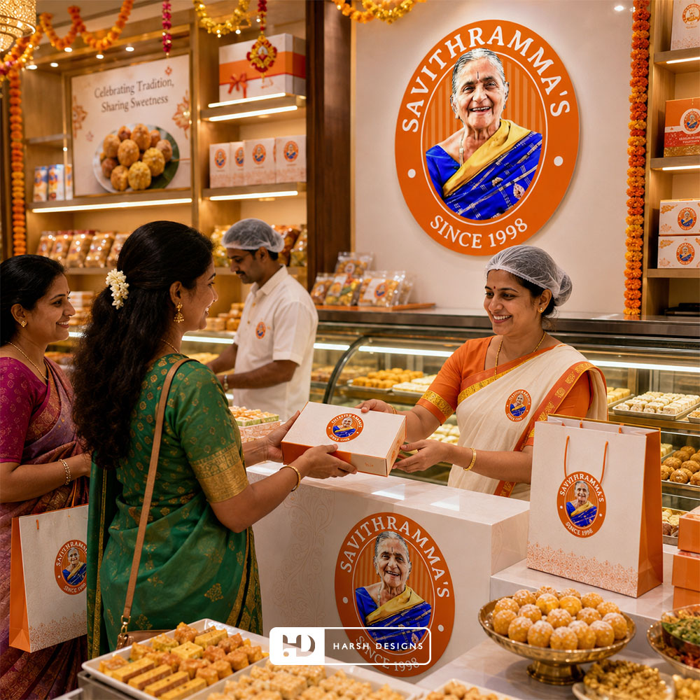
The circular/oval structure also helps the logo function as a visual seal when applied to:
- Stand-up pouches
- Product labels
- Ecommerce product images
- Website elements
- Social media creatives
- Promotional materials
The result is a logo that can operate as both the primary brand identity and a compact brand badge.
The Portrait as the Core Brand Asset
The portrait is the most important visual element in the Savithrammas identity.
It differentiates the brand immediately from food businesses that depend on predictable imagery such as bowls, leaves, chilli symbols, chef illustrations or generic traditional motifs.
Here, the individual behind the brand becomes the primary recognition device.
This creates several advantages.
Human Recognition
Customers see a person rather than an anonymous symbol.
Brand Authenticity
The name and portrait reinforce one another, helping the identity feel connected to a real story.
Packaging Recognition
The face remains one of the most noticeable brand elements even when different products use different background colours and layouts.
Visual Consistency
Whether the packaging is orange, black or part of another product line, the emblem continues to act as the common brand signature.
Typography and Logo Structure
The typography was organised around the emblem rather than competing with the portrait.
The uppercase SAVITHRAMMA’S lettering follows the outer curve of the identity, creating a clear visual boundary around the central image.
The SINCE 1998 statement is positioned along the lower curve, reinforcing the heritage-led presentation.
White typography against the warm orange background creates strong contrast and allows the brand name to remain visible even when the logo is reproduced at smaller sizes.
The complete composition works as a unified mark instead of treating the portrait, name and establishment year as separate visual elements.
Colour Strategy
Warm Orange as the Primary Identity Colour
Orange became the dominant colour of the logo.
Within the identity, it creates a warm visual character suited to traditional food products while providing strong contrast against the white lettering and the colourful portrait.
It is also distinctive enough to remain recognisable when the logo is placed over different packaging environments.
The logo therefore works across both light and dark surfaces without losing its visual personality.
White for Contrast and Clarity
White is used primarily for the brand name, supporting elements and borders.
Its role is functional as much as visual.
It improves readability, separates the logo structure clearly and helps the emblem maintain a clean appearance despite the level of detail contained within the central portrait.
Preserving the “Since 1998” Heritage Marker
The words “Since 1998” are incorporated directly into the logo rather than being treated as an optional marketing statement.
This helps make the brand’s history part of its everyday presentation.
Every time the logo appears on packaging, the website or another brand touchpoint, the heritage marker appears with it.
For a traditional food brand, this allows history to become part of brand recognition rather than something explained only in long-form content.
Taking the Identity Into Packaging
A logo becomes more valuable when it can operate consistently outside the logo sheet.
Savithrammas required an identity that could work across multiple food products with different visual treatments.
Harsh Designs extended the logo into a broader packaging system.
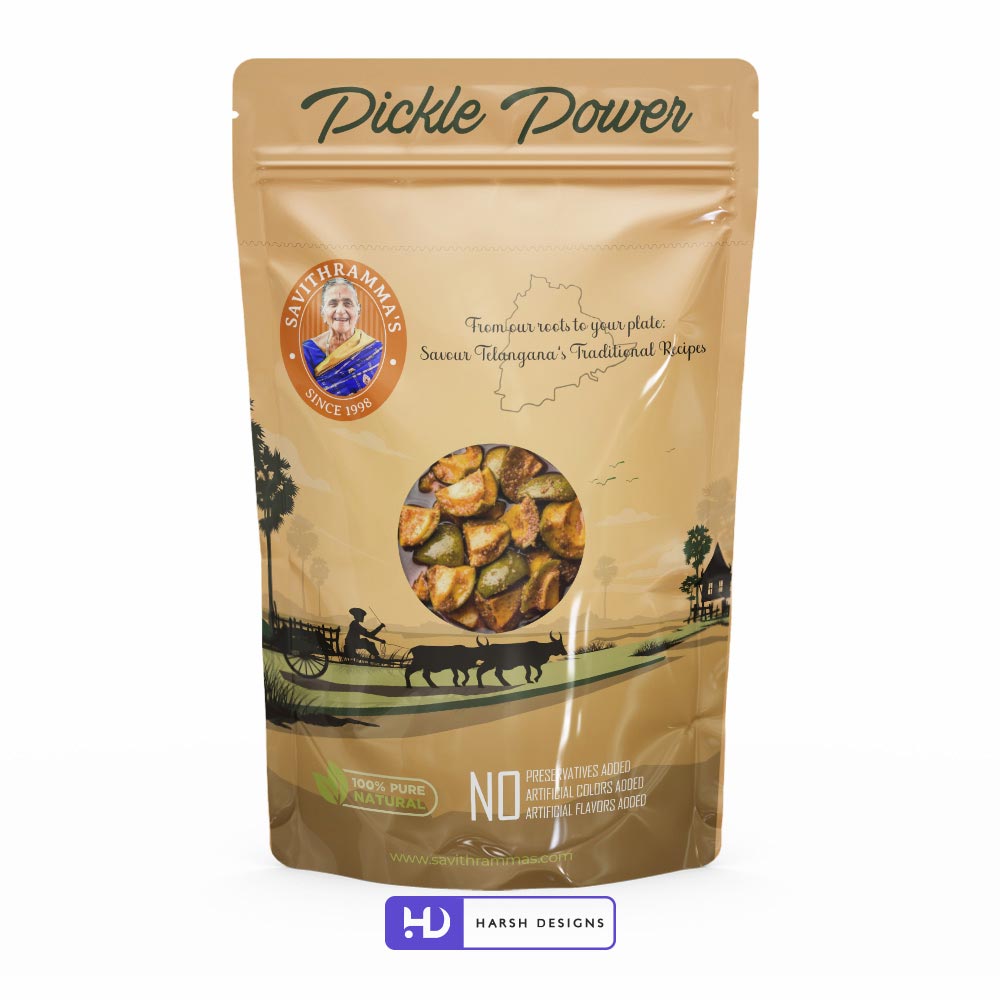
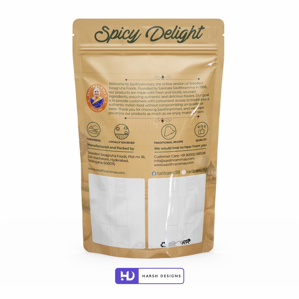
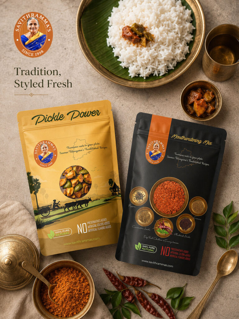
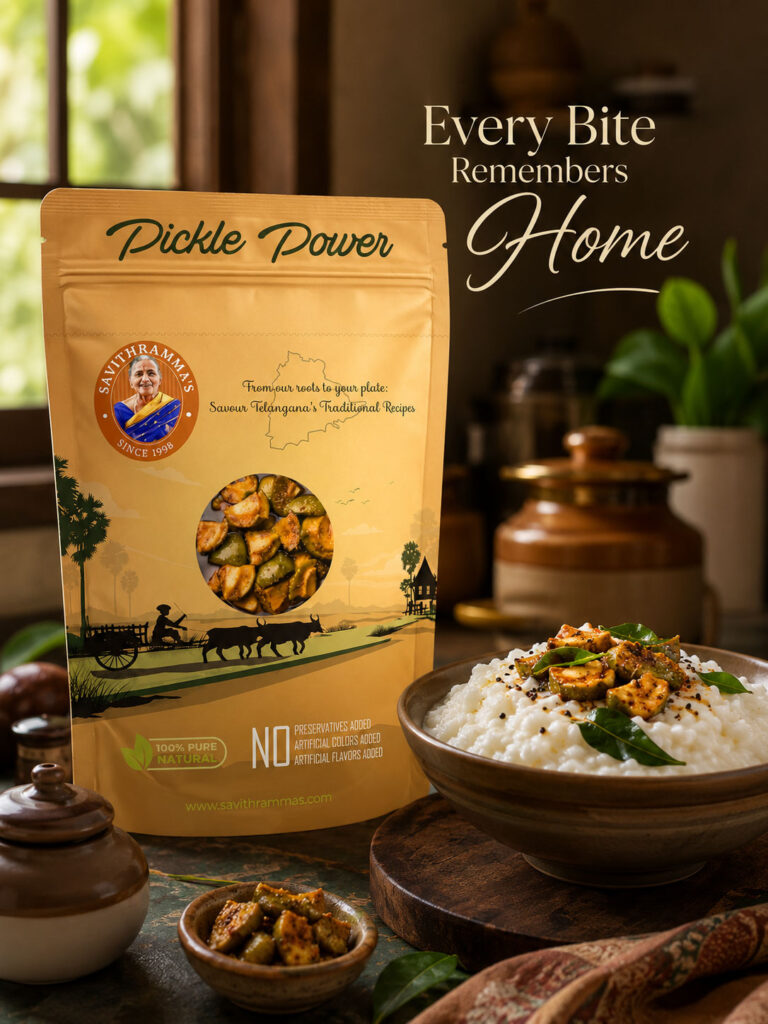
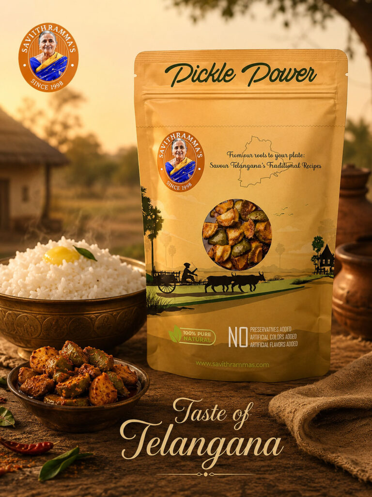
Traditional Pickle Packaging
For the lighter packaging direction, the brand uses a warm earthy palette combined with regional visual references.
The packaging includes:
- The Savithrammas emblem
- Product-focused imagery
- A Telangana map outline
- Traditional landscape illustrations
- Rural visual elements
- Product visibility through a transparent window
- Natural-product communication
- No-preservatives / artificial-colours / artificial-flavours messaging
The logo remains prominent without overpowering the actual product.
The result is packaging that combines brand heritage with clear product communication.
Building Regional Context Into the Packaging
The packaging goes beyond displaying the brand name.
Visual references such as the Telangana outline, rural landscapes, palm trees, traditional transportation and local architectural influences help establish a sense of place.
These elements support the brand’s traditional positioning while allowing the central logo to remain the consistent signature.
Instead of forcing every regional reference into the logo itself, the broader packaging system carries more of the storytelling.
This keeps the logo simpler and more reusable.
Creating a Second Packaging Direction
Savithrammas also required packaging capable of supporting products with a more premium or intense visual character.
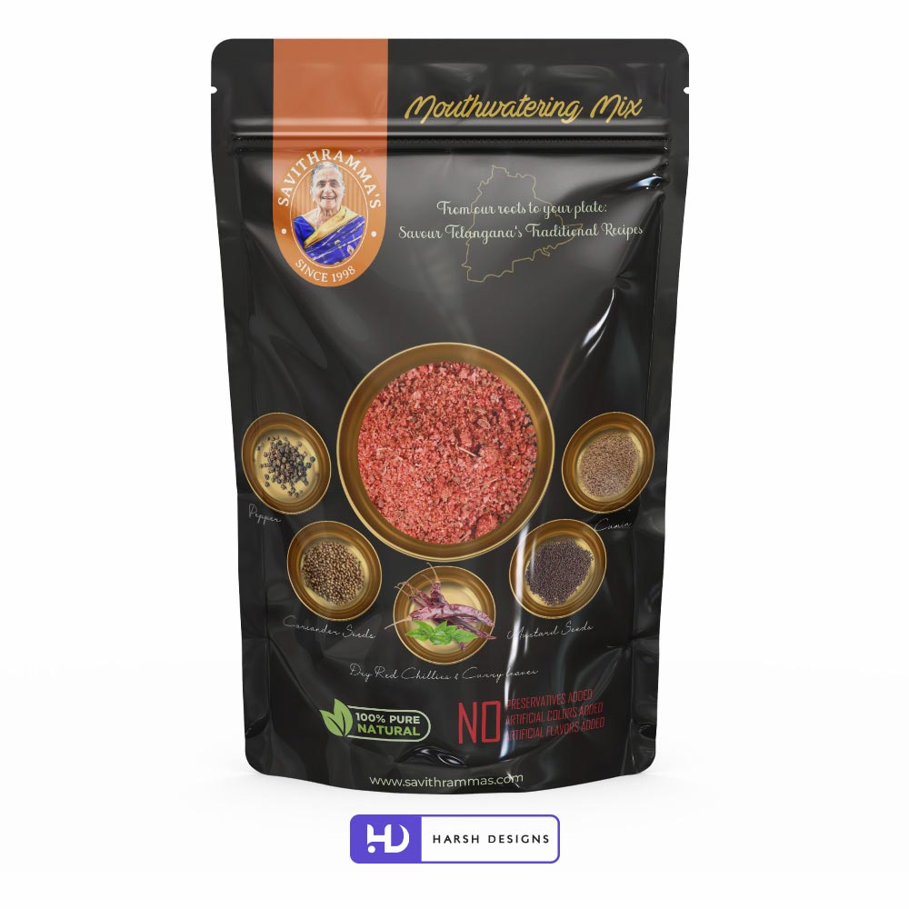
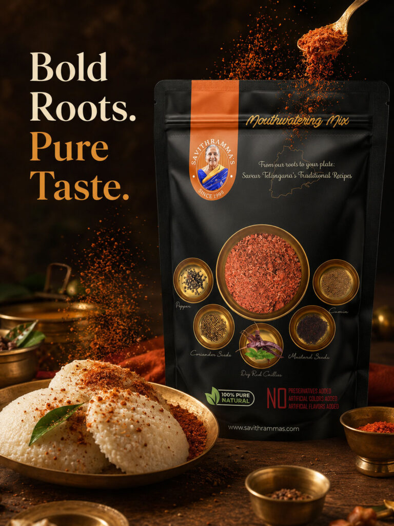
For spice and mix products, a black packaging system was developed with orange and gold accents.
The change from a warm ochre pouch to a dark black pouch demonstrates an important part of the identity system:
The packaging can change while the brand remains recognisable.
The Savithrammas emblem continues to provide continuity across the range.
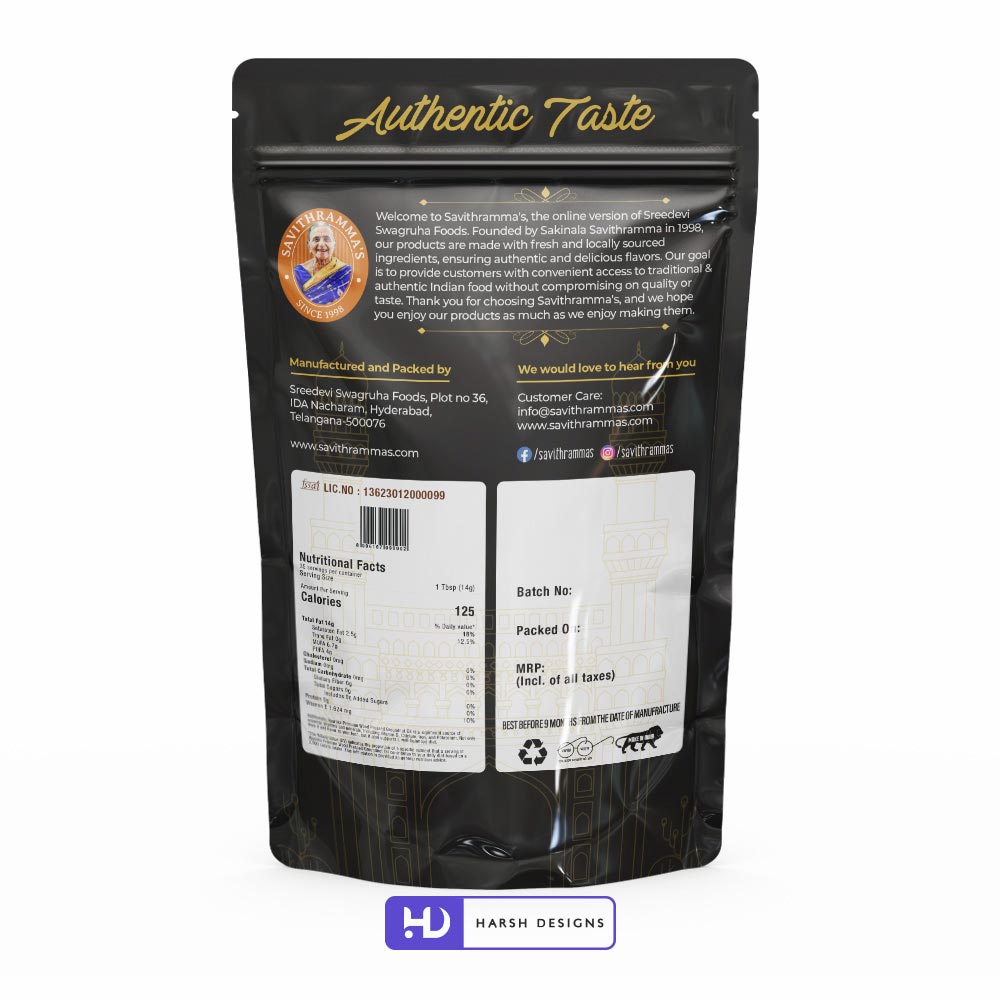
Black and Gold Product Packaging
The darker packaging direction uses:
- Black as the dominant background
- Warm orange brand accents
- Gold-toned product presentation
- Ingredient-focused imagery
- Product-name typography
- Natural-product communication
- Clearly organised regulatory and product information
For the front of the pouch, ingredients and spice bowls become prominent product cues while the Savithrammas logo remains clearly visible.
The back panel carries the more functional information required for the product, including brand communication, manufacturer information, nutritional information and product-specific fields.
Creating a Consistent Multi-Product Brand System
One of the most important outcomes of the project was the ability to create variety without losing recognition.
The orange and black packaging systems look intentionally different, yet both unmistakably belong to Savithrammas.
That consistency is created through recurring elements such as:
- The Savithrammas portrait emblem
- Warm orange brand accents
- Heritage-led typography
- Traditional visual language
- Product-centred presentation
- Consistent natural/authentic positioning
This allowed the identity to become a flexible system rather than a fixed graphic.
From Logo Design to a Complete Brand Experience
The Savithrammas project developed beyond logo design.
Once the visual identity had been established, Harsh Designs extended the same brand thinking across the customer journey.
The project included:
Logo Design
Development of the Savithrammas heritage-inspired emblem identity.
Product Packaging Design
Packaging systems created for different products and visual categories.
Product Photography
Professional product presentation for ecommerce and marketing use.
SEO Content Creation
Search-friendly website and product content designed to improve online discoverability.
Custom Ecommerce Website Development
Development of an online shopping experience capable of presenting and selling the product range.
Global Delivery Integration
Ecommerce functionality supporting customers across different locations and markets.
Country-Wise Pricing
Backend functionality enabling pricing requirements for different countries.
Tax Configuration
Required ecommerce tax structure and setup.
Shipping Integration
Delivery and shipping functionality integrated into the ecommerce system.
Social Media Marketing
Ongoing brand communication across social platforms.
Digital Marketing
Support through broader online promotional activity.
Google Ads and Meta Ads
Paid advertising support as part of the brand’s digital growth initiatives.
Extending the Brand Into Ecommerce
A traditional food brand being presented online needs more than a visually attractive homepage.
Customers must be able to understand:
- What the brand represents
- What products are available
- What makes those products distinctive
- How they can purchase
- How products can be delivered
- Whether the business feels credible
The Savithrammas website therefore became another important application of the identity.
The logo, product photography, food imagery, content and ecommerce functionality were brought together into a single online experience.
This allowed the visual identity developed during branding to continue through the actual purchasing journey.
Custom Ecommerce Development
Harsh Designs developed the Savithrammas ecommerce platform with backend control and functionality supporting the operational requirements of the business.
The scope included elements such as:
- Product catalogue management
- Ecommerce purchasing functionality
- Country-wise pricing
- Tax configuration
- Shipping setup
- Global delivery integration
- Product presentation
- SEO-friendly content structure
This was an important stage of the project because the brand identity had to work not only as a design system, but as part of a functioning commercial platform.

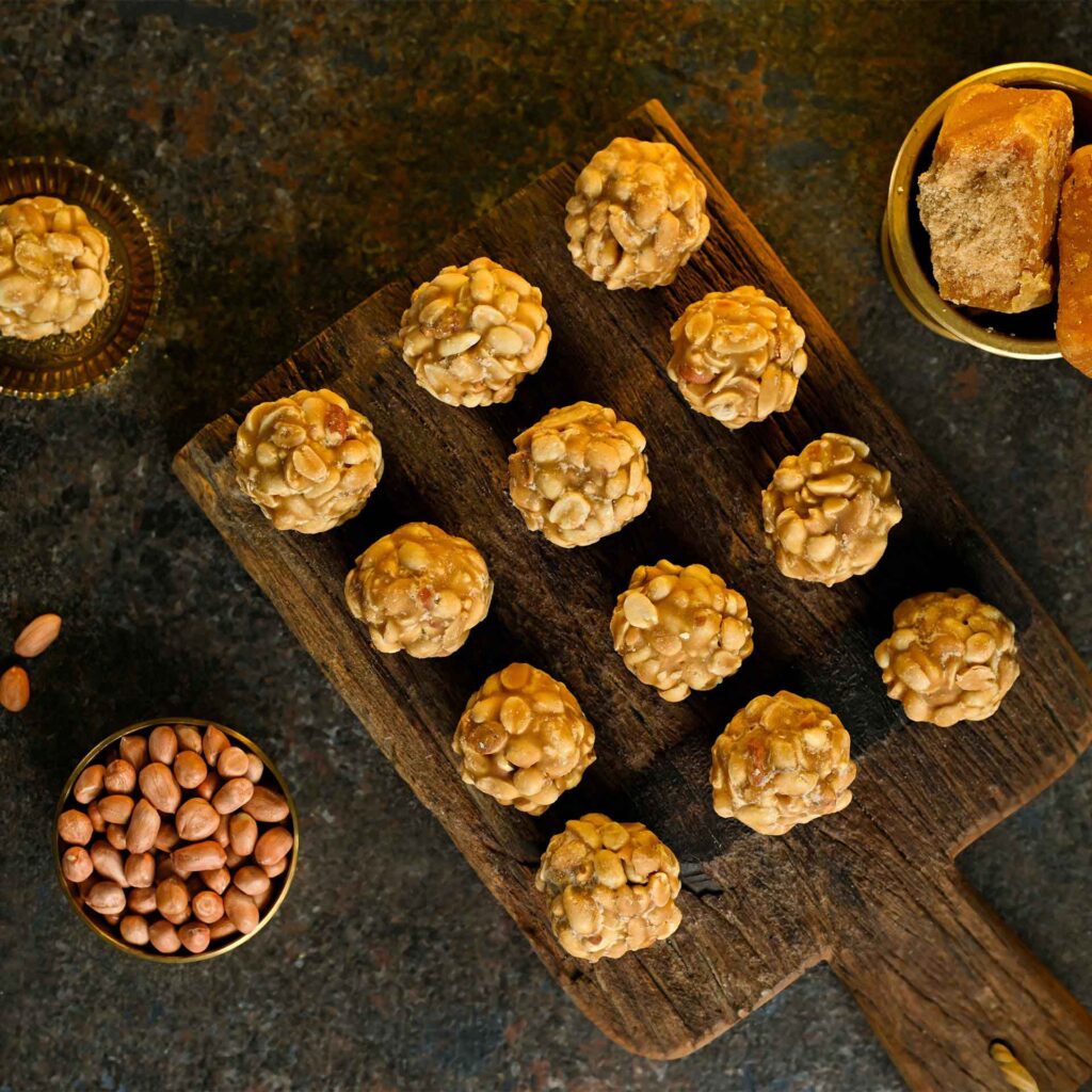
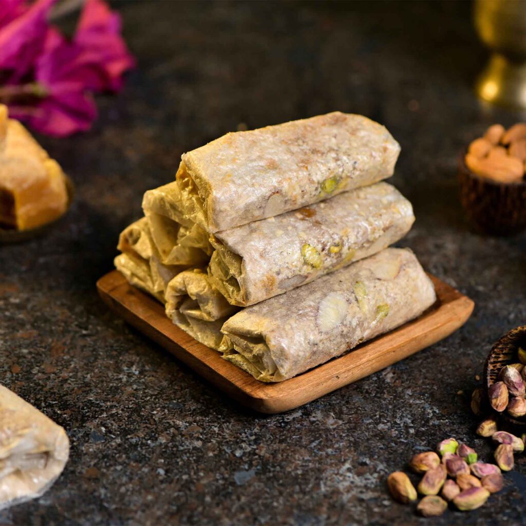
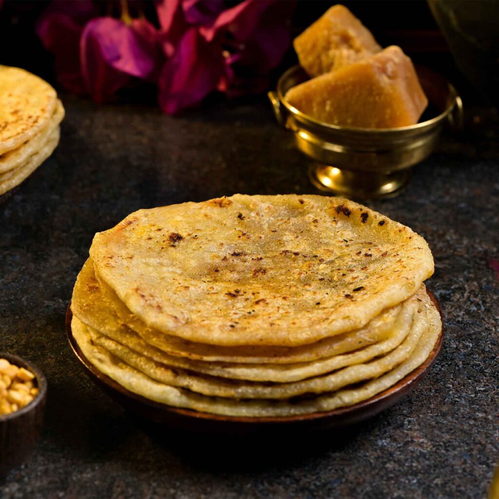
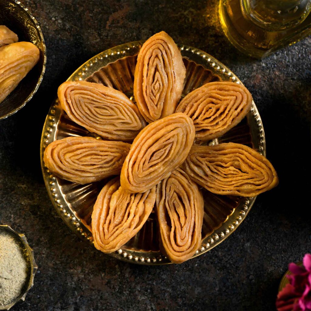
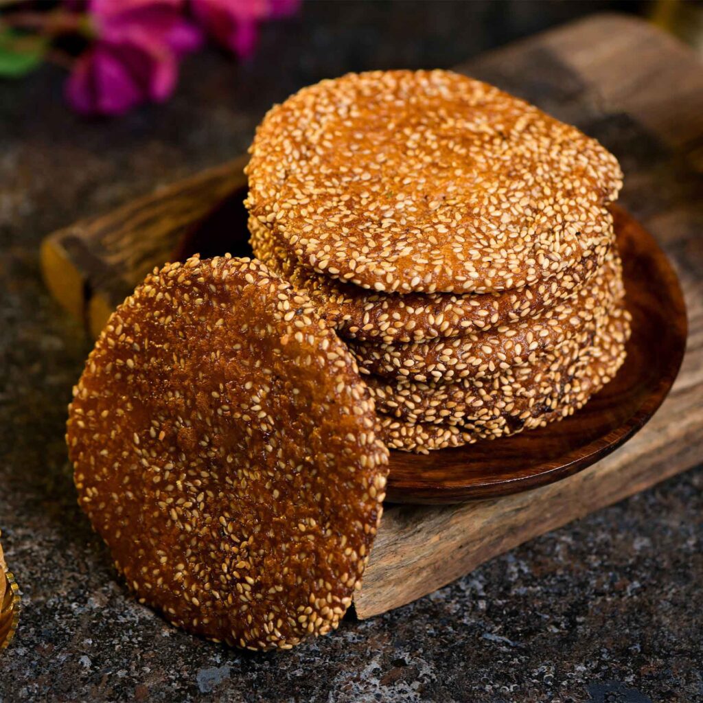
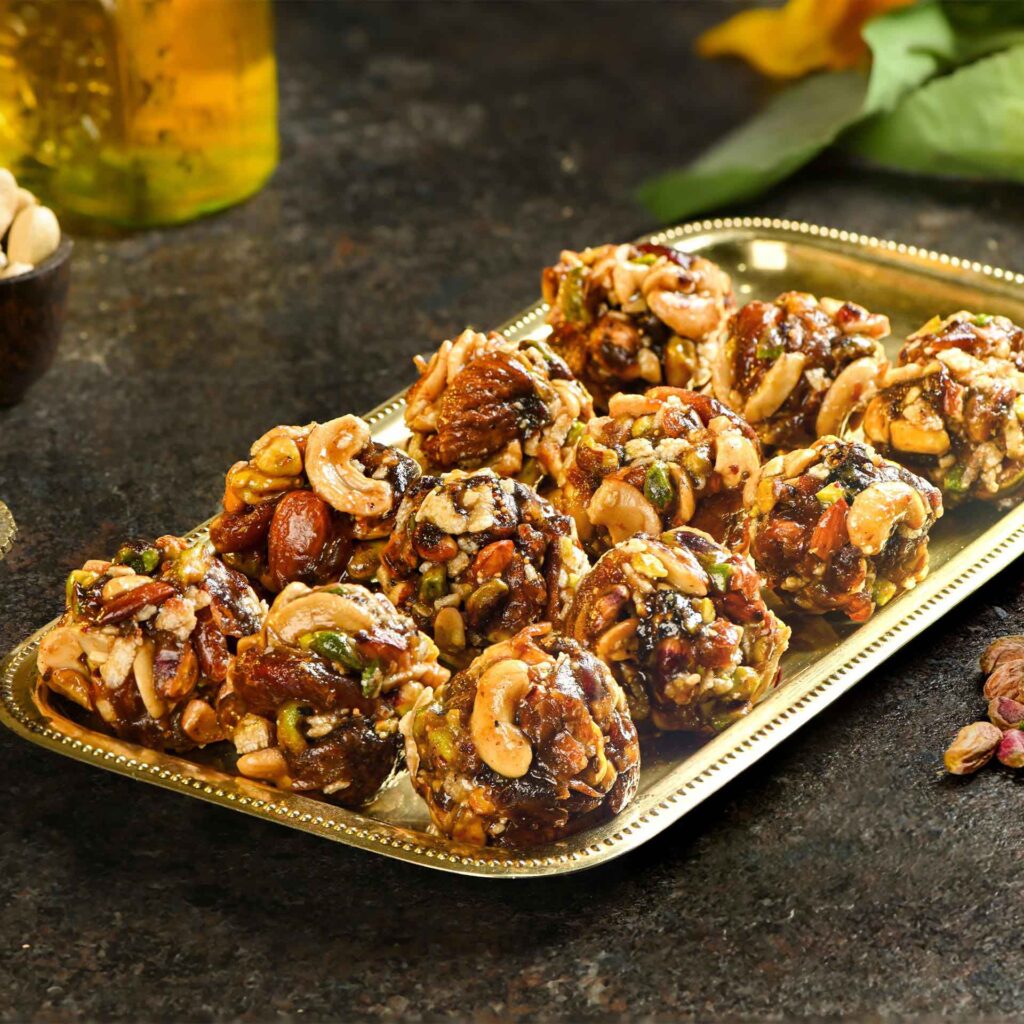
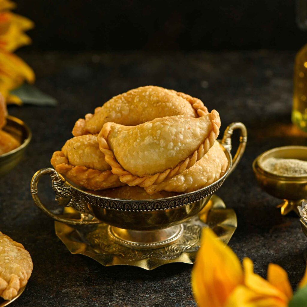
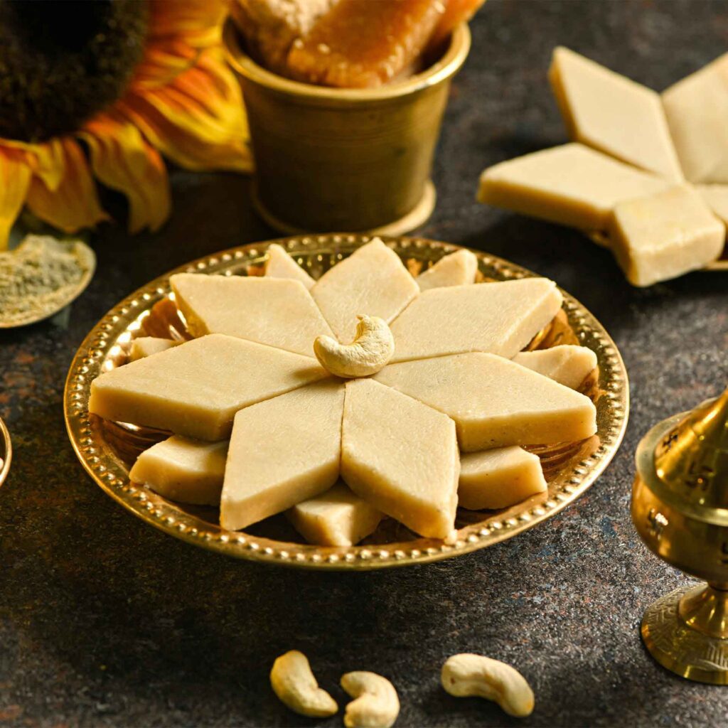
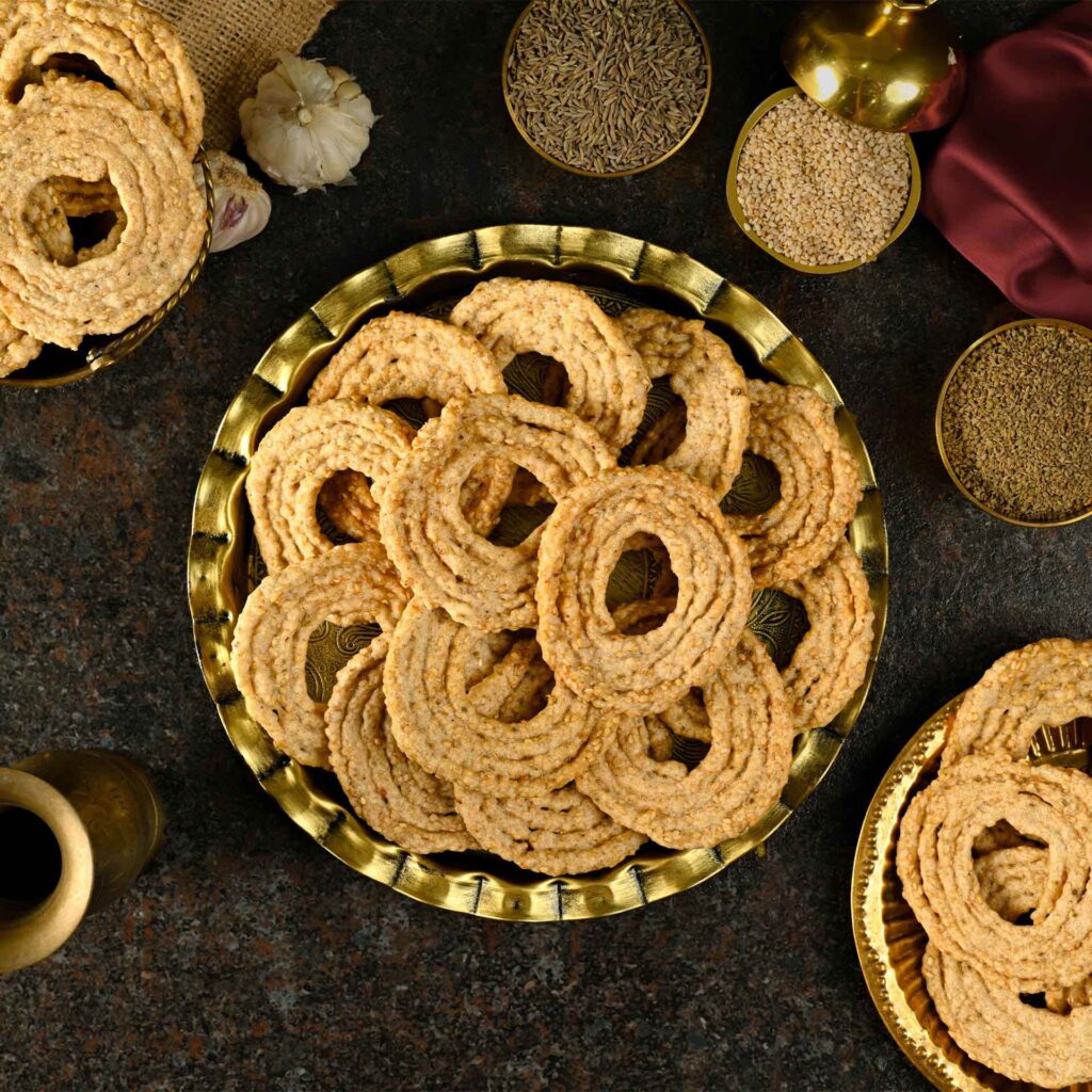
Product Photography and Ecommerce Presentation
Packaging design is only one part of presenting a food product online.
Customers viewing a digital store cannot physically pick up the product, examine the pouch or compare it directly on a shelf.
Photography therefore becomes a major part of the product experience.
Professional product visuals helped present Savithrammas products clearly across:
- Ecommerce listings
- Product detail pages
- Social media
- Digital advertisements
- Marketing creatives
- Brand presentations
The photography, packaging and website were treated as connected components rather than independent deliverables.
SEO and Content Development
The website also needed content capable of communicating the brand and product range to search engines as well as customers.
Harsh Designs supported the project with SEO-friendly content and digital optimisation around the ecommerce presence.
Rather than allowing the visual identity to stop at design, the objective was to help build an online brand system capable of supporting discovery, communication and sales.
Social Media and Digital Marketing
Once the brand identity and ecommerce presence were established, the same visual language could be extended into ongoing digital communication.
Harsh Designs supported Savithrammas through:
- Social media marketing
- Digital marketing
- Google Ads
- Meta advertising
- Brand-led promotional communication
This helped keep the identity consistent across the different environments in which customers encountered the brand.
The same Savithrammas emblem that appears on a physical food pouch could now appear across ecommerce listings, advertising and social communication.


Services Delivered by Harsh Designs
For Savithrammas, Harsh Designs provided a connected range of creative, technical and digital services:
- Logo Design
- Brand Identity Development
- Product Packaging Design
- Product Photography
- SEO Content Creation
- Custom Ecommerce Website Development
- Backend Ecommerce Development
- Country-Wise Pricing Setup
- Tax Configuration
- Shipping Integration
- Global Delivery Integration
- Social Media Marketing
- Digital Marketing
- Google Ads
- Meta Ads
- Complete Brand-to-Ecommerce Support
The Final Brand Identity
The completed Savithrammas identity is centred on something competitors cannot easily replicate: the person and heritage behind the brand.
Instead of depending on an abstract food symbol, the identity uses Savithramma herself as the visual anchor.
The resulting system combines:
Portrait + Brand Name + Heritage Marker + Distinctive Colour + Packaging Storytelling
This core identity was then applied across different product categories and digital platforms.
From warm traditional pickle packaging to darker premium spice packaging, the logo remains the consistent element connecting the entire brand.
The Outcome
The Savithrammas project resulted in more than a new logo.
It established a visual foundation capable of supporting multiple business touchpoints.
The identity was successfully extended across:
- Product packaging
- Ecommerce
- Product photography
- Website communication
- SEO content
- Social media
- Digital advertising
The project demonstrates how a carefully developed logo can become the starting point for a much broader brand system.
Rather than redesigning the identity every time a new requirement appeared, the original visual direction provided a consistent framework for the brand to grow around.
Harsh Designs Role
Harsh Designs worked across both the creative and technical sides of the Savithrammas project.
Our involvement connected brand identity with its real-world applications—from the logo customers recognise to the packaging they receive and the ecommerce platform through which they can discover and purchase the products.
This approach allowed us to maintain continuity across:
Brand Strategy → Logo Design → Packaging → Photography → Content → Ecommerce → Marketing
For us, that continuity is important.
A successful identity should not exist only in a presentation document. It should continue working wherever customers interact with the business.
Why This Food Brand Logo Design Works
The strength of the Savithrammas logo comes from its specificity.
It does not attempt to look like every traditional food brand.
It uses a real portrait, a clear heritage marker and a compact emblem structure to create recognition around the brand’s own story.
At the same time, its form allows it to remain usable across very different applications.
This combination of story, recognition and scalability made the identity suitable for a food brand operating across both physical packaging and digital commerce.
Building Heritage Brands for Today’s Market
Traditional businesses do not always need to abandon their history in order to look contemporary.
In many cases, their history is exactly what makes them different.
The design challenge is to identify the parts of that heritage customers can recognise and translate them into a system that works across today’s packaging, ecommerce and digital environments.
The Savithrammas project shows how a personal story can become a practical brand asset when it is developed consistently.
Looking for a Food Brand Logo or Brand Identity?
If you are launching a food product, traditional food business, FMCG brand or ecommerce product range, Harsh Designs can help develop an identity that works beyond the logo itself.
Our branding process can extend across:
- Logo Design
- Brand Identity
- Packaging Design
- Product Photography
- Ecommerce Development
- SEO
- Social Media
- Digital Marketing
Build a brand identity that can grow from the first logo concept to the final customer experience.