The Power of Color Psychology in Design: Unlocking the Secrets to Influence and Impact
Introduction
Color Psychology in Design is a powerful tool in design, capable of influencing emotions, perceptions, and decisions. From the vibrant yellow that evokes happiness to the calming blue that symbolizes trust, color plays a crucial role in creating visual experiences that resonate with audiences. In this blog, we’ll explore the fascinating world of color psychology and its impact on design. By understanding the meanings and emotions associated with different colors, you can create designs that not only look beautiful but also convey the right message and connect with your audience on a deeper level.
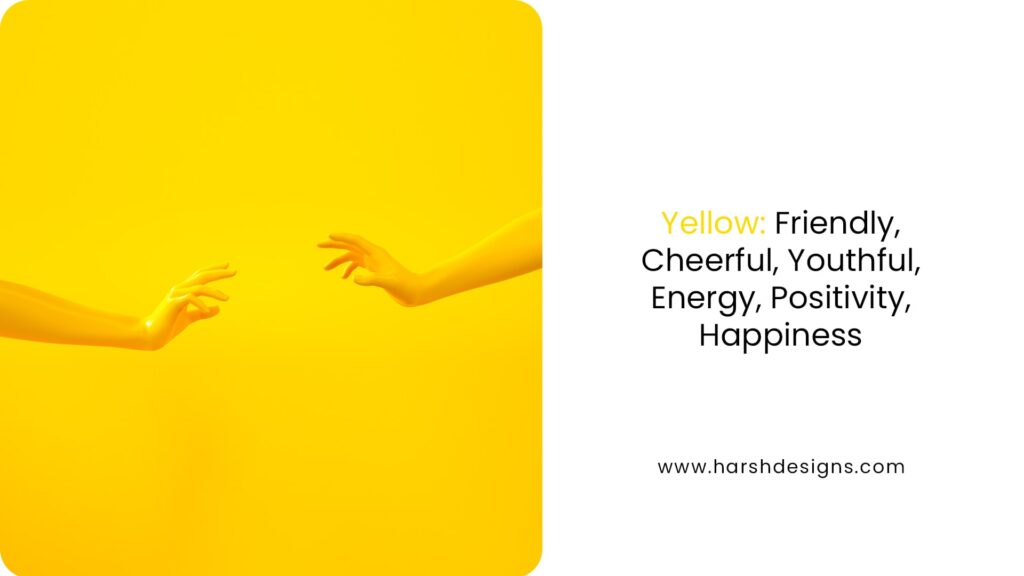
1. Yellow: The Color of Happiness and Positivity
Yellow is often associated with warmth, cheerfulness, and positivity. It’s a color that instantly grabs attention and radiates energy. When used in design, yellow can evoke feelings of happiness and optimism, making it a great choice for brands that want to convey friendliness and approachability.
However, yellow can also be overwhelming if used excessively. To strike the right balance, consider using yellow as an accent color or in combination with more neutral tones to maintain a sense of harmony in your design.
Quote: “Yellow is the color of sunshine, hope, and happiness. It stands for freshness, positivity, clarity, energy, optimism, enlightenment, remembrance, intellect, honor, loyalty, and joy.”
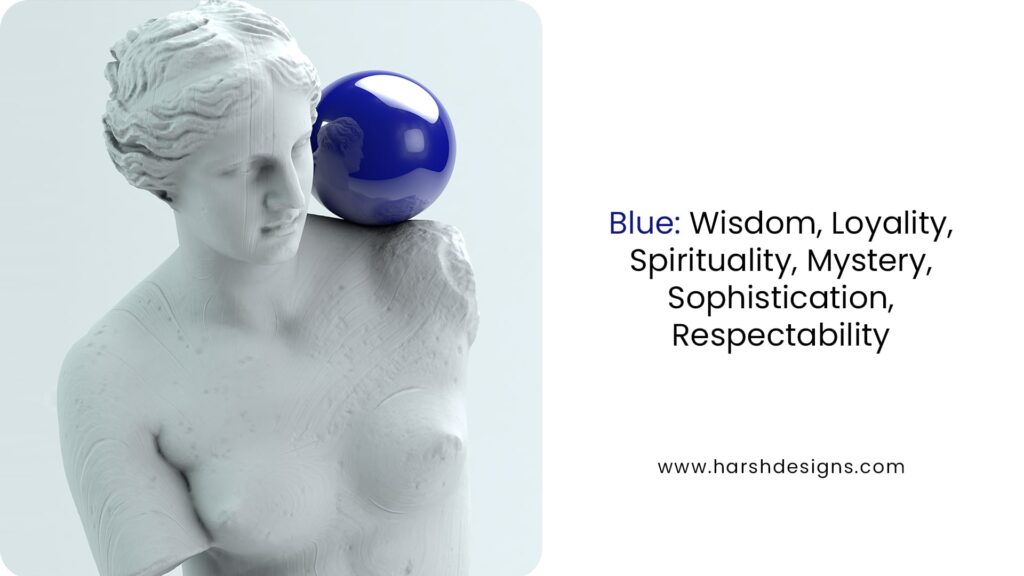
2. Blue: The Color of Trust and Stability
Blue is a versatile color that evokes feelings of calmness, trust, and reliability. It’s no wonder that many financial institutions and tech companies use blue in their branding to convey a sense of professionalism and stability. Blue is also associated with intelligence and wisdom, making it a popular choice for educational and corporate designs.
In design, blue can be used in various shades to create different effects. Light blue is often used to evoke tranquility and peace, while dark blue can signify depth and power.
Pro Tip: Use blue in your designs when you want to establish trust and credibility. It’s a color that resonates well with a wide audience and can be very effective in creating a professional image.
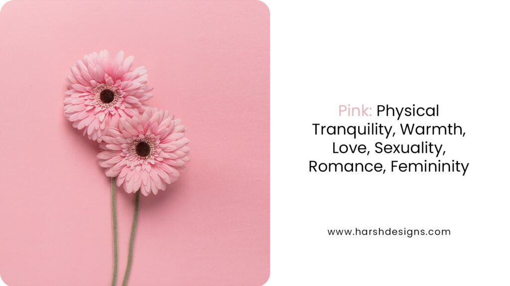
3. Pink: The Color of Love and Femininity
Pink is a color that symbolizes love, warmth, and femininity. It is often associated with romance and tenderness, making it a popular choice for brands targeting women or promoting products related to beauty and care. Pink can range from soft pastels to bold magentas, each conveying different levels of energy and emotion.
When used in design, pink can create a sense of warmth and approachability. However, it’s important to consider your audience and the message you want to convey, as pink can also be seen as overly feminine or youthful depending on the context.
Fun Element: Imagine a beauty brand using pink as its primary color to evoke feelings of care and luxury. Pairing it with gold or black can elevate the design to feel more sophisticated and premium.
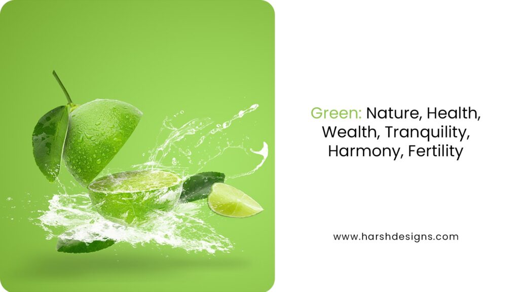
4. Green: The Color of Nature and Tranquility
Green is synonymous with nature, health, and tranquility. It is a color that is often used in designs related to the environment, wellness, and sustainability. Green has a calming effect and is associated with growth, harmony, and freshness.
In branding, green can signify eco-friendliness and a commitment to natural products. It is also a color that represents balance and stability, making it a great choice for brands in the health and wellness industries.
Quote: “Green is the prime color of the world, and that from which its loveliness arises.” – Pedro Calderon de la Barca
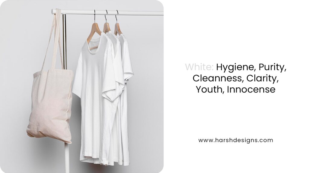
5. White: The Color of Purity and Simplicity
White is a color that represents purity, cleanliness, and simplicity. It is often used in minimalist designs to create a sense of space and openness. White can also evoke feelings of innocence and youth, making it a versatile color for a wide range of designs.
In design, white is often used as a background color to provide contrast and highlight other elements. It is also associated with modernity and sophistication, especially when paired with black or metallic accents.
Pro Tip: Use white space effectively in your designs to create a clean and uncluttered look. This not only enhances readability but also gives your design a modern and elegant feel.
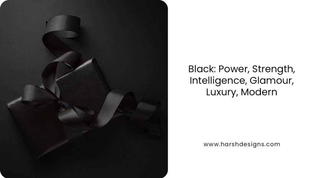
6. Black: The Color of Power and Elegance
Black is a powerful color that conveys strength, elegance, and sophistication. It is often used in luxury branding to create a sense of exclusivity and high-end appeal. Black is also associated with mystery and authority, making it a great choice for designs that want to evoke a sense of drama and intensity.
In design, black can be used as a dominant color or as an accent to add depth and contrast. It pairs well with almost any color, making it a versatile choice for various design styles.
Fun Element: Think of a luxury fashion brand using black as its primary color to convey sophistication and exclusivity. Pairing it with gold or silver accents can create a design that feels both elegant and timeless.
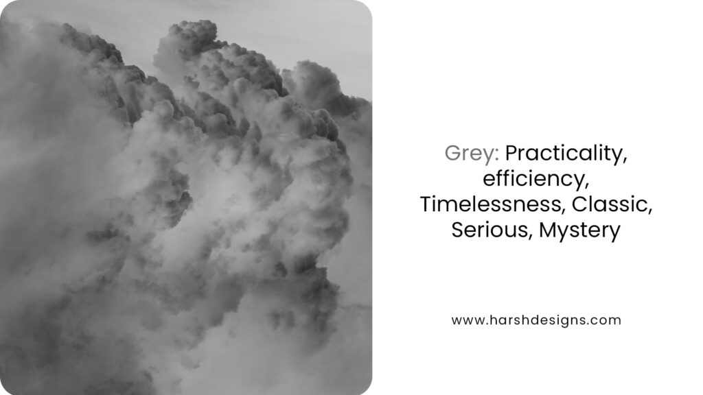
7. Grey: The Color of Practicality and Timelessness
Grey is a neutral color that represents practicality, efficiency, and timelessness. It is often used in designs that want to convey a sense of balance and calmness. Grey is also associated with formality and professionalism, making it a popular choice for corporate and industrial designs.
In design, grey can be used as a base color to create a sophisticated and understated look. It works well with both bright and muted colors, making it a versatile option for various design applications.
Pro Tip: Use different shades of grey to create depth and dimension in your designs. Lighter shades can evoke a sense of calmness, while darker shades can add a touch of drama and sophistication.
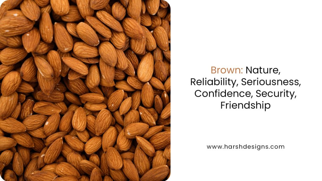
8. Brown: The Color of Reliability and Warmth
Brown is a color that symbolizes nature, reliability, and warmth. It is often used in designs that want to evoke a sense of earthiness and stability. Brown is associated with organic and natural products, making it a popular choice for brands in the food and beverage, as well as the outdoor and lifestyle industries.
In design, brown can create a warm and inviting atmosphere. It pairs well with earthy tones like green and beige, as well as vibrant colors like orange and red.
Fun Element: Imagine a coffee brand using brown as its primary color to evoke the rich, warm tones of freshly brewed coffee. Pairing it with cream or gold accents can enhance the overall warmth and appeal of the design.
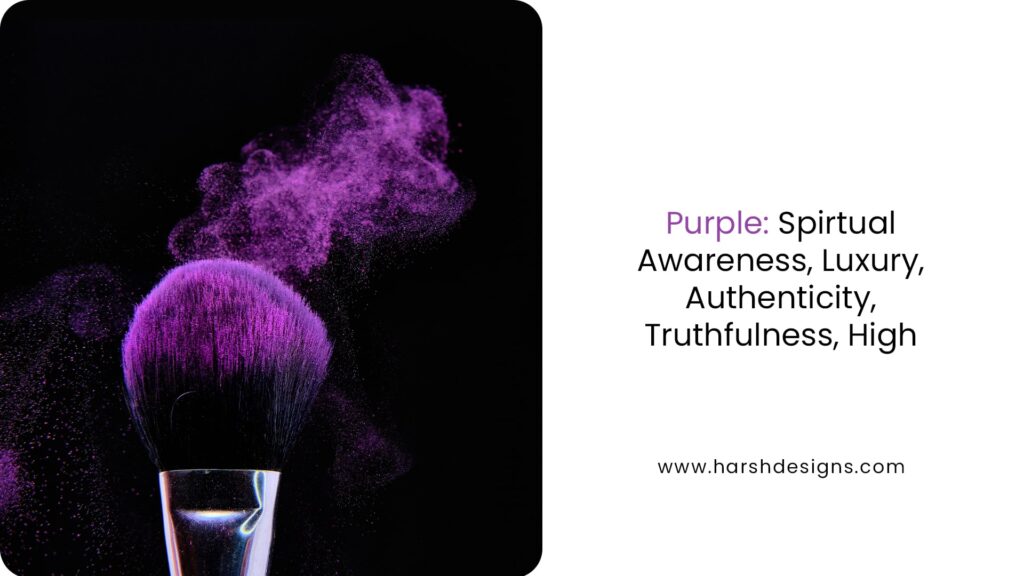
9. Purple: The Color of Luxury and Spirituality
Purple is a color that represents luxury, spirituality, and creativity. It is often associated with royalty and sophistication, making it a popular choice for high-end brands. Purple is also linked to imagination and creativity, making it a great color for artistic and innovative designs.
In design, purple can be used to create a sense of elegance and exclusivity. It works well with both dark and light colors, allowing for versatile design applications.
Quote: “Purple is the color of luxury, creativity, and spirituality. It’s a color that inspires and elevates.”
Conclusion: The Power of Color in Design
Color is more than just a visual element in design; it is a powerful psychological tool that can influence emotions, perceptions, and even behaviors. Whether you’re designing a logo, website, packaging, or marketing material, the colors you choose play a critical role in how your brand is perceived by your audience. By understanding color psychology, you can create designs that not only capture attention but also resonate deeply with your target audience.
The Psychological Impact of Color
Each color carries its own set of meanings and emotional associations. For instance, red is often associated with passion, energy, and urgency, making it a popular choice for call-to-action buttons and clearance sales. Blue, on the other hand, is seen as trustworthy and calming, which is why it is commonly used in the corporate world, especially in the financial sector. Green is synonymous with nature, health, and tranquility, making it ideal for brands that want to convey eco-friendliness or well-being.
But the psychological impact of color goes beyond just these broad associations. The same color can evoke different emotions depending on its shade, saturation, and context. For example, a deep, rich green may evoke feelings of luxury and stability, while a bright, lime green might suggest youthfulness and vibrancy. Understanding these nuances is key to leveraging color psychology effectively in your designs.
Creating Emotional Connections Through Color
One of the most powerful aspects of color psychology is its ability to create an emotional connection between your brand and your audience. When used effectively, color can make your audience feel a certain way, which in turn can influence their decision-making process. For example, a brand that wants to convey warmth and friendliness might use shades of orange, which is associated with enthusiasm and creativity. A luxury brand, aiming to evoke a sense of exclusivity and sophistication, might opt for black or deep purple, colors often associated with wealth and elegance.
This emotional connection is particularly important in branding. A well-chosen color palette can make your brand more memorable and help it stand out in a crowded marketplace. Think about iconic brands like Coca-Cola, whose use of red is instantly recognizable and evokes feelings of excitement and energy. Or Tiffany & Co., whose signature blue is synonymous with luxury and elegance. These brands have successfully used color to create strong, emotional connections with their customers.
Enhancing Design Effectiveness
Beyond creating emotional connections, color can also enhance the effectiveness of your design by guiding the viewer’s attention and influencing their perceptions. For instance, high-contrast colors can be used to draw attention to specific elements of your design, such as call-to-action buttons or important information. Similarly, a well-balanced color scheme can make your design more visually appealing and easier to navigate, improving the overall user experience.
Color can also be used strategically to convey information quickly. For example, in infographics or data visualizations, color can be used to differentiate between categories, highlight key points, or indicate trends. This makes the information more accessible and easier to understand, which is especially important in a world where people are bombarded with information and have limited attention spans.
Cultural Considerations in Color Usage
While color psychology is a powerful tool, it’s important to remember that the meanings and associations of colors can vary significantly across different cultures. For instance, while white is often associated with purity and cleanliness in Western cultures, it is traditionally worn at funerals in many Eastern cultures, where it is associated with mourning and loss. Similarly, while red is considered a lucky color in China, symbolizing prosperity and happiness, it can be associated with danger or warnings in other contexts.
When designing for a global audience, it’s essential to take these cultural differences into account to ensure that your color choices are appropriate and effective. This is particularly important for brands that operate in multiple countries or aim to appeal to diverse demographics. Conducting thorough research and testing your designs with target audiences from different cultural backgrounds can help you avoid potential pitfalls and ensure that your color choices resonate with everyone.
The Role of Color in Brand Identity
At the core of any successful brand identity is a carefully considered color palette. The colors you choose for your brand will become closely associated with it, helping to shape perceptions and build recognition over time. A strong color palette can set the tone for your brand, communicate its values, and differentiate it from competitors.
When selecting a color palette for your brand, consider not only the emotions and meanings associated with different colors but also how the colors work together as a cohesive whole. A well-chosen palette should be versatile enough to be used across a variety of mediums, from your website and social media profiles to packaging and print materials. It should also be distinctive, helping your brand to stand out and be easily recognized.
Conclusion
In conclusion, color psychology is an essential aspect of design that can significantly impact how your audience perceives and interacts with your brand. By understanding the emotional and psychological associations of different colors, you can create designs that resonate with your audience, convey the right message, and enhance your brand’s overall effectiveness. Whether you’re working on a logo, website, or marketing campaign, consider the power of color and how it can be used to create a lasting impression.
At Harsh Designs, we specialize in creating visually stunning and impactful designs that make the most of color psychology. Our team of experienced designers understands the nuances of color and how to use it strategically to elevate your brand. Explore our portfolio and discover how we can help you create designs that resonate with your audience and stand the test of time. Whether you’re looking to build a new brand identity or refresh an existing one, we’re here to help you achieve your goals through the power of color.
Related Posts
Categories
- 3D Product Packaging
- Case Study
- Content Marketing
- Digital Marketing
- Digital Marketing
- Google Ads
- Logo Design
- Logo Design
- Packaging Design
- Print & Brochure Design
- Product Photography
- Search Enginee Marketing (SEM)
- Social Media Marketing (SMM)
- Social Media Marketing (SMM)
- Video Marketing
- Web Development
Recent Posts
- The Power of Design: How It Shapes Our Everyday Lives
- The Power of Color Psychology in Design: Unlocking the Secrets to Influence and Impact
- 7 Signs of a Good Logo Design: The Ultimate Guide to Creating a Timeless Brand Identity
- TruRadix Nutraceuticals & Harsh Designs: A Case Study in Digital Excellence
- Biryani Lounge Milton: A Digital Marketing Success Story
